Presentations
How to Make a Professional-Looking Presentation with AI in 2026
Learn the 8-step framework for making any presentation look professional, verified design principles top presenters use, real examples for sales decks and student presentations, and how to upgrade any deck in minutes with AI.


İlayda Tunaboylu
What Makes a Presentation Look Professional?
A professional-looking presentation combines clear visual hierarchy, consistent typography, a limited color palette, generous white space, meaningful visuals, and cohesive design across every slide. Professional design isn't about being flashy. It's about making your message land instantly and signaling that you take the work (and your audience) seriously. The main benefit of a professional-looking presentation is that it builds credibility before you've spoken a word, which directly affects whether audiences believe, remember, and act on your content.
According to research on visual perception, audiences form aesthetic judgments about a slide within 500 milliseconds. Studies on presentation retention show professionally designed slides increase message retention by up to 65% compared to text-heavy default templates. In sales specifically, professionally designed pitch decks close deals 25 to 40% more often than amateur-looking equivalents. The gap between amateur and professional design shows up directly in whether people take your ideas seriously.
For related content, see our guides on presentation design, what makes for a good presentation, and how to do a presentation.
Why Professional Design Matters More Than Ever
Attention is scarce. Poorly designed presentations lose the room in the first 30 seconds.
Design signals seriousness. A dated or cluttered deck undermines even strong content. Viewers project design quality onto message quality.
Modern audiences expect polish. With AI tools now making professional design accessible in minutes, "we didn't have time" no longer excuses amateur-looking decks.
Sharing depends on design. Screenshots of well-designed slides get shared on LinkedIn and Twitter. Text-heavy corporate slides don't.
Retention rises with professional design. Research consistently shows well-designed visual slides outperform text-heavy ones on retention by 40 to 65%.
The 8-Step Professional Presentation Framework
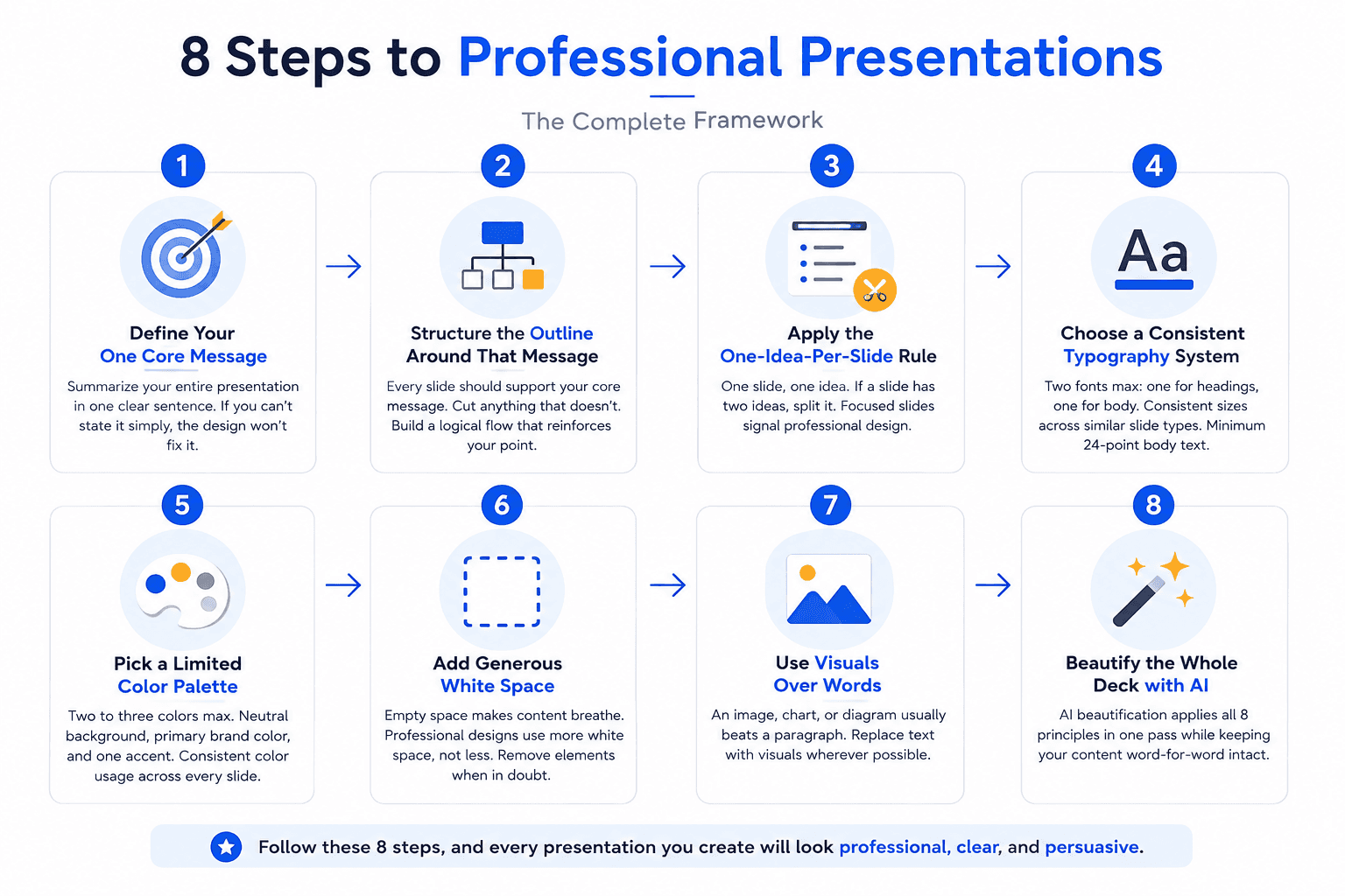
Every professional-looking presentation follows this 8-step framework. Learn it once and every deck you build gets better.
Step | What to Do |
|---|---|
1 | Define your one core message |
2 | Structure the outline around that message |
3 | Apply the one-idea-per-slide rule |
4 | Choose a consistent typography system |
5 | Pick a limited color palette |
6 | Add generous white space |
7 | Use visuals over words |
8 | Beautify the whole deck with AI |
Step 1: Define Your One Core Message
Before designing anything, know the single sentence that summarizes your whole presentation. If you can't state it in one sentence, the design won't fix it. Great presentations lead with one clear message and reinforce it throughout.
Step 2: Structure the Outline Around That Message
Every slide should support the core message. Cut anything that doesn't. See our 10/20/30 rule guide for pitch-specific structure and our how to start a presentation guide for strong openings.
Step 3: Apply the One-Idea-Per-Slide Rule
If a slide has two ideas, split it into two slides. This is the single most impactful design principle. Text-heavy slides with 5+ bullet points signal amateur design. Focused slides with one clear point signal professional design.
Step 4: Choose a Consistent Typography System
Two fonts max: one for headings, one for body. Ideally one font family with different weights. Consistent font sizes across similar slide types (all titles the same size, all body text the same size). Minimum 24-point body text for readability.
Step 5: Pick a Limited Color Palette
Two to three colors max. A neutral background (white, black, or dark grey), a primary brand color, and one accent color for emphasis. More colors than that creates visual noise. Consistent color usage across every slide.
Step 6: Add Generous White Space
Empty space isn't wasted. It's what makes the content breathe. Every professional design uses significantly more white space than amateur design does. When in doubt, remove elements rather than add them.
Step 7: Use Visuals Over Words
An image, chart, or diagram usually beats a paragraph. Every professional slide replaces text with visual wherever possible. See our guides on the pie chart and bar graph for chart-specific design.
Step 8: Beautify the Whole Deck with AI
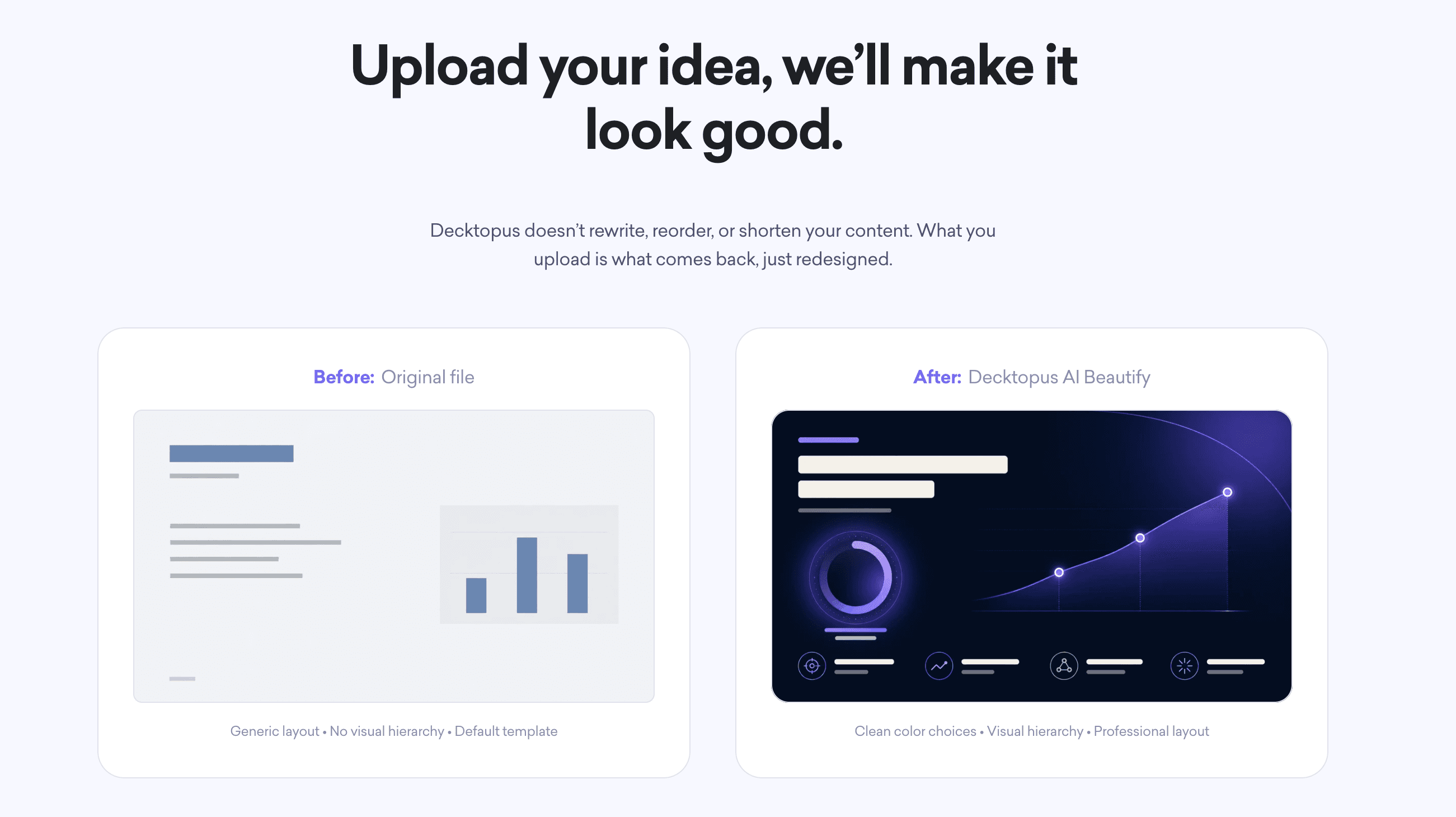
Even if you follow every principle above, applying them manually to a 30-slide deck takes hours. AI beautification like Decktopus AI Beautify applies all 8 principles in one pass while keeping your content word-for-word intact.
Design Principles Every Professional Slide Follows
One clear focal point. Each slide has one thing the eye is drawn to first.
Aligned elements. Everything sits on a clear grid.
Consistent styling. Same fonts, colors, layouts across slides.
High contrast. Dark text on light background (or reverse) for readability.
Purposeful visuals. Every image, chart, or icon has a reason to be there.
Restraint over decoration. Professional design removes elements rather than adding them.
Data with context. Charts are labeled, annotated, and tied to a clear takeaway.
Whitespace as design element. Empty space is intentional, not accidental.
For a deeper breakdown, see our related guide on slide design principles.
Professional Presentation Examples: Sales Decks
Sales decks are where professional design directly affects revenue. Here's how to make yours look professional.
Cover slide: company logo, prospect's name prominently, engagement title (specific to their situation), date. Skip generic "Business Proposal" titles.
Problem slide: the prospect's specific challenge in their own language. Quantified where possible.
Solution slide: your recommended approach tied to outcomes. Not a feature list.
Value slide: measurable benefits with real numbers. Case study numbers if available.
Social proof slide: named clients with quantified outcomes. Skip logo grids without context.
Pricing slide: tiered options (essential, recommended, premium) with the recommended tier visually anchored. Proposals with tiered pricing close 35.8% more often than single-price ones.
Timeline slide: visual roadmap with owner assignments and dependencies.
Call to action slide: dated, specific next step.
For sales-specific guidance, see our guides on the sales pitch, pitch deck examples, and best pitch deck generators for founders.
Professional Presentation Examples: Student and Academic Decks
Student presentations are graded partly on design quality. Here's how to make yours look professional.
Title slide: name, class, professor, assignment title, date. Follow rubric requirements exactly.
Research question or thesis slide: the specific claim you're making. Clear and unambiguous.
Literature review slide: key sources with brief context. Visual timeline if relevant.
Methodology slide: step-by-step visual of your approach.
Findings slide: data visualized clearly, key finding highlighted.
Discussion slide: interpretation of findings, implications.
Conclusion slide: restated thesis, key takeaways, next questions.
Bibliography slide: properly formatted citations per your class citation style.
For related student content, see our guides on are presentations common in college, job interview presentations, and the AI tool for students.
Professional Presentation Examples: Executive and Board Decks
Executive and board decks demand a different kind of professionalism: sophisticated, concise, data-heavy.
Executive summary slide: the ask and the key numbers upfront.
Strategic context slide: where this fits in the broader business.
Data dashboard slide: key metrics visualized cleanly.
Progress slide: what's shipped, what's next, what's blocked.
Risks and mitigations slide: honest assessment, not sugarcoated.
Financial slide: transparent breakdown tied to strategic goals.
Decision slide: what's being asked, by when, by whom.
For related content, see our guides on the best pitch deck generators for founders and how to make the best startup pitch.
Common Mistakes That Make Presentations Look Unprofessional
Text walls. More than 20 words per slide instantly signals amateur design.
Too many fonts. Multiple font families across the deck breaks visual consistency.
Rainbow color palettes. Four or more colors creates visual chaos.
Default templates. Every viewer has seen the default PowerPoint and Google Slides templates. Using them signals lack of effort.
Inconsistent alignment. Elements floating without a grid look unprofessional.
Chart junk. Default Excel charts with gridlines, borders, and cluttered legends.
Random capitalization. Some titles in Title Case, others in ALL CAPS, others in sentence case.
Meaningless stock photos. Generic images of "business handshake" or "office team" add nothing.
Ignoring master template. Setting up a proper master saves formatting hours. Or use AI beautification to enforce consistency automatically.
Slides that need explanation to grasp. If viewers can't understand the slide in 3 seconds, the design has failed.
For more, see our guide on 7 mistakes we all made during a presentation.
Manual Design vs. AI-Powered Professional Design
Factor | Manual Design | AI Beautification |
|---|---|---|
Time for a 30-slide deck | 4 to 8 hours | 5 to 15 minutes |
Requires design skills | Yes | No |
Consistency across slides | Depends on designer | Automatic |
Content preservation | Manual (risk of drift) | Word-for-word |
Cost | Designer time or in-house effort | Software subscription |
Best for | Highest-stakes brand-critical decks | Everyday professional decks |
How to Make Your Presentation Look Professional with Decktopus AI
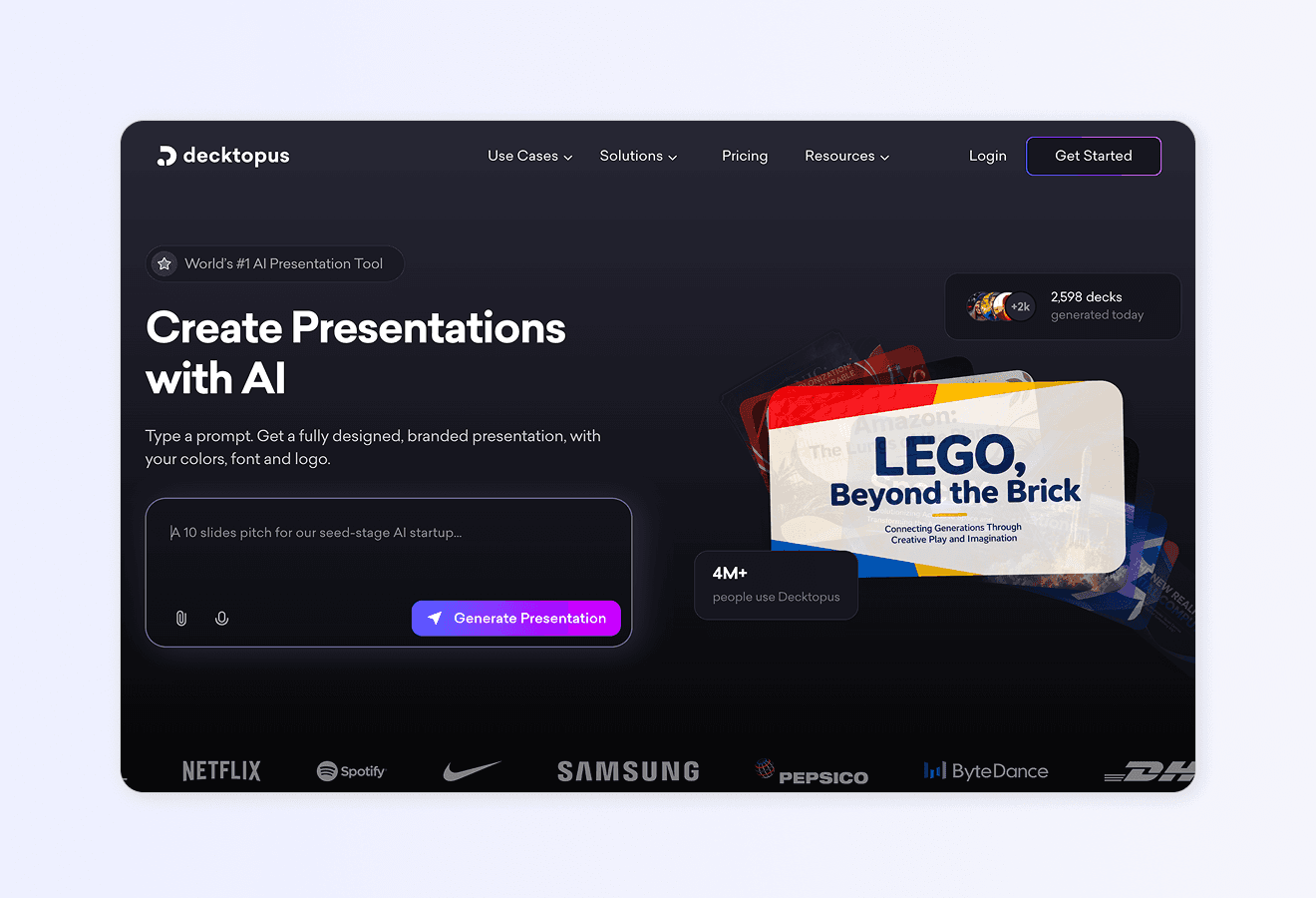
The fastest way to apply every principle in this guide is Decktopus AI Beautify. Upload your existing deck, choose a professional style, and download the redesigned version in minutes. Content stays word-for-word intact.
Why Decktopus AI Beautify Makes Presentations Look Professional
Full-deck redesign in one pass. Every slide gets updated together.
Content stays word-for-word. Only design changes.
Professional styles ready to go. Multiple options designed by real designers.
Optional prompt for direction. Add "corporate," "minimalist," "energetic."
Fully editable after redesign. Nothing is locked.
Works for any presentation type. Sales, pitch, academic, executive, board.
Multi-format export. PDF, PPT, PNG.
Two Beautify options:
Redesign keeps your text and structure intact. New design only.
Use as a Resource extracts key points from your uploaded deck and builds a fresh presentation.
Step-by-Step Workflow
Upload your PowerPoint or PDF via paperclip icon
Choose Redesign to keep content intact
Pick a professional style, past style, or let AI choose
Review the beautified deck (content unchanged)
Refine specific slides with Edit with AI or Edit Text
Export as PDF, PPT, or PNG. Share via live link with auto-update. Present from Presentation Mode.
For deeper use case guidance, see Decktopus AI for Sales, Decktopus AI for Marketers, and Decktopus AI for Founders.
For related content, see our guides on how to beautify your presentation slides with AI and slide design ideas and inspiration.
Ready to make your presentation look professional? Try Decktopus AI Beautify.
Frequently Asked Questions
How do I make a professional-looking PowerPoint?
Follow the 8-step framework: define your core message, structure around it, one idea per slide, consistent typography, limited color palette, generous white space, visuals over words, beautify with AI. The fastest way to apply all 8 is uploading your deck to Decktopus AI Beautify.
How do I make a presentation look good if I have no design skills?
Use AI beautification tools like Decktopus AI Beautify. Upload your deck, pick a professional style, and download the redesigned version. No design skills needed.
How do I improve an existing presentation?
Two approaches: manual redesign (4 to 8 hours for a 30-slide deck) or AI beautification (5 to 15 minutes). Both preserve your content. AI beautification is faster and enforces consistency automatically.
What makes a presentation look unprofessional?
Text walls, too many fonts, rainbow color palettes, default templates, inconsistent alignment, chart junk, random capitalization, meaningless stock photos, and slides that need explanation to understand.
How do I make my slides look pretty?
Focus on visual hierarchy, generous white space, limited color palette (2 to 3 colors), consistent typography (two fonts max), and one focal point per slide. Add high-quality visuals only when they add meaning.
How can I make my presentation look better fast?
Upload it to an AI beautification tool. Decktopus AI Beautify redesigns a full deck in 5 to 15 minutes while keeping your content word-for-word intact.
What color palette looks professional?
Two to three colors: a neutral background (white, black, or dark grey), a primary brand color, and one accent color. Consistent usage across every slide.
What font size looks professional on slides?
Minimum 24-point body text. 30-point or larger if presenting to a room. Titles 40+ point. See our guide on the 10/20/30 rule.
How do I make a student presentation look professional?
Follow the rubric exactly, use a clean template, apply the 8-step framework above, cite sources properly, and rehearse the delivery. For students, Decktopus AI generates full presentations from a short description in minutes.
How do I make a sales deck look professional?
Use tiered pricing (proposals with three tiers close 35.8% more often), lead with the prospect's problem, use named case studies with quantified outcomes, end with a dated call to action. See our guides on the sales pitch and pitch deck examples.
What tools help make professional presentations?
For AI-generated professional presentations, Decktopus AI. For redesigning existing decks, Decktopus AI Beautify. For general design, Canva and Adobe Express. See our roundup of the best AI presentation tools.
How long does it take to make a professional presentation?
Manual: 4 to 8 hours for a 30-slide deck if you know what you're doing. With AI beautification: 15 minutes end-to-end.
Can AI make my presentation look professional?
Yes. Modern AI beautification tools apply professional design principles (hierarchy, typography, color, spacing) to your existing deck in minutes while keeping your content intact.
How do I make my board presentation look professional?
Prioritize sophistication over decoration. Executive summary upfront. Data dashboards clean and annotated. Every slide answers one strategic question. See our guide on 5 ways to make board meetings more valuable.
What tool should I use to make my presentation professional fast?
Decktopus AI Beautify is the fastest option. Upload your deck, choose a professional style, download the redesigned version. For more, see our roundup of the best AI presentation tools.
Conclusion
Professional presentation design isn't about being flashy. It's about making your message land in the first 3 seconds a viewer sees each slide. The 8-step framework in this guide (define message, structure outline, one idea per slide, consistent typography, limited color, white space, visuals over words, AI beautify) applies universally across sales decks, student presentations, executive updates, and every other deck type.
For teams that don't have hours to spend on manual redesign, Decktopus AI Beautify applies every professional design principle in this guide automatically. Upload your deck, pick a style, download. Every word of your original content stays intact. Only the design changes.
For more resources, see our guides on presentation design, slide design ideas and inspiration, how to beautify your presentation slides with AI, and the best AI presentation tools.
Related posts

Webinar Follow-Up Emails: The Sequence That Runs After the Deck Ends
Learn how to build a webinar follow-up email sequence with behavioral segmentation, timely emails, better deliverability, and personalized outreach.
Presentations

Best TED Talks to Improve Your Presentation Skills
Watch ten of the best TED talks for presentation skills and use a practical exercise from each to improve structure, voice, visuals, and confidence.
Presentations

Decktopus AI Best Practices: The Complete Guide, Tips and Tricks (2026)
A complete guide to using Decktopus AI effectively, from writing better prompts and reviewing outlines to rehearsing with Loop and building carousels.
Presentations