Templates & How-to
Pie Chart Guide: How to Create Effective Data Visualizations
Learn what a pie chart is, when to use one, the most common types, and how to build one fast with Decktopus AI.

What Is a Pie Chart?
A pie chart is a circular data visualization that represents parts of a whole as proportional slices. Each slice shows the size of one category relative to the total, so the sum of all slices always equals 100%. The main benefit of a pie chart is that it makes proportional relationships in categorical data instantly readable at a glance.
The pie chart was invented by Scottish engineer William Playfair in 1801 in his book Statistical Breviary. Over two centuries later, it remains one of the top three most-used data visualization formats in business presentations, alongside the bar chart and line chart.
Pie charts work best when you have a small number of categories (typically 6 or fewer) and want to show how each contributes to a total. For larger data sets, bar charts, stacked charts, or tables tend to work better.
For broader guidance on chartFor broader guidance on chart selection, see our guides on the bar graph and how to build your own with the pie chart maker. selection, see our guide on data visualization.
[[EMBED:PGlmcmFtZSBzcmM9Imh0dHBzOi8vd3d3LnlvdXR1YmUuY29tL2VtYmVkL0dqSmRaYVFySXRnIiB0aXRsZT0iWW91VHViZSB2aWRlbyIgZnJhbWVib3JkZXI9IjAiIGFsbG93PSJhY2NlbGVyb21ldGVyO2F1dG9wbGF5O2NsaXBib2FyZC13cml0ZTtlbmNyeXB0ZWQtbWVkaWE7Z3lyb3Njb3BlO3BpY3R1cmUtaW4tcGljdHVyZSIgYWxsb3dmdWxsc2NyZWVuIHN0eWxlPSJ3aWR0aDoxMDAlO2FzcGVjdC1yYXRpbzoxNi85O2JvcmRlcjowO2JvcmRlci1yYWRpdXM6MTJweDttYXJnaW46OHB4IDAiPjwvaWZyYW1lPg==]]
Usage Areas of Pie Charts
1) Business and Finance
Representing budget allocations
Displaying market share of products or services
Illustrating expense breakdowns
2) Marketing
Showing the distribution of target audience demographics
Visualizing market segmentation
Displaying the effectiveness of different marketing channels
3) Education
Illustrating the composition of student populations
Displaying the distribution of grades or scores
Visualizing survey results among students
4) Healthcare
Representing the composition of patient diagnoses
Displaying the distribution of medical conditions
Visualizing the percentage of patients in different age groups
5) Demographics
Illustrating population distributions by age, gender, or ethnicity
Displaying the breakdown of household types
Visualizing workforce diversity
6) Project Management
Representing the allocation of resources in a project
Displaying the progress of project tasks
Visualizing project timelines
7) Research and Surveys
Displaying survey responses in different categories
Illustrating the composition of research samples
Visualizing the distribution of responses in a study
8) Social Sciences
Representing the distribution of opinions in a society
Displaying the percentage of participants in different social groups
Visualizing sociological data
Features of a Pie Chart
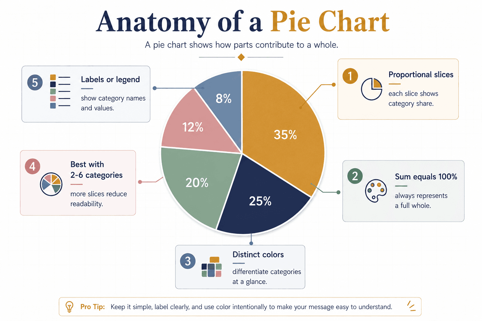
Proportional representation. Each slice corresponds to the proportion of one category relative to the whole.
Circular shape. The circular format makes proportional differences visible instantly.
Simple and understandable. Each slice immediately shows its share, allowing quick reading without axis labels or grid lines.
Total of 100%. A pie chart always represents a complete whole, and the sum of the slices equals 100%.
Use of colors. Distinct colors help differentiate slices and make each category recognizable.
Quick comparison. Large slices immediately draw the eye, making it easy to identify the dominant category.
Best for categorical data. Pie charts excel at showing how a small set of categories contribute to a total.
Best for limited data sets. With more than 6 to 7 categories, pie charts get cluttered. Use a bar chart instead.
Common Types of Pie Charts
Basic Pie Chart — the standard circular chart with proportional slices.
Exploded Pie Chart — one or more slices are pulled away from the center to emphasize them.
Doughnut Chart — a pie chart with a hole in the center, often used to show one metric in the center label.
3D Pie Chart — a stylized version with depth, though harder to read accurately.
Multi-level Pie Chart — concentric rings that show hierarchical categories.
Donut Hole Chart — a doughnut variant used to combine multiple related metrics.
Polar Area Chart — slices with equal angles but varying radius, useful for cyclical data.
Pie Chart vs. Bar Chart: When to Use Each

Use a pie chart when you have a small number of categories that add up to a whole and you want to show proportional share at a glance.
Use a bar chart when you have many categories, need precise comparisons, or want to show change over time.
For more, see our guide on the bar graph and try the bar graph maker.
Step-by-Step Guide to Creating a Pie Chart on Decktopus AI

Decktopus makes chart creation part of the presentation building flow. Here’s the full workflow:
1. Describe your topic. Type something like “Q3 revenue breakdown by product line” or upload your source data as a supporting file. If you already have an older deck with a pie chart in it, Decktopus’s Beautify feature can redesign it or use it as a source to build a new version.
2. Choose your style. Pick a brand, reuse a saved look, or start fresh with AI. Decktopus will ask how you want your presentation to look. You can apply a saved brand, import your brand directly from your company website URL (which pulls in your logo, colors, and fonts), or let AI generate a style from scratch.
3. Review the outline. Decktopus generates a slide-by-slide structure. Add a pie chart slide where it’s needed by choosing Add Slide and selecting the chart type.
4. Refine with Edit with AI. Click Edit with AI and type instructions like “add a pie chart showing Q3 revenue split by product line” or “change the pie chart to a donut chart with the total in the center.” Adjust categories, values, and colors from the chart edit panel. All edits are tracked with unlimited version history.
5. Export or share. Download as PDF, PPT, or PNG. Share via live link (any updates you make afterward automatically appear at the same link, so your audience always sees the latest data). Or present directly.
You can also use the Loop AI Delivery Coach during rehearsal to get real-time feedback on how you talk through your chart. And Decktopus’s AI Assistant can generate audience Q&A questions and answers to prepare you for tough follow-ups after showing your chart.
For broader guidance, see our roundup of the best AI presentation tools and our guide on how to do a presentation.
Ready to build a presentation with clean, on-brand charts? Get started with Decktopus.
Frequently Asked Questions
What is a pie chart used for?
A pie chart is used for visually representing the proportional distribution of data categories in a circular graph. It is commonly used to show the contribution of each category to the whole, making it easier to compare shares at a glance. Pie charts appear across business, marketing, education, healthcare, and research.
How do you calculate a pie chart?
To calculate values for a pie chart: find the total sum of your data values, calculate the percentage for each value (Value ÷ Total × 100), draw each slice sized to match its percentage, and label each slice with its category. You can also use a pie chart calculator, or let Decktopus handle the math automatically when you enter raw values.
Is a pie chart always 100%?
Yes. A pie chart represents 100% of the whole. Each slice corresponds to a percentage of the total, and the sum of all slices equals 100%. This is why pie charts only work with parts-of-a-whole data. If your categories don’t add up to a full total, use a bar chart instead.
When should I not use a pie chart?
Avoid pie charts when you have more than 6 or 7 categories, when your data includes negative values, when you need precise comparisons between similar-sized slices, or when you’re showing change over time. In those cases, a bar chart, stacked chart, or line chart works better.
What is the difference between a pie chart and a donut chart?
A pie chart is a solid circle divided into slices. A donut chart is the same, but with a hole in the middle. The hole is often used to display a total or a headline number, making donut charts useful when you want to show both parts and the whole in one visual.
Can I make a pie chart in Decktopus?
Yes. Decktopus includes pie chart, donut chart, bar chart, and other chart types built into the slide library. You can add a chart slide, enter your data, and customize colors from the design panel in a few clicks.
How many slices should a pie chart have?
Between 2 and 6 slices work best. Beyond that, slices become too thin to read clearly. If you have more than 6 categories, group the smallest into an “Other” slice, or switch to a bar chart.
What is the best tool to make a pie chart quickly?
Decktopus generates full presentations with charts, on-brand styling, and interactive elements in minutes. For more, see our guide on the best AI presentation tools.

Decktopus Content Team


