
.svg)
.svg)
.svg)


.svg)


.avif)
.avif)
.avif)


Decktopus Content Team
When you're presenting to clients, investors, or colleagues, it's important that your slides look as good as they can.
This doesn't mean spending hours on them. There are some easy tricks you can use to make your presentation look great without a lot of effort. In this blog post, we'll give you some tips on how to create beautiful, appealing presentations. Keep reading to learn more.
6 Design Tips to Make Your Audience Wow
Design is a critical part of any business, but it's especially important for startups and small businesses. You only have one shot to make a good first impression. These six design tips will help you create an engaging and visually appealing presentation that will wow your audience.
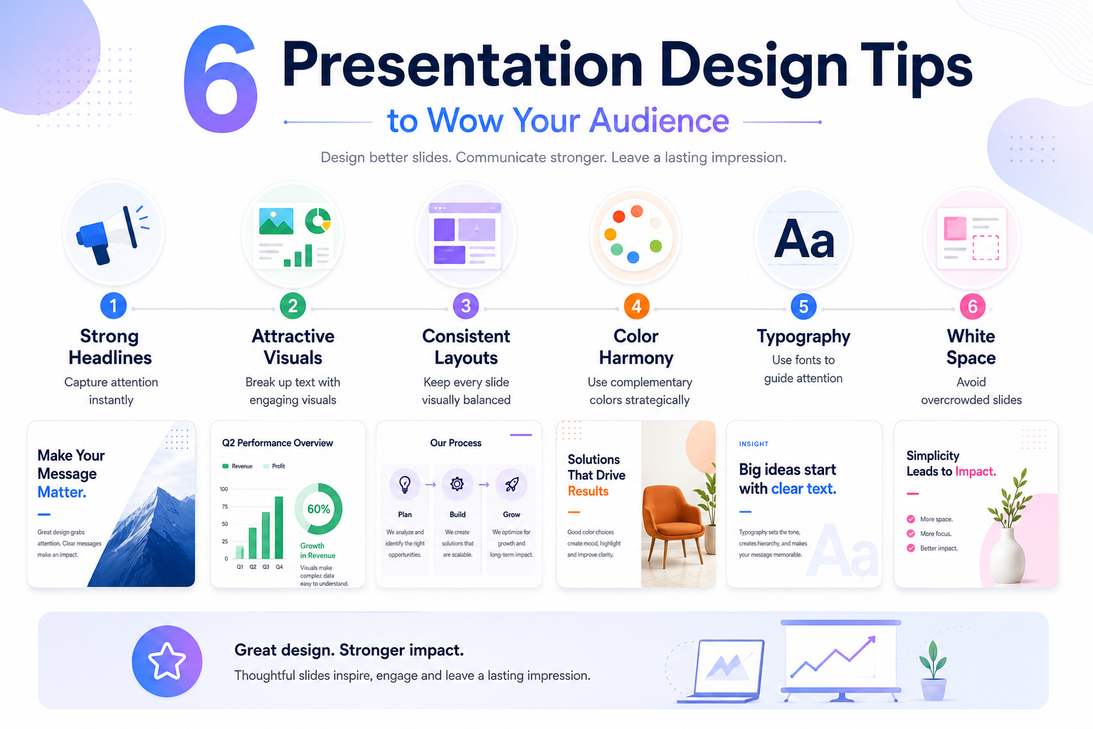
1. Start With a Strong Story and Headline to Capture Your Audience's Attention
Whenever you're starting a business, there are a million things you need to do and it can be tough to know where to begin. One of the most important early steps is creating a brand for your company. This doesn't just mean coming up with a clever name or designing a snazzy logo. Your brand is what people think of when they hear your company's name. It's the overall perception people have of your company.
Good presentation design starts with a strong headline. Your headline should be something that will grab your audience's attention and make them want to learn more. It should be short, clear, and to the point. Avoid using jargon or excessively long phrases. Instead, focus on creating a headline that is both informative and interesting. Once you have a strong headline, the rest of your presentation will flow more smoothly.
With a weak headline, you run the risk of losing your audience's attention before you even begin. If you want to make sure your presentation is effective, start by crafting a killer headline.
It's also important to make sure that your headline is relevant to the rest of your presentation. If you're giving a presentation on presentation design, starting with a headline about the importance of body language in presentations is likely to confuse your audience. Next time you're putting together a presentation, start with a strong headline that will grab your audience's attention and hold it until the very end.
For more on opening strong, see our breakdown of how to start a presentation with hooks that grab attention.
2. Use Attractive and Interesting Visuals to Break Up the Text and Keep the Focus
Is your presentation looking a little too text-heavy? If you're finding that your audience is tuning out, it might be time to add some visuals. Attractive and interesting visuals can break up the text, helping to keep your readers engaged.
Presentations are a common way to communicate information to a group. Simply standing up and reading from a sheet of paper is often not the most effective way to engage your audience. There are a number of ways to make your presentation more visually appealing.
Using attractive visuals is one way to break up the text and keep your audience's attention. You can use editable poster templates to make visually appealing posters or create infographics to make your presentations more digestible. Another way to add interest is to use animation or transitions between slides. By taking the time to design an interesting presentation, you can ensure that your audience will stay engaged and retain the information you're communicating.
This can be anything from using photos and infographics to highlight key points, to incorporating videos or animation to add excitement. The important thing is to design your presentation in a way that will visually engage your audience and help them understand and remember your main points.
Bonus: Use professional stock photos from sites like Unsplash or Pexels. Or generate custom images directly inside your presentation tool. For more on AI-generated visuals, see our guide on AI image generators from text.
How to Use Visuals to Your Advantage
When creating a presentation, it is important to use visuals to your advantage. Visuals can help make your message memorable, eliminate extra text, and represent simple concepts with icons. Visuals should be used in a way that is complementary and consistent throughout the presentation.
Tips for using visuals effectively:
- Use visuals to help make your message memorable
- Use visuals to eliminate extra text
- Use visuals to represent simple concepts with icons
- Use visuals in a way that is complementary and consistent throughout the presentation
For more on visualizing data specifically, see our breakdowns of bar charts and pie charts.
3. Stick to a Simple, Consistent Layout Throughout Your Presentation
It's easy to get carried away with design when you're creating a presentation, but keeping your layout simple and consistent will make it more effective. Too much formatting can be distracting, and it's tough to keep track of different fonts and colors when you're trying to focus on the content. Stick with a basic font and color scheme, and use bold headings and bullet points to add emphasis where needed.
You'll be thankful for the simplicity when you're giving your presentation in front of a roomful of people.
Designing an effective presentation can be a tricky balancing act. On the one hand, you want to include enough visual interest to keep your audience engaged. On the other hand, you don't want to overload your slides with too much information or too many elements.
A good rule of thumb is to stick to a simple, consistent layout throughout your presentation. This will help your audience focus on the most important information and follow your train of thought more easily. There will always be exceptions to this rule, but in general, simplicity is key when it comes to presentation design.
For more on what separates a polished deck from a confusing one, see our breakdown of what makes for a good presentation.
4. Choose Colors and Tones That Complement Each Other
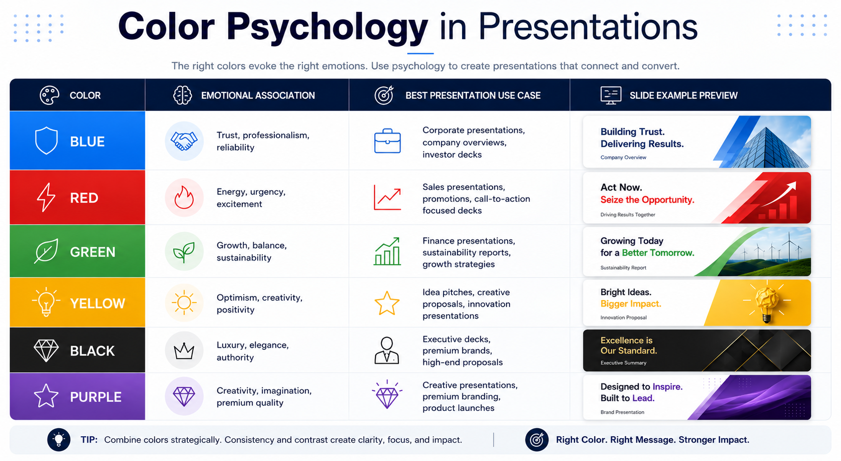
One of the first things you'll need to do when starting a presentation is select colors that complement each other. This can be a daunting task, but it's important to choose colors that create a visually appealing palette.
When it comes to creating a visually appealing presentation, choosing the right colors is a crucial first step. While there are no hard and fast rules about which colors work well together, there are some general principles that can help guide your choices. A well-chosen graphic design tool or a logo maker can aid you in this process.
For example, using colors with a similar hue but different levels of saturation can create a harmonious effect, while complementary colors can provide a more dynamic contrast. You should also be mindful of the message you want to convey. Warmer colors tend to be more energetic, while cooler tones convey a sense of calm. By taking the time to select a well-coordinated color palette, you'll create a presentation that is both visually appealing and informative.
For a deeper breakdown, see our guide on color psychology in presentations.
5. Use Typography to Add Interest and Emphasis
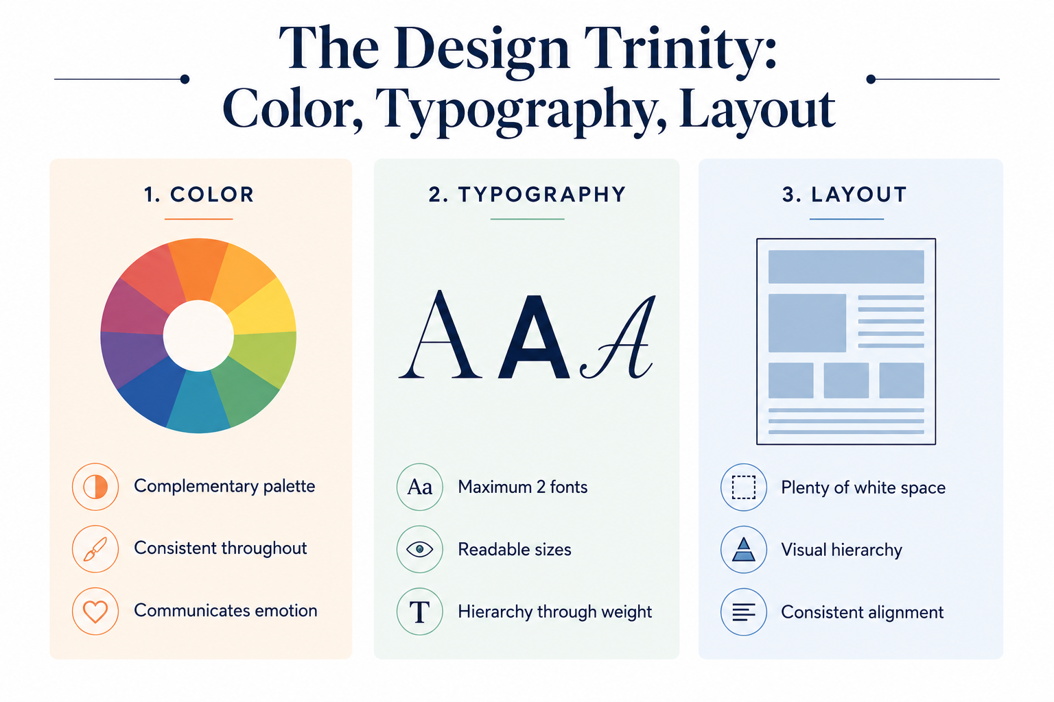
If you're like most people, you probably think of typography as the fonts used in your word processor. But typography is so much more than that. Good typography can add interest and emphasis to your words, making them more readable and engaging.
When you're giving a presentation, you want your audience to remember what you said. One way to make sure your words stick in their minds is to use typography effectively. Typography is the art and technique of arranging type to make your words more readable, interesting, and visually appealing. By using different font styles, sizes, and colors, you can add emphasis and interest to your presentation.
That can go a long way toward ensuring your audience remembers your message long after your presentation is over. Take time to think about how you can use typography to add impact and emphasis to your words. It'll be worth the effort.
Bonus: Highlight important points by enlarging the font size, using a different color, or bolding the text. This will help ensure that your audience doesn't miss any of the key points you're communicating.
How to Use Color, Fonts, and Design Elements in Your Presentation
Color. Color can play an important role in making your presentation more visually appealing and memorable. Use colors that complement each other and are consistent throughout the presentation. You can use different colors to represent important stats or trends.
Fonts. Choose fonts that are easy to read and complement each other. Stick to one or two fonts throughout the presentation for consistency.
Images. Use images sparingly, but make sure they are high quality and relevant to the topic of your presentation.
6. Don't Overcrowd Your Slides
In the world of business, a lot can be said with just a few words. This rings especially true when it comes to slide presentations. Despite what you may have heard, slides are not meant to be filled with text. In fact, if they are, it's likely that your audience will lose focus and tune out. What's the key to creating an effective presentation? Keep it simple.
First, if your slides are too crowded, it's hard for the audience to know where to look. They may start reading instead of listening to you, and then they'll miss important points.
Second, if you don't leave enough white space, it can be visually overwhelming for people. It's important to have some negative space on your slides so people's eyes can rest and they can focus on what you're saying.
Negative space is the area on your slide that doesn't contain any text or images. By using more negative space, you can make your overall presentation look cleaner and more professional.
Finally, if you overcrowd your slides, it makes it seem like you're trying to cram too much information into a short presentation. This leaves the audience feeling overwhelmed and confused. When you're designing your presentation, keep these three things in mind: leave enough white space, don't overcrowd your slides, and make sure the audience knows where to look.
For more common pitfalls to avoid, see our breakdown of the 7 mistakes we all made during a presentation.

Tools for Creating a Beautiful Presentation
There are many tools that help you create a beautiful presentation. The right one helps you create a variety of professional presentations without manual design work. For a comprehensive comparison, see our guide on the best AI presentation tools.
Extra Tips to Make Your Presentation Neat
Make It Easy to Follow With a Core Message
When creating a presentation, it is important to first create an outline that covers the key points you will be discussing. This will help you stay on track and ensure that your presentation flows smoothly.
To make your presentation easy to follow, use contrast between the text and background. If you're using a white background, use dark text. If you're using a dark background, use light text.
How to Make Your Presentation Memorable
A presentation is only as good as its design. If your presentation is cluttered, confusing, and unappealing, your audience will not be engaged. Tips to create a beautiful and appealing presentation:
- Split a group presentation by topic to keep your audience engaged. Each presenter can focus on their area of expertise and the audience will not get lost in the material.
- Use a variety of page layouts to maintain your audience's interest. You can use different layouts for different types of information (text-heavy slides vs. image-heavy slides).
- Use AI presentation tools to generate a complete, on-brand starting point. This saves hours of manual design work.
Tips for Delivering a Great Presentation
When delivering a presentation, it's important to capture and maintain your audience's attention. You can do this by using powerful images that draw their attention. You can also use media (video, animation, sound) to deepen your arguments and make your presentation more engaging.
To be a great presenter, you need to be skilled in presentation design. This includes knowing how to structure your slides, use visuals effectively, and deliver your content in an engaging way. For closing strong, see our breakdown of how to end a presentation with impact. For delivery and stage presence, see our guide on public speaking tips to deliver the perfect presentation.
How to Build Beautiful Slides with Decktopus

You can apply every design principle in this guide manually. Or you can let AI handle the design while you focus on the message.
Decktopus generates beautiful, on-brand presentations from a short description. Here's how the workflow looks:
1. Describe your topic. Type what your presentation is about, or upload supporting files like research notes or your existing draft. Decktopus reads it and gets to work generating the full deck structure.
2. Choose your style. Pick a brand, reuse a saved look, or start fresh with AI. Decktopus will ask how you want your presentation to look. You can apply a saved Brand Kit, import your brand directly from your company website URL (which pulls in your logo, colors, and fonts), or let AI generate a style from scratch.
3. Review the outline. Decktopus generates a slide structure based on your input. Adjust the order or focus before the full deck is built.
4. Refine in the editor. Use the prompt bar to fine-tune any slide. Try instructions like "make this section more visual," "regenerate this image in a more editorial style," or "switch this to a comparison chart." Brand Compliance keeps every slide consistent across your deck.
5. Export or share. Download as PDF or PPT, share via link, or present directly from the editor.
Your design choices (color, typography, layout, hierarchy) all get applied automatically. That means every slide reflects the best practices in this guide without any manual formatting work.
Ready to build beautiful slides without the hours of design work? Get started with Decktopus.


.svg)
.svg)
.svg)
.svg)
.svg)
.svg)
.svg)
