Presentations
Slide Design Ideas & Inspiration: Before & After Examples for 2026
Get 50+ slide design ideas, before/after examples across every category, verified design principles top presenters use, and how to redesign your slides in minutes with AI.

İlayda Tunaboylu
What Makes a Slide Design "Good"?
A well-designed slide communicates one clear idea instantly, with visual hierarchy that guides the eye, typography that reads well from the back of the room, color that supports (not competes with) the message, and enough white space to breathe. Good slide design isn't about being pretty. It's about making the message land in the first 3 seconds a viewer sees the slide. The main benefit of investing in slide design is that professionally designed slides get audiences to remember, share, and act on your content at dramatically higher rates than text-heavy default templates.
According to research on visual perception, audiences form aesthetic judgments about a slide within 500 milliseconds. Studies from presentation design research show that professionally designed slides can increase message retention by up to 65% compared to text-heavy default templates. In business, where the average professional attends dozens of meetings per month and views hundreds of slides, the gap between good and bad slide design shows up directly in whether ideas land, get shared, and drive decisions.
For related content, see our guides on presentation design, what makes for a good presentation, and an effective presentation and why it matters.
Why Slide Design Matters More Than Ever
Attention is scarce. With more meetings, more decks, and shorter attention spans, poorly designed slides lose the room in the first 30 seconds.
Design signals professionalism. A dated, cluttered slide undermines even strong content. Viewers project the design quality onto the message quality.
Retention rises with good design. Research consistently shows that well-designed visual slides outperform text-heavy ones on retention by 40 to 65%.
Sharing depends on design. Screenshots of well-designed slides get shared on LinkedIn and Twitter. Screenshots of text-heavy corporate slides do not.
AI raised the floor. With AI tools like Decktopus AI Beautify that redesign full decks in minutes, "we didn't have time to design it" no longer holds. Audiences now expect polished decks even from small teams.
The 10-Principle Slide Design Framework
Every strong slide follows these 10 principles. Learn them once and every deck you build gets better.
# | Principle | What It Means |
|---|---|---|
1 | One idea per slide | If a slide has two ideas, split it into two slides |
2 | Visual hierarchy | The most important thing on the slide is the biggest and most prominent |
3 | Generous white space | Empty space isn't wasted, it's what makes the content breathe |
4 | Consistent typography | Same font family, sizes, and weights across every slide |
5 | Limited color palette | Two to three colors max, applied consistently |
6 | High contrast text | Dark text on light background (or reverse) for readability |
7 | Minimum 24-point font | If you're presenting live, 30+ point body text is safer |
8 | Visuals over words | An image or chart usually beats a paragraph |
9 | Aligned elements | Everything on the slide should sit on a clear grid |
10 | Consistent slide-to-slide flow | Every slide feels like it belongs to the same deck |
For a deeper breakdown, see our related guide on slide design principles.
Slide Design Ideas by Category
Different slide types call for different design approaches. Here are ideas for the 10 most common slide categories.
1. Cover Slides
Purpose: first impression. Establish tone and topic.
Design ideas:
Full-bleed image with a bold title overlay
Minimalist white background with large centered typography
Split design: image on one half, title on the other
Gradient background with contrasting title
Company logo in corner, title centered, subtitle below
2. Agenda / Table of Contents Slides
Purpose: preview the flow.
Design ideas:
Numbered list with clean typography
Visual timeline showing sections
Icon grid with one icon per section
Two-column layout (sections left, brief description right)
3. Section Divider Slides
Purpose: signal transitions between major sections.
Design ideas:
Bold single word or short phrase
Number + section title (like "02 — Market Analysis")
Full-color slide with just the section title
Image + section title overlay
4. Data Slides
Purpose: show numbers that matter.
Design ideas:
One massive number with a short label ("47%")
Simple bar chart with the key bar highlighted in your brand color
Line chart showing a clear trend, with the endpoint annotated
Pie chart with 3 to 5 segments (never more)
Comparison card showing "Before: X" and "After: Y"
For chart-specific guidance, see our guides on the pie chart and bar graph.
5. Comparison Slides
Purpose: show options side by side.
Design ideas:
Two-column layout with clear labels
Comparison table with rows and columns
"Us vs. Them" grid with checkmarks and X marks
Three-tier layout for essential/recommended/premium
6. Team Slides
Purpose: introduce the people.
Design ideas:
Grid of headshots with names and titles
One person per slide (for leadership decks)
Circular photos with hover-style descriptions
Split layout with photo left, credentials right
7. Timeline Slides
Purpose: show sequence over time.
Design ideas:
Horizontal timeline with milestone markers
Vertical timeline for step-by-step processes
Gantt-style layout for project phases
Curved or arc timeline for storytelling arcs
8. Quote Slides
Purpose: add authority or emotional weight.
Design ideas:
Large quote text with small attribution below
Full-bleed background with quote overlay
Quote card with speaker photo
Pull quote formatted like a magazine
9. Pricing Slides
Purpose: present tiers clearly.
Design ideas:
Three-column tier layout with recommended tier highlighted
Simple table with columns for each tier
Feature-by-feature comparison
Anchor pricing with a strong recommended tier
10. Closing / Q&A Slides
Purpose: land the message and open dialogue.
Design ideas:
Bold call to action with a specific next step
Contact information card
"Questions?" with a memorable image
Quote or key takeaway summary
For more on closing effectively, see how to end a presentation with impact.
Slide Design Templates vs. AI-Powered Redesign
Many people search for "slide design templates" hoping to grab a ready-made design. Templates have their place, but AI-powered redesign now offers a faster, more flexible alternative.
Factor | Templates | AI-Powered Redesign |
|---|---|---|
Speed to finished deck | Fast once found | Minutes from upload |
Uniqueness | Everyone uses the same templates | Every redesign is generated fresh |
Fit to your content | Force your content into template structure | Adapts to your content |
Editing after | Manual per slide | Prompt-based or manual |
Consistency across slides | Depends on template quality | Automatic |
Works on existing decks | No (start from template) | Yes (upload and redesign) |
Best for | New decks starting from scratch | Existing decks that need a refresh |
Templates are a starting point. AI redesign is the upgrade. If your deck already exists and just needs to look better, AI beautification is faster and more content-preserving than restarting with a template.
8 Before & After Slide Design Examples
Real examples of how thoughtful design transforms the same content.
Example 1: Text-Heavy Corporate Slide
Before: Full-width paragraph with 8 bullet points. Default template. No visual hierarchy.
After: Same content restructured with a bold headline, two supporting points, and one visual element. White space introduced. Typography hierarchy applied.
Example 2: Data Overload
Before: Table with 20 rows and 8 columns crammed onto one slide.
After: The three most important data points pulled out as large numbers. Full table moved to appendix.
Example 3: Bland Cover Slide
Before: White background, small centered title, default font.
After: Bold typography, brand color palette, visual accent element, professional feel.
Example 4: Chart Without Story
Before: Default Excel chart pasted into slide. No annotation. No highlighted point.
After: Same data, cleaner chart, key data point highlighted in brand color, one-sentence takeaway added.
Example 5: Team Slide as Résumé Dump
Before: Every team member's full bio pasted onto one slide. Wall of text.
After: Grid of headshots with name, title, and one-line credibility marker. Bios moved to appendix.
Example 6: Confusing Pricing Table
Before: Small text, unclear tier hierarchy, no recommended option identified.
After: Three-column layout, recommended tier visually anchored, clear feature comparison, price prominent.
Example 7: Vague Timeline
Before: Bullet list of dates with no visual sequence.
After: Horizontal timeline with milestone markers, key phase highlighted, dependencies clear.
Example 8: Weak Closing Slide
Before: "Thank you" centered on white background.
After: Bold call to action with dated next step, contact information card, memorable image.
For related examples, see our guides on pitch deck examples, portfolio examples, and best presentation.
Where to Find Slide Design Inspiration
Behance and Dribbble — designers share presentation work. Great for aesthetic inspiration but often too abstract for real business decks.
Public pitch decks — Airbnb, Uber, Facebook, and many other companies have shared their original pitch decks online. See our pitch deck examples guide.
Awwwards and Site Inspire — for landing page and hero design ideas that translate to cover slides.
Company annual reports — top public companies invest heavily in report design. Great for data visualization inspiration.
Presentation Zen and Nancy Duarte's books — foundational works on presentation design.
TED Talks — watch how top presenters use visuals to support (not overwhelm) their spoken words.
Instagram and LinkedIn — design accounts share slide inspiration daily. Save what resonates.
Decktopus AI's own outputs — the fastest way to see what a professionally designed version of your own deck could look like is to run it through Decktopus AI Beautify.
Common Slide Design Mistakes to Avoid
Too much text. If a slide has more than 20 words, split it or cut it.
Too many fonts. Two fonts max: one for headings, one for body. Ideally one font family with different weights.
Too many colors. Two to three colors max. A neutral background, a primary brand color, one accent.
Poor contrast. Grey text on white background looks modern but readers can't read it in the back of the room. Prioritize readability.
Random capitalization. Pick one style (title case, sentence case) and stick with it across every slide.
Inconsistent alignment. If titles are centered on some slides and left-aligned on others, the deck feels sloppy.
Chart junk. Default Excel charts have too many gridlines, unnecessary borders, and cluttered legends. Strip them down.
Stock photos that don't add meaning. A generic image of "business people shaking hands" adds nothing. Cut it.
Slide numbers hidden. Include slide numbers so audiences can reference specific slides during Q&A.
Ignoring the master template. Setting up a proper master template once saves hours of formatting later. Or use AI beautification to enforce consistency automatically.
Slides that need explanation to understand. If a viewer can't grasp the slide's point in 3 seconds, the design has failed.
For more presentation mistakes to avoid, see our guide on 7 mistakes we all made during a presentation.
How to Get Better Slide Design Fast with Decktopus AI Beautify
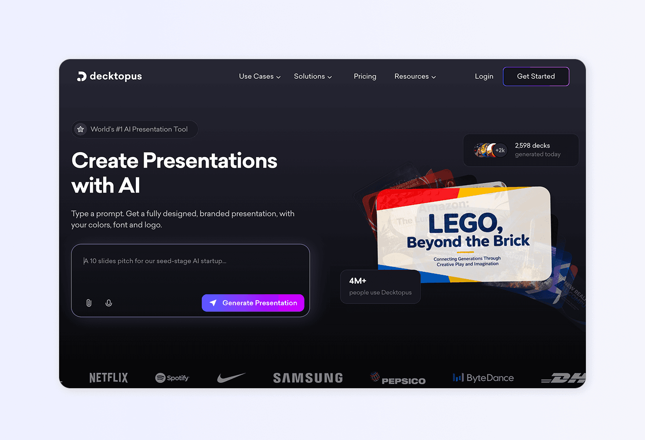
The fastest way to apply every principle in this guide to an existing deck is to upload it to Decktopus AI Beautify. Beautify redesigns your full deck in one pass while keeping every word of your content intact. No prompts to write. No design decisions you don't want to make.
Why Decktopus AI Beautify Fits Slide Design Inspiration Workflows
Full-deck redesign in one pass. Layouts, colors, typography, and visual hierarchy update across every slide at once.
Your content stays word-for-word. Text, data, and structure stay intact. Only the design changes.
Professional styles ready to go. Choose from clean, professional styles designed by real designers. Or reuse a style you've used before. Or let AI pick one.
Optional prompt for design direction. Want something specific? Add "more corporate," "brighter," "minimal." Beautify factors it in.
Fully editable after redesign. Nothing is locked. Refine specific slides after with Edit with AI or Edit Text.
Works on any deck type. Sales, pitch, company update, lecture, board deck. Beautify handles all of them.
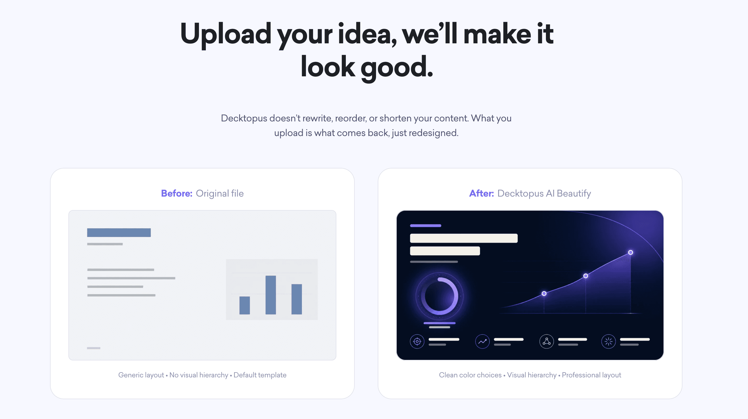
Two Beautify options:
Redesign keeps your text and structure intact. New design only. Prompt optional.
Use as a Resource extracts key points from your uploaded deck and builds a fresh presentation. Prompt required. Best when you want a new deck inspired by an older one.
Who This Section Is For
Marketers wanting slide inspiration for campaign decks
Founders upgrading pitch deck design
Sales teams refreshing collateral for new markets
Consultants producing on-brand deliverables for multiple clients
Educators modernizing course materials and lecture slides
Designers wanting to save time on the redesign layer
For deeper use case guidance, see Decktopus AI for Marketers, Decktopus AI for Sales, Decktopus AI for Founders, and Decktopus AI for Agencies.
Step-by-Step: Redesign Your Deck With Decktopus AI Beautify
1. Upload your deck. Drop in your existing PowerPoint (.pptx) or PDF file. No cleanup needed first.
2. Choose Redesign. Keep your content, change the design.
3. Choose your style. Pick a professional style, reuse a past style, or let AI pick. Add an optional prompt for direction.
4. Review the beautified deck. Every slide keeps its original text, structure, and slide count. Only the design has changed.
5. Refine if needed. Use Edit with AI or Edit Text to adjust specific slides.
6. Export or share. Download as PDF, PPT, or PNG. Share via live link with auto-update. Or present directly.
For broader guidance, see the best AI presentation tools, our how to beautify your presentation slides with AI guide, and how to make a professional-looking presentation with AI.
Ready to redesign your deck? Try Decktopus AI Beautify. Upload it, pick a style, done.
Frequently Asked Questions
What are the best slide design ideas for 2026?
The best-performing slide designs in 2026 lean minimalist: one idea per slide, generous white space, strong typography hierarchy, limited color palette, and visuals over words. Bold data slides (one huge number with a small label) and clean before/after cards are especially popular.
Where can I find slide design inspiration?
Behance and Dribbble for aesthetic ideas. Public pitch decks (Airbnb, Uber, Facebook) for business context. Nancy Duarte and Presentation Zen books for foundational principles. Company annual reports for data visualization. Decktopus AI Beautify to see what a professionally designed version of your own deck could look like.
What is the difference between slide design templates and AI redesign?
Templates give you a starting layout you fill in with your content. AI redesign takes an existing deck and applies a new design across every slide in one pass. Templates work for new decks. AI redesign works for existing decks that need to look better.
What makes a slide design look professional?
Consistent typography (two fonts max), limited color palette (2 to 3 colors), generous white space, strong visual hierarchy, one main idea per slide, high contrast text, aligned elements, and cohesive style across every slide in the deck.
How many colors should a slide have?
Two to three at most. Usually a neutral background (white, black, or dark grey), a primary brand color, and one accent color for emphasis. More colors than that creates visual noise.
What font size should I use on slides?
Minimum 24-point for body text. 30-point or larger if you're presenting to a large room. Titles should be 40+ point. See our guide on the 10/20/30 rule for the classic reference.
Should I use images on every slide?
No. Use images when they add meaning. A generic stock photo of "business handshake" adds nothing. A specific chart, screenshot, or product image can carry a whole slide.
How do I create before and after slide comparisons?
Split the slide into two columns. Label them "Before" and "After" clearly. Use the same layout on both sides so the differences stand out. Highlight the change with color or annotation.
What are common slide design mistakes to avoid?
Too much text, too many fonts, too many colors, poor contrast, inconsistent alignment, chart junk, meaningless stock photos, unclear visual hierarchy, and slides that need explanation to understand.
Can I redesign my existing PowerPoint slides with AI?
Yes. Tools like Decktopus AI Beautify let you upload an existing PowerPoint (.pptx) or PDF file and redesign the entire deck in one pass. Your text stays word-for-word. Only the design changes.
How long does it take to redesign a deck with AI?
Most AI beautification tools redesign a full 30 to 50-slide deck in 2 to 5 minutes. Larger decks (up to 100 slides) may take 5 to 10 minutes.
Do I need design skills to use AI beautification?
No. AI beautification handles layout, color, typography, and visual hierarchy automatically. You upload the deck and pick a style. The tool does the design work.
What are the top slide design trends in 2026?
Minimalist typography, bold single-number data slides, monochromatic color palettes, generous white space, hand-drawn or geometric illustration accents, dark mode presentations, and AI-generated custom imagery replacing stock photos.
How do I make my slides look like the Airbnb pitch deck?
The Airbnb pitch deck is known for simple layouts, one idea per slide, minimal text, and clean typography. See our full breakdown on the presentation template series: Airbnb pitch deck for slide-by-slide analysis.
What tool should I use to redesign my slides fast?
Decktopus AI Beautify is the fastest option for full-deck redesign with content preservation. Upload your deck, choose a style, download the redesigned version. For more, see our roundup of the best AI presentation tools.
Conclusion
Great slide design isn't about being pretty. It's about making your message land in the first 3 seconds a viewer sees the slide. The 10 design principles in this guide (one idea per slide, visual hierarchy, white space, consistent typography, limited color, high contrast, minimum font size, visuals over words, aligned elements, consistent flow) form the foundation of every professional deck.
The 10 slide categories (covers, agendas, section dividers, data, comparisons, teams, timelines, quotes, pricing, closings) each have their own design conventions worth studying. The 8 before-and-after examples in this guide show how thoughtful redesign transforms the same content into something audiences remember.
For teams that don't have hours to spend on redesign, AI-powered tools have changed the game. Decktopus AI Beautify redesigns your full deck in minutes while keeping every word of your content intact. Upload, pick a style, download. Every principle in this guide gets applied automatically.
For more resources, see our guides on presentation design, slide design principles, how to beautify your presentation slides with AI, and the best AI presentation tools.
Related posts

Webinar Follow-Up Emails: The Sequence That Runs After the Deck Ends
Learn how to build a webinar follow-up email sequence with behavioral segmentation, timely emails, better deliverability, and personalized outreach.
Presentations

Best TED Talks to Improve Your Presentation Skills
Watch ten of the best TED talks for presentation skills and use a practical exercise from each to improve structure, voice, visuals, and confidence.
Presentations

Decktopus AI Best Practices: The Complete Guide, Tips and Tricks (2026)
A complete guide to using Decktopus AI effectively, from writing better prompts and reviewing outlines to rehearsing with Loop and building carousels.
Presentations