Templates & How-to
How to Create A Pie Chart in Excel: A Step-By-Step Guide on to Make Excel Pie Chart
Are you trying to create pie chart on Excel and cannot figure out how? We are here to help. Make an Excel pie chart on your documents or reports! Discover other pie charts available on Decktopus!

Excel is one of the most commonly used tools for data analysis. Microsoft Excel has a variety of functions. One of them is data visualization. Excel can create many types of graphs and different visualizations that make it easier to read and make interpretations of data. One of them being a pie chart maker.

Although Excel is a favorite tool for many researchers and data analysts, as well as for those looking for an invoice generator, it can be challenging to learn and master. If you don’t have any experience with data analysis in Excel, we’ve got you covered!
In this guide, we will create a pie chart in Excel together! Also, if you want a more aesthetically pleasing pie chart, Decktopus is here! Create pie charts with ease and customize them to your heart’s content with Decktopus.

What is a pie chart?
A pie graph is a visual graphic with a circular structure. The circle itself, with its slices, is representative of the total. Every slice depicts a reasonable fraction of the entire. Every slice added together equals 100%.

Pie charts consist of:
Slices: The pie is cut into individual slices. A distinct category or section of the data set is represented by each slice. Each slice radiates from the pie’s center.
Labels: A corresponding category or percentage is written on each slice.
Legend: A legend explains how to interpret the data. It contains details about the meanings associated with various colors.
Title: Pie charts typically have a title. The data on the pie chart is described in the title and gives meaning about the context of the data.
Types of Pie Charts Available in Excel
There are 5 types of pie charts available in Excel. Based on your needs, you can choose any of them. These visualizations significantly influence how we read the data and make interpretations.
[[EMBED:PGRpdiBzdHlsZT0ib3ZlcmZsb3cteDphdXRvO21hcmdpbjoyMHB4IDAiPjx0YWJsZSBzdHlsZT0id2lkdGg6MTAwJTtib3JkZXItY29sbGFwc2U6Y29sbGFwc2U7Zm9udC1zaXplOjE1cHg7bWFyZ2luOjhweCAwIj48dGggc3R5bGU9ImJvcmRlcjoxcHggc29saWQgI2UzZTZlYTtwYWRkaW5nOjEwcHggMTRweDt0ZXh0LWFsaWduOmxlZnQ7YmFja2dyb3VuZDojZjRmNmY4O2ZvbnQtd2VpZ2h0OjYwMCI+PHRyPjx0aCBzdHlsZT0iYm9yZGVyOjFweCBzb2xpZCAjZTNlNmVhO3BhZGRpbmc6MTBweCAxNHB4O3RleHQtYWxpZ246bGVmdDtiYWNrZ3JvdW5kOiNmNGY2Zjg7Zm9udC13ZWlnaHQ6NjAwIj4jPC90aD48dGggc3R5bGU9ImJvcmRlcjoxcHggc29saWQgI2UzZTZlYTtwYWRkaW5nOjEwcHggMTRweDt0ZXh0LWFsaWduOmxlZnQ7YmFja2dyb3VuZDojZjRmNmY4O2ZvbnQtd2VpZ2h0OjYwMCI+UGllIENoYXJ0IFR5cGU8L3RoPjx0aCBzdHlsZT0iYm9yZGVyOjFweCBzb2xpZCAjZTNlNmVhO3BhZGRpbmc6MTBweCAxNHB4O3RleHQtYWxpZ246bGVmdDtiYWNrZ3JvdW5kOiNmNGY2Zjg7Zm9udC13ZWlnaHQ6NjAwIj5EZXNjcmlwdGlvbjwvdGg+PC90cj48L3RoZWFkPjx0Ym9keT48dHI+PHRkIHN0eWxlPSJib3JkZXI6MXB4IHNvbGlkICNlM2U2ZWE7cGFkZGluZzoxMHB4IDE0cHg7dGV4dC1hbGlnbjpsZWZ0O3ZlcnRpY2FsLWFsaWduOnRvcCI+MTwvdGQ+PHRkIHN0eWxlPSJib3JkZXI6MXB4IHNvbGlkICNlM2U2ZWE7cGFkZGluZzoxMHB4IDE0cHg7dGV4dC1hbGlnbjpsZWZ0O3ZlcnRpY2FsLWFsaWduOnRvcCI+Mi1EIFBpZSBDaGFydDwvdGQ+PHRkIHN0eWxlPSJib3JkZXI6MXB4IHNvbGlkICNlM2U2ZWE7cGFkZGluZzoxMHB4IDE0cHg7dGV4dC1hbGlnbjpsZWZ0O3ZlcnRpY2FsLWFsaWduOnRvcCI+U3RhbmRhcmQgdHdvLWRpbWVuc2lvbmFsIHBpZSBjaGFydDwvdGQ+PC90cj48dHI+PHRkIHN0eWxlPSJib3JkZXI6MXB4IHNvbGlkICNlM2U2ZWE7cGFkZGluZzoxMHB4IDE0cHg7dGV4dC1hbGlnbjpsZWZ0O3ZlcnRpY2FsLWFsaWduOnRvcCI+MjwvdGQ+PHRkIHN0eWxlPSJib3JkZXI6MXB4IHNvbGlkICNlM2U2ZWE7cGFkZGluZzoxMHB4IDE0cHg7dGV4dC1hbGlnbjpsZWZ0O3ZlcnRpY2FsLWFsaWduOnRvcCI+My1EIFBpZSBDaGFydDwvdGQ+PHRkIHN0eWxlPSJib3JkZXI6MXB4IHNvbGlkICNlM2U2ZWE7cGFkZGluZzoxMHB4IDE0cHg7dGV4dC1hbGlnbjpsZWZ0O3ZlcnRpY2FsLWFsaWduOnRvcCI+VGhyZWUtZGltZW5zaW9uYWwgcGllIGNoYXJ0PC90ZD48L3RyPjx0cj48dGQgc3R5bGU9ImJvcmRlcjoxcHggc29saWQgI2UzZTZlYTtwYWRkaW5nOjEwcHggMTRweDt0ZXh0LWFsaWduOmxlZnQ7dmVydGljYWwtYWxpZ246dG9wIj4zPC90ZD48dGQgc3R5bGU9ImJvcmRlcjoxcHggc29saWQgI2UzZTZlYTtwYWRkaW5nOjEwcHggMTRweDt0ZXh0LWFsaWduOmxlZnQ7dmVydGljYWwtYWxpZ246dG9wIj5QaWUgb2YgUGllIENoYXJ0PC90ZD48dGQgc3R5bGU9ImJvcmRlcjoxcHggc29saWQgI2UzZTZlYTtwYWRkaW5nOjEwcHggMTRweDt0ZXh0LWFsaWduOmxlZnQ7dmVydGljYWwtYWxpZ246dG9wIj5Db21iaW5lcyBzbWFsbCBzbGljZXMgaW50byBhIHNlY29uZGFyeSBwaWUgY2hhcnQ8L3RkPjwvdHI+PHRyPjx0ZCBzdHlsZT0iYm9yZGVyOjFweCBzb2xpZCAjZTNlNmVhO3BhZGRpbmc6MTBweCAxNHB4O3RleHQtYWxpZ246bGVmdDt2ZXJ0aWNhbC1hbGlnbjp0b3AiPjQ8L3RkPjx0ZCBzdHlsZT0iYm9yZGVyOjFweCBzb2xpZCAjZTNlNmVhO3BhZGRpbmc6MTBweCAxNHB4O3RleHQtYWxpZ246bGVmdDt2ZXJ0aWNhbC1hbGlnbjp0b3AiPkJhciBvZiBQaWUgQ2hhcnQ8L3RkPjx0ZCBzdHlsZT0iYm9yZGVyOjFweCBzb2xpZCAjZTNlNmVhO3BhZGRpbmc6MTBweCAxNHB4O3RleHQtYWxpZ246bGVmdDt2ZXJ0aWNhbC1hbGlnbjp0b3AiPkNvbWJpbmVzIHNtYWxsIHNsaWNlcyBpbnRvIGEgc2Vjb25kYXJ5IGJhciBjaGFydDwvdGQ+PC90cj48dHI+PHRkIHN0eWxlPSJib3JkZXI6MXB4IHNvbGlkICNlM2U2ZWE7cGFkZGluZzoxMHB4IDE0cHg7dGV4dC1hbGlnbjpsZWZ0O3ZlcnRpY2FsLWFsaWduOnRvcCI+NTwvdGQ+PHRkIHN0eWxlPSJib3JkZXI6MXB4IHNvbGlkICNlM2U2ZWE7cGFkZGluZzoxMHB4IDE0cHg7dGV4dC1hbGlnbjpsZWZ0O3ZlcnRpY2FsLWFsaWduOnRvcCI+RG91Z2hudXQgUGllIENoYXJ0PC90ZD48dGQgc3R5bGU9ImJvcmRlcjoxcHggc29saWQgI2UzZTZlYTtwYWRkaW5nOjEwcHggMTRweDt0ZXh0LWFsaWduOmxlZnQ7dmVydGljYWwtYWxpZ246dG9wIj5QaWUgY2hhcnQgd2l0aCBhIGhvbGUgaW4gdGhlIGNlbnRlciwgcmVzZW1ibGluZyBhIGRvdWdobnV0PC90ZD48L3RyPjwvdGJvZHk+PC90YWJsZT48L2Rpdj4=]]
How to Create a Pie Chart in Excel
A 9-Step Tutorial on Making Excel Pie Chart
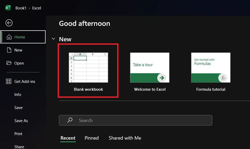
Step 1: Open Microsoft Excel
Open Excel. Click on the “Blank workbook”. This will create a blank spreadsheet for us to do data analysis.
If you already have existing data, you should directly choose that data file. For this, you should click on “Open” on the left screen and choose the respective file. In the guide, you can skip to the 4th Step.
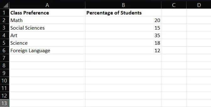
Step 2: Enter names into your chart
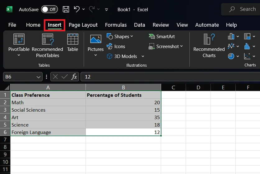
Enter your categories on the worksheet. On A1 and B1, you should add the data labels of the data you are going to work on.
The label in B1 will later show up on your pie chart as titles.
In this example, we are working on the data about the percentage of students’ class preferences. Thus, we labeled data as “Class Preference” and “Percentage of Students”.

Step 3: Enter your data
You can now fill in your data. On the A column, enter the categories. On the B column, enter the values for corresponding categories.
In our data, we have entered the names of classes in the “Class Preference” column on A. The corresponding values on the “Percentage of Students” preferring these classes are entered in the B column.
The pie chart template will automatically calculate the percentages. You can enter data other than data percentages as well.
Tip: Consider entering short phrases in the A column. Longer phrases will cause your pie chart to look crowded and difficult to understand. Also, longer phrases may not fit on each slice.
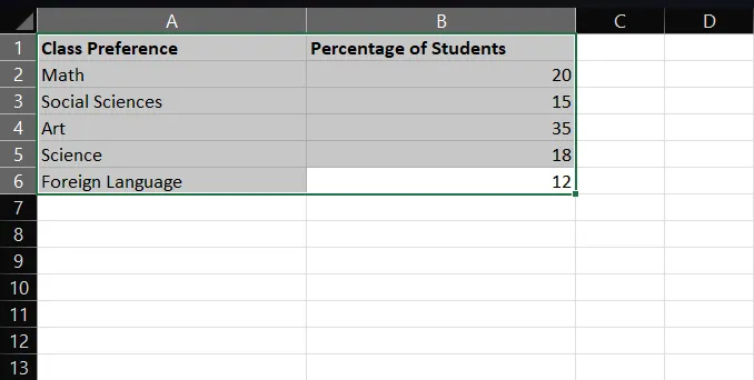
Step 4: Select the table
To select the data, you should hold the Shift key and drag your cursor from A1 to the end of the table. Your cursor should look like a plus sign that indicates that your cursor is on selecting.
Tip: Be sure to select only your data. Do not add any blank cells to your selection. This may disturb the created bar graph. Selected bars will be shown as gray bars.
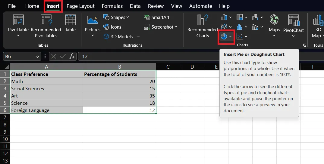
Step 5: Insert
Click on the “Insert” tab on the upper ribbon. Make sure you are still selecting the data.
Step 6: Insert Pie Chart
Click on the “Pie Chart” icon on the left. It is an icon showing a little pie chart with gray and blue. This icon is on the “Charts” groups of the editing ribbon.
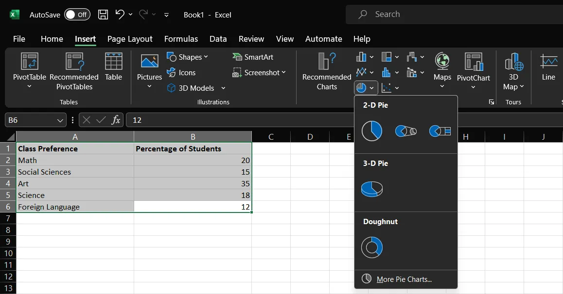
Step 7: Choose your Pie Chart
After clicking on the pie chart icon, Excel will provide a dropdown menu of different types of pie chart options. You can choose any visualization based on your data. Hovering on them will reveal their names and preview the format. You can review the format of each pie chart on the dropdown Excel provided.
The available options are listed above in the “Types of Pie Chart” section of our guide.
For our example, we will use a simple 2-D pie chart.
Step 8: Review your Pie Chart
After choosing your pie chart, Excel will insert the default pie chart in the middle of the document. You can review it and use it as it is or export it as a separate file.
Step 9: Customize the Pie Chart and make the necessary changes
Make the final touches on your pie chart.
You can make changes to it in the “Chart Design” tab and “Format” tab, which appear in the editing ribbon bar.
On the “Chart Design” tab, you can choose different templates that change the backgrounds and the overall look of your graph.
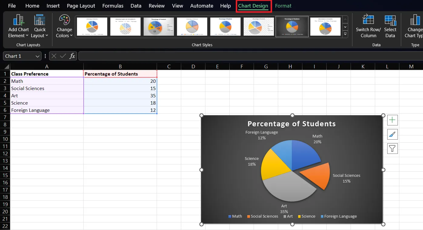
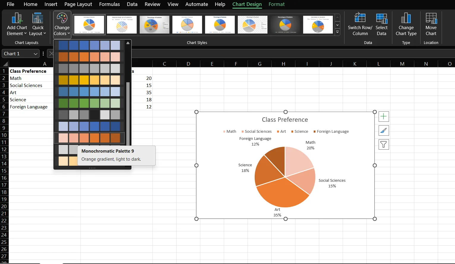
Besides the templates, you can find different color palettes for your chart. Click on “Change Colors” to adjust the colors inside your pie chart.
You can also click the paintbrush icon next to the chart and click the “Color” tab to change your chart colors.
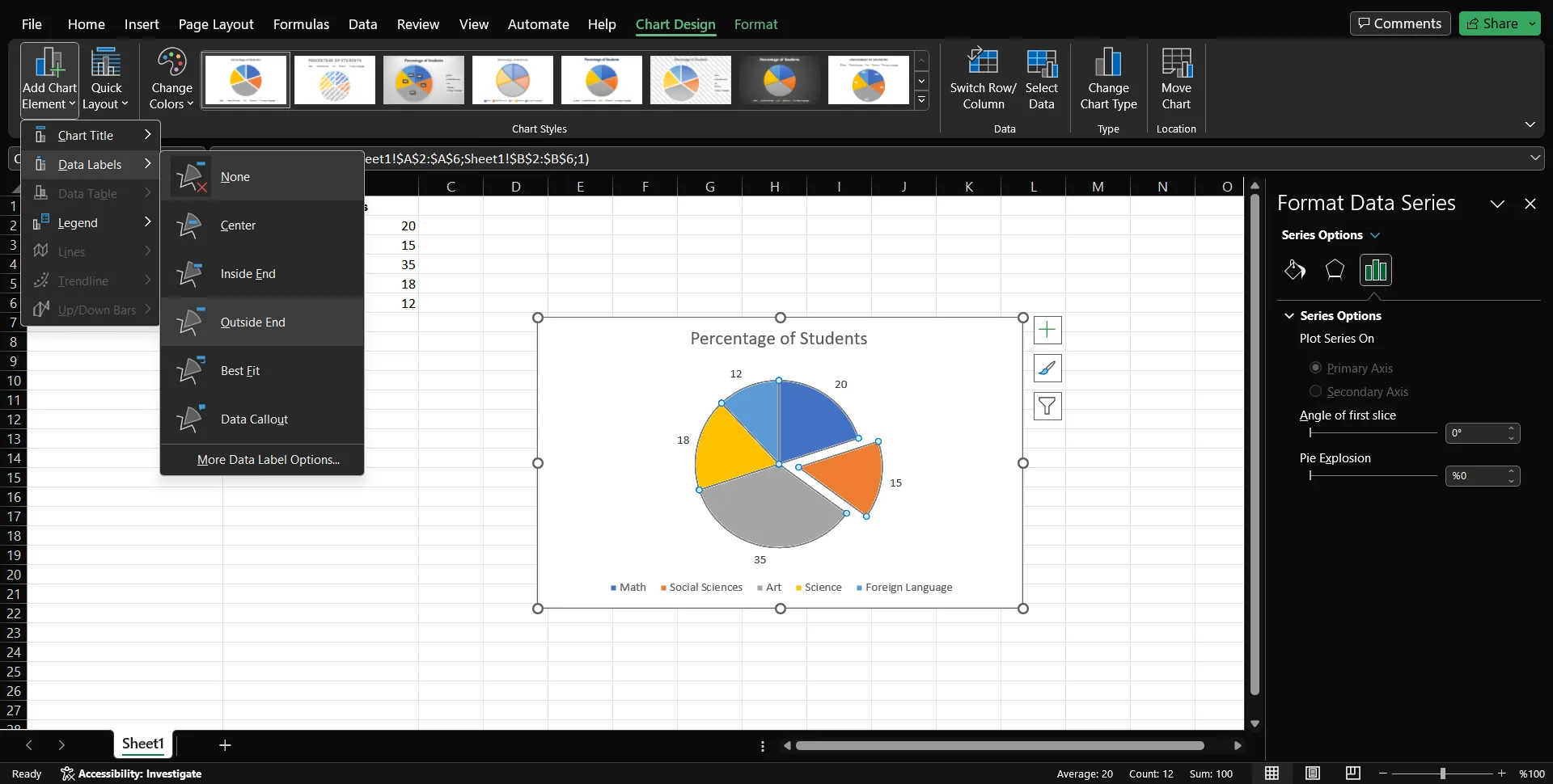
On the “Format” tab in the editing ribbon, you can make changes to the location of labels, values, percentages, and words on your pie chart.
After finalizing your customizations, you can simply right-click on anywhere on the worksheet to go back to your data. You can later access this design by clicking on the created graph.
Create AI-generated charts on Decktopus
Though Excel has many functions, it is challenging to use for many people. You may not be tech-savvy, which is understandable. However, creating a pie chart in Excel may not be the best option for you and your skills.

[[EMBED:PGRpdiBzdHlsZT0iYmFja2dyb3VuZDpsaW5lYXItZ3JhZGllbnQoMTM1ZGVnLCM0ZjYxZmYsIzdDM0FFRCk7Ym9yZGVyLXJhZGl1czoxNnB4O3BhZGRpbmc6MzJweCAyOHB4O3RleHQtYWxpZ246Y2VudGVyO21hcmdpbjoyOHB4IDA7Y29sb3I6I2ZmZiI+PGRpdiBzdHlsZT0iZm9udC1zaXplOjIycHg7Zm9udC13ZWlnaHQ6NzAwO2xpbmUtaGVpZ2h0OjEuMzttYXJnaW4tYm90dG9tOjhweCI+Q3JlYXRlIHlvdXIgbmV4dCBwcmVzZW50YXRpb24gd2l0aCBBSTwvZGl2PjxkaXYgc3R5bGU9ImZvbnQtc2l6ZToxNXB4O2xpbmUtaGVpZ2h0OjEuNTtvcGFjaXR5Oi45MjttYXJnaW46MCBhdXRvIDIwcHg7bWF4LXdpZHRoOjUyMHB4Ij5UdXJuIGFueSB0b3BpYyBpbnRvIGEgcG9saXNoZWQsIG9uLWJyYW5kIGRlY2sgaW4gbWludXRlcyB3aXRoIERlY2t0b3B1cy48L2Rpdj48YSBocmVmPSJodHRwczovL2FwcC5kZWNrdG9wdXMuY29tL3JlZ2lzdGVyIiB0YXJnZXQ9Il9ibGFuayIgcmVsPSJub29wZW5lciIgc3R5bGU9ImRpc3BsYXk6aW5saW5lLWJsb2NrO2JhY2tncm91bmQ6I2ZmZjtjb2xvcjojNGY2MWZmO3BhZGRpbmc6MTRweCAzMnB4O2JvcmRlci1yYWRpdXM6MTBweDtmb250LXdlaWdodDo2MDA7Zm9udC1zaXplOjE1cHg7dGV4dC1kZWNvcmF0aW9uOm5vbmUiPkdldCBTdGFydGVkIEZyZWU8L2E+PC9kaXY+]]
Decktopus is an AI-powered tool that includes a variety of functions, one of them being the pie chart generator! This easy-to-use tool eliminates the need to learn Excel to create visually stunning pie charts!
[[EMBED:PGlmcmFtZSBzcmM9Imh0dHBzOi8vd3d3LnlvdXR1YmUuY29tL2VtYmVkL1dJYjJGZFJYU3NjIiB0aXRsZT0iWW91VHViZSB2aWRlbyIgZnJhbWVib3JkZXI9IjAiIGFsbG93PSJhY2NlbGVyb21ldGVyO2F1dG9wbGF5O2NsaXBib2FyZC13cml0ZTtlbmNyeXB0ZWQtbWVkaWE7Z3lyb3Njb3BlO3BpY3R1cmUtaW4tcGljdHVyZSIgYWxsb3dmdWxsc2NyZWVuIHN0eWxlPSJ3aWR0aDoxMDAlO2FzcGVjdC1yYXRpbzoxNi85O2JvcmRlcjowO2JvcmRlci1yYWRpdXM6MTJweDttYXJnaW46OHB4IDAiPjwvaWZyYW1lPg==]]
Decktopus is an easy-to-use AI specialized in creating presentations. Desktops can handle everything that can be added to slides! The features of Decktopus are created to address any need while creating slides.
Here is a shortened list of the features available on Decktopus:
4) Donut Chart Maker
7) AI Assistant
8) AI-created Q&A Session Notes
9) Rehearsal Mode
10) Presentation Notes
11) 100+ templates
12) Audible Presentations
13) Custom Domain
Decktopus is a FREE tool! You can try these and other features of Decktopus yourself!
Click to sign up!
How to Create a Pie Chart in Decktopus?
Decktopus brings AI excellence to your charts and graphs! The pie chart maker on Decktopus allows specific customizations for formatting, such as changing colors, text fonts, font sizes, the position of the title, adding subtitles to explain the graph, background color, and changes to data.

Creating pie charts in Decktopus is easier than ever! All you have to do is to click on the “Pie Chart” template. After, click on the template to either manually enter your data or copy-paste it from another source.
For a step-by-step tutorial on how to create pie charts on Decktopus, you can take a look at our other related posts!
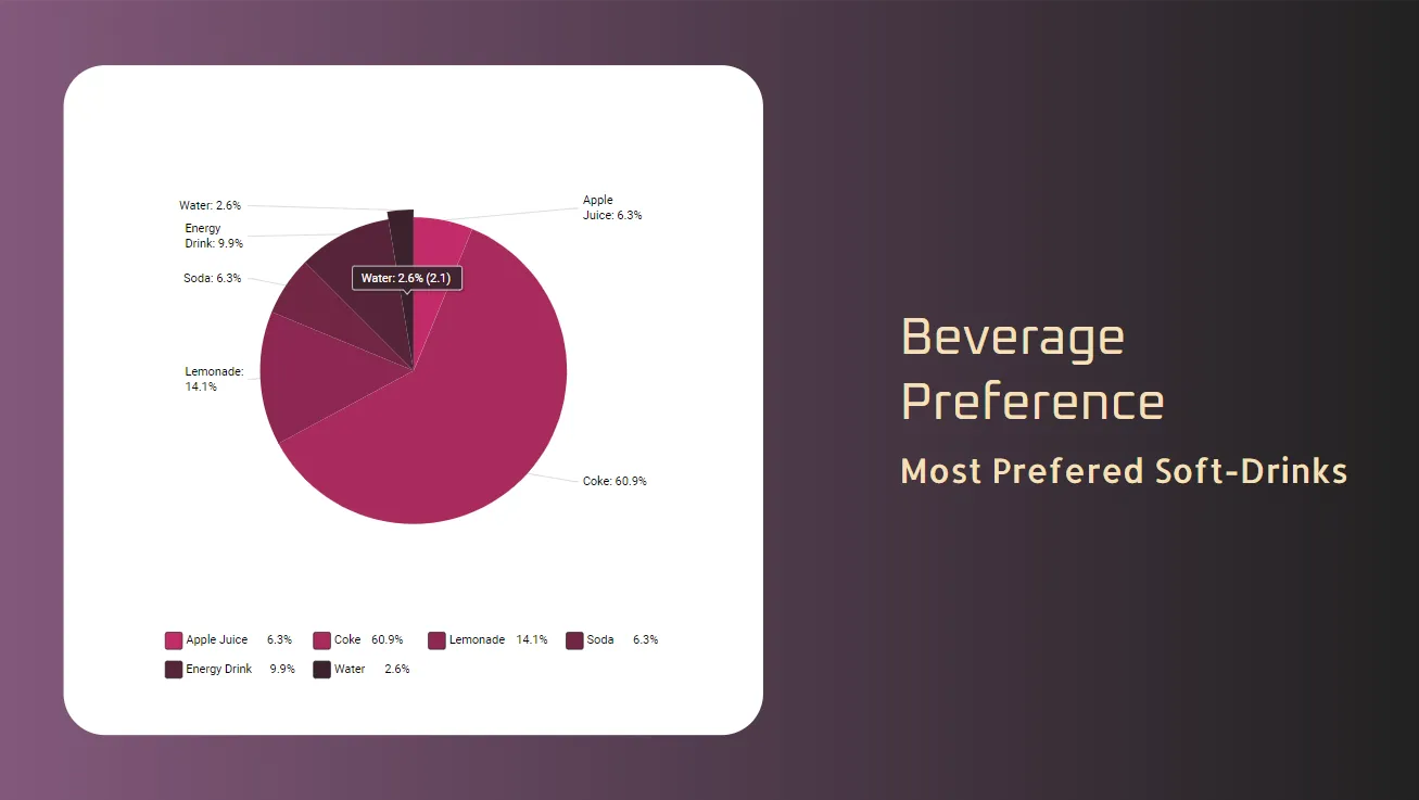
Here are some of the pie chart examples on Decktopus:
You can pick a slice to put emphasis on it on Decktopus. This will allow you to communicate your point to your audience!
You can also separate slices from pie charts to put emphasis on them on Decktopus:

Decktopus allows you to make any adjustments you need! With its easy-to-use interface, create your pie charts in a few seconds! When you feel stuck, Decktopus has an AI assistant ready to help! Feel free to ask anything challenging or hard to accomplish.
Frequently Asked Questions
1) Can I create a simple pie chart in Excel?
You can follow the guide above to create pie charts in Excel.
To create more aesthetic graphs and charts, try Decktopus! Decktopus is an easy and time-saver tool that will assist you with all presentation-related needs!
2) Can I add words to the Excel pie chart?
Yes. You can find the related customizations on the “Format” tab in the editing ribbon.
3) How to make a pie chart in Excel with percentages?
You should click the “Format” tab in the editing ribbon to access value customizations. You can also click on the “+” button in the left of the pie chart, to quickly adjust.
4) How to create a pie chart in Google Sheets?
Of course! Google Sheets is famous for its familiarity to Excel, but more easy to adjust. However, the output will be similar to Excel. Thus, we recommend Decktopus!
Create any pie chart you want without tutorials and guides on Decktopus!

Decktopus Content Team


