
.svg)
.svg)
.svg)


.svg)


Line graphs are one of the most commonly used graphs. In any area of our life, line graphs can be encountered. Because of its usefulness, line graphs can be used in businesses, the finance sector, sciences such as Biology and Chemistry, and medicine sector. For bar-based comparisons, see our bar graph maker
To be able to efficiently use and create line graphs, it is important to understand what a line graph is, what types of line graphs exist, how to interpret them, where to use them, and how to create line graphs.
In this post, we will cover all there is needed to know about line graphs, with different examples!
What is a Line Graph?
Definition of Line Charts
The line graph definition is based on its concept. A line graph shows changes or trends over time. Each point in a line chart represents the data on the specific time period. The line segments connect these data points to create a graphical visual to emphasize changes.
Parts of a Line Graph
A line graph charts is composed of the following:
- Title: A title shows what the graph is based on. It makes it easier to understand the purpose of the graph and the data it is composed of.
- Data point: A data point corresponds to the intersection of x-axis and y-axis values.
- Axes: A line graph has two axes, namely the x-axis (horizontal) and y-axis (vertical). The x-axis plots the duration or time. Meanwhile, the y-axis represents what is being measured or data points. The x-axis can sometimes be called an independent axis because it is independent of what is being measured. In this sense, the y-axis is a dependent measure, as it is dependent on x-values.
- Grid Lines: Gridlines are guiding lines to indicate which data point corresponds to the x-axis variable and y-axis variable.
- Legend: The legend is given at the end of the graph. A legend gives information on how to read the graph. For example, it can contain information on what each color means in a graph.
- The Line: The line connects the data points, each representing data on a specific time in the X-axis.
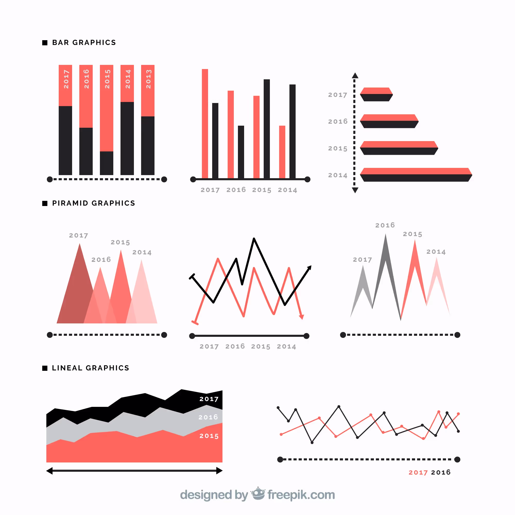
Types of Line Graphs and Examples
Although there are many variations of line graphs, all of them are based on the same three types of line graphs.
There are three main types of line graphs:
- Simple Line Graph
- Multiple Line Graph
- Compound Line Graph
1) Simple Line Chart
A simple line graph is the classical and commonly known line graph. Simple line graphs only include lines that represent changes in the variable over time. Only one variable is added to the data. Thus, making comparisons is impossible. Nevertheless, it is open to interpretations of the changes in one variable over time.
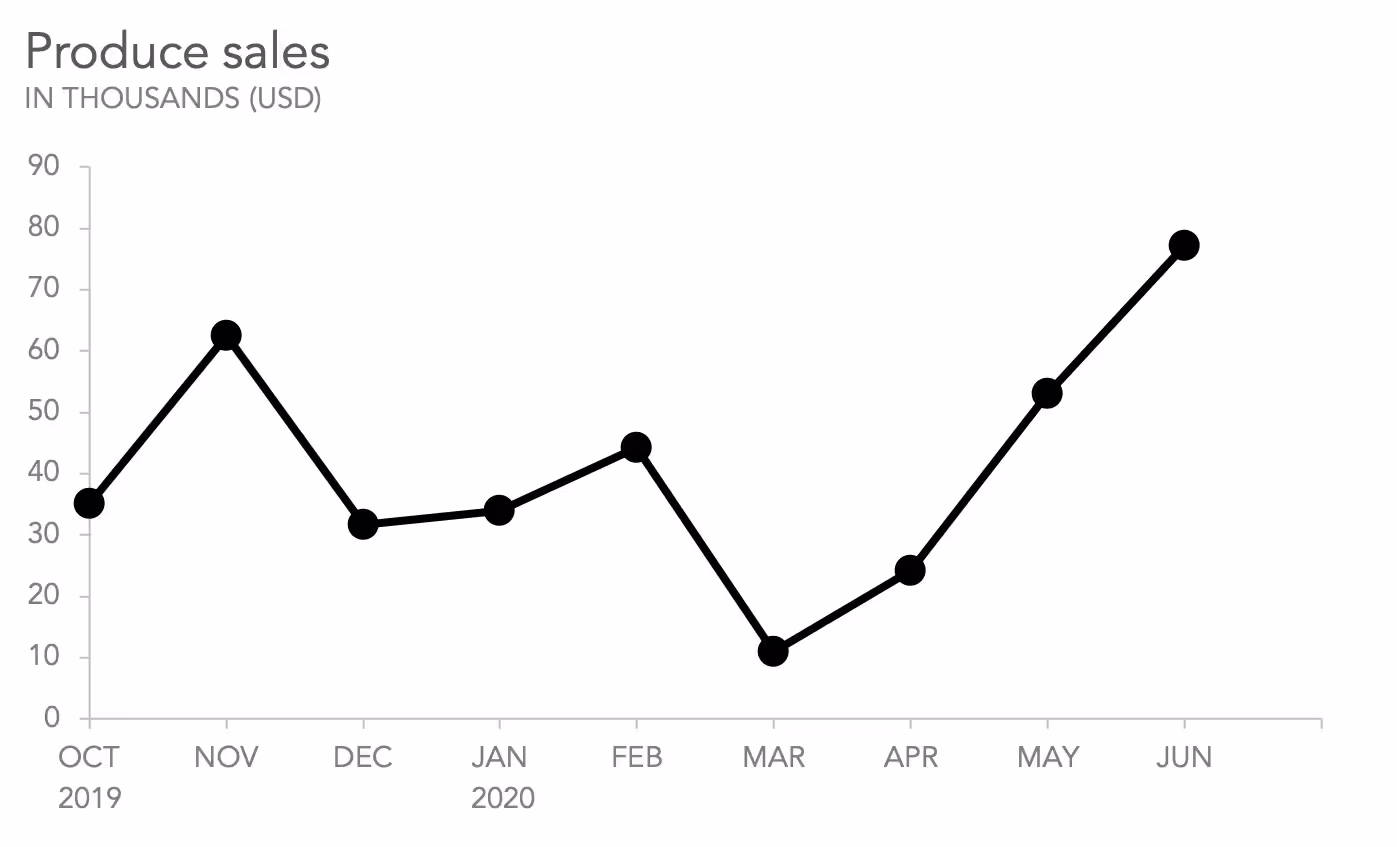
Example of a Simple Line Graph
In this line graph, the changes in produce sales over a nine-month period are represented. As you can see, there is only one variable, that is produce sales. The x-axis shows the time period months, and the y-axis shows how much sales are made. Each data point represents how much sales are made in the specific month it is corresponding.
2) Multiple Line Chart
As the name suggests, a multiple-line chart includes multiple lines in the same graph. In other words, more than one variable is graphed. The number of variables is equal to the number of line graphs. This chart allows us to interpret much information on the same graph. It is also possible to make comparisons and interpretations.
The most used type of multiple-line chart is the double-line chart. However, there is no limitation for adding more variables. Though, to be able to read the chart easily and not overcomplicate it, keeping it simple is the best!
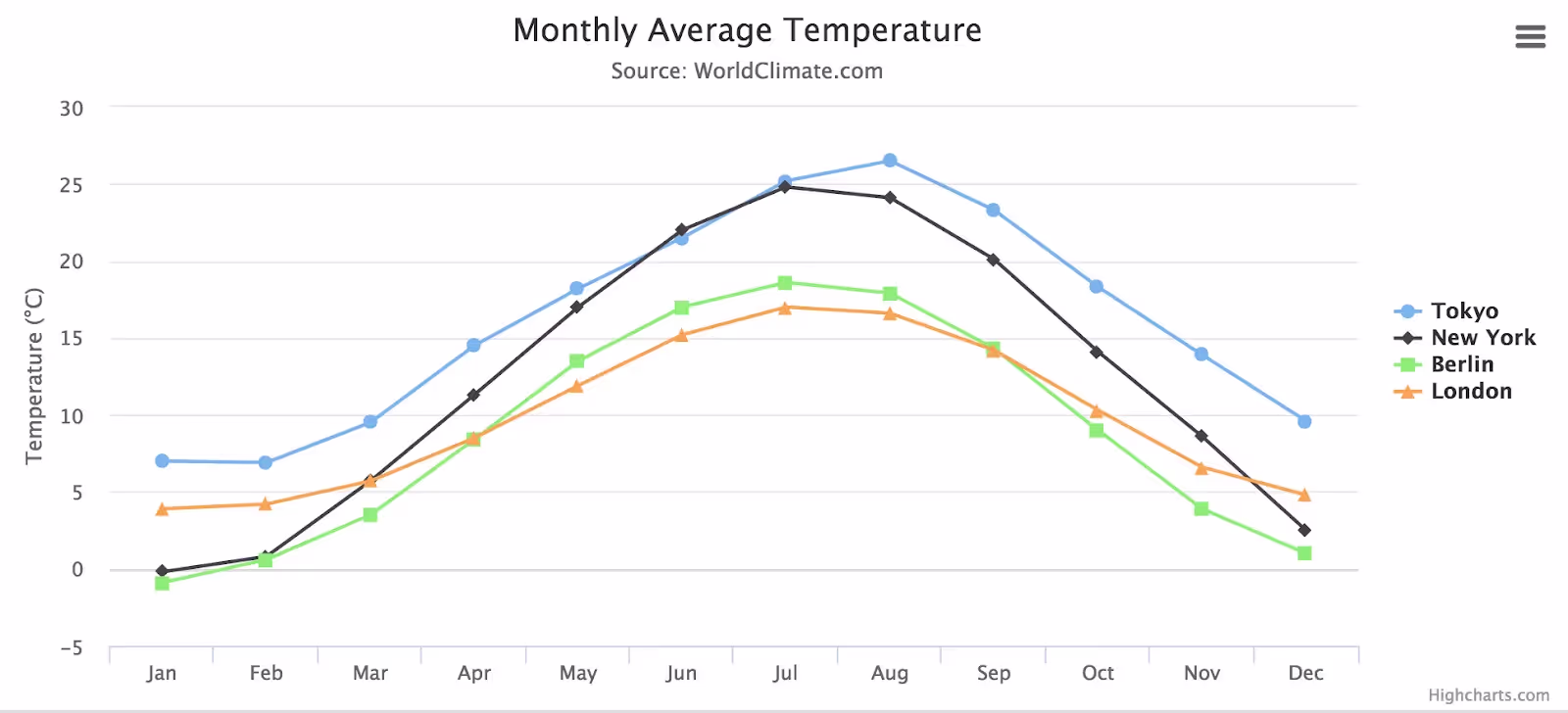
Example of a Multiple Line Graph
In this line graph, four lines can be seen. Each line color and its corresponding information, which is called legend, is given on the right. The graph shows the monthly average temperature in four different cities.
The x-axis shows the months of the year, while the y-axis shows the temperature. A data point corresponds to the monthly temperature rate for a specific month. You can compare the cities or make interpretations about their temperature rates.
The curves and graph peaks correspond to an overall picture of data. Similarly, the slope shows the magnitude of the changes in different data points.
3) Compound Line Chart
Compound line graphs are similar to multiple line graphs, as they include more than one variable. However, on compound line graphs, variables are stacked on each other to show the total quantity.
Compound line graphs are the most informative type. It allows us to compare the variables and also to interpret the total changes.
You may want to take a look at the YouTube video below by Learning at Ease. This tutorial explains the concept behind the compound line graphs and how to interpret them:
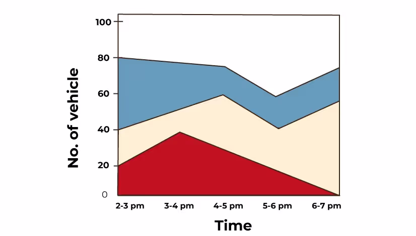
Example of a Compound Line Graph
In this line graph, you can see the data on the number of vehicles on different roads in different time periods. The x-axis shows the time interval in a day, while the y-axis shows the number of vehicles. Each color represents a different road.
You can interpret how many cars are on each road separately. It is also possible to interpret the total number of cars on the roads during a time period by interpreting the line on the top.
Where to add a Line Chart?
A line chart can be used on many occasions. You can encounter line graphs on marketing reports, essays, research papers, business proposals, executive summaries and so on!
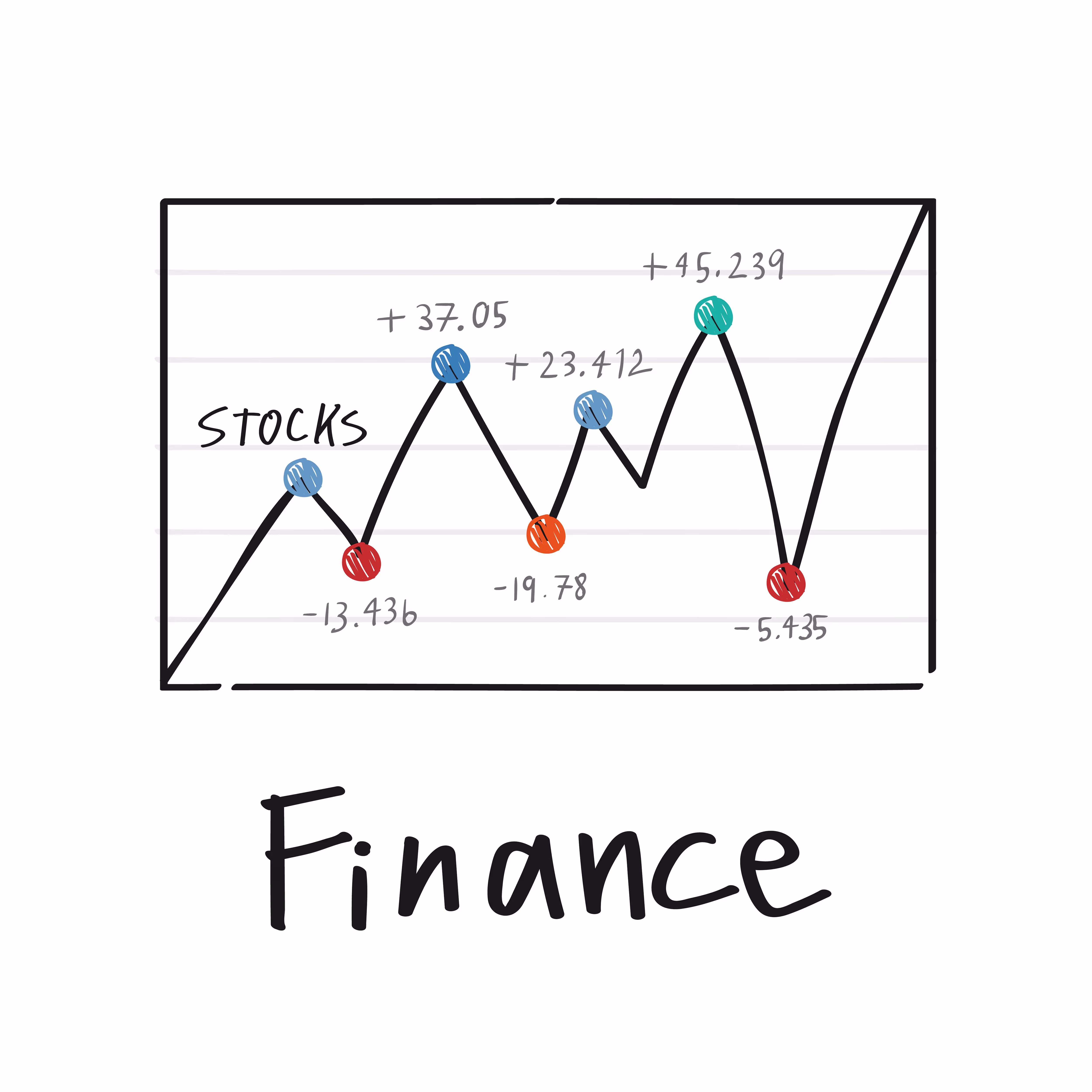
- A common use is in finance. A line chart can show the changes in values over time. A line graph on how the value of stocks changes over time is widespread.
- Another use is for history. For example, in a report on the historical growth of a company, line graphs are essential!
Using a Line Chart
Using a line chart has advantages and disadvantages, which should be considered before plotting a line graph.
Benefits of a Line Chart
- They are easy to understand.
- Line graphs show changes and trends over a time period.
- Different variables can be plotted on the same graph, which allows us to make comparisons.
- Line graphs are able to show even the small shifts that may not be visual in other graphs.
- Line charts are easy to make, simple, and efficient.
Disadvantages of a Line Chart
- Adding too many variables on line graphs makes them clustered and tangled. Causing lines to be unable to be interpreted.
- A wide range of data may not be plotted as a line graph.
- Data, including decimals or fractions, are hard to plot as a line graph. For a line graph, the data should be whole values. In other words, the data type is restricted.
- The data format and structure are restricted as well. Only linear variables can be plotted.
How to Create a Line Graph?
Decktopus: The Line Graph Creator
Decktopus AI is a multi-functional AI presentation maker! Decktopus AI creates slides based on your topic. Describe what your presentation is about, pick a style, and get a fully built presentation generated automatically. The created slides include all the images, information, graphs, logos, and icons you need! Enjoy the AI excellence in your slides, and present with only one click!
Decktopus is one of the leading presentation tools. It is easy to sign up, free trial to use and has an easy-to-adjust interface that allows users to quickly get used to it. Decktopus can be accessed online through your browser and laptops!
With the AI-powered system, Decktopus is able to create anything you may think of adding to a presentation. Decktopus is able to customize each element with ease. With the customized charts, make your graphs stand out!
The main features of the Decktopus are:
1) Line Chart Maker
4) Donut Chart Maker
7) AI Prompt Editing
8) Brand Kit Integration
9) Version History
10) PDF and PowerPoint Export
Decktopus has an easy-to-use interface that is approved by many users. You can create anything within a few seconds! Thus, creating a line chart can be reduced into a few simple steps!
Here is a detailed tutorial on how to create line charts with Decktopus!
How to Create a Line Graph with Decktopus?
Step 1
Describe Your Topic 🧠
Describe what your presentation is about. Broad topics like "Marketing Strategy for Startups" work just as well as specific ones like "Q3 Sales Report for Enterprise Clients." You can also upload supporting files like PDFs, documents, or research materials to give the AI more context.

Step 2
Choose Your Style 🎨
Pick a brand, reuse a saved look, or start fresh with AI.
Decktopus will ask how you want your presentation to look. You can apply a saved brand kit, import your brand directly from your company website, or let AI generate a style from scratch.

Step 3
Review the Outline ⚙️
Decktopus generates a slide outline based on your prompt. You can review the structure before moving forward. The flow, slide order, and content focus are all adjustable at this stage if anything needs tweaking. Once you're ready, Decktopus builds the full presentation.
Step 4
Edit in the Editor ✏️
Once the editor opens, your full presentation is ready. You can present or share it straight away, or refine it further if you'd like.
If you want to make changes, you have two options:
Edit with AI: Use the prompt bar at the bottom of the editor. Type instructions like "make this more concise" or "simplify this slide," and Decktopus applies the change instantly. You can also use quick-action buttons like Make it concise, Simplify, Add more details, or Make it more minimal.
Edit Text: Click the Edit Text button to open the manual editing panel on the right side. Every text element on the slide is listed individually, so you can click into any one and change it directly. Hit Apply Changes when done.

Step 5
Add a Line Chart Slide (If Needed)
If your presentation does not already have a line graph slide, click Create New Slide in the left panel. Type a prompt describing the chart you want and add the data you want to include. Decktopus will generate the slide for you automatically.
Step 6
Export or Share
When your presentation is ready, download it as a PDF or PowerPoint, share via link, or present directly from the editor.

That’s it!
Frequently Asked Questions
Where line graphs are used?
Line graphs are everywhere in our lives. Line graphs can be encountered from the stock market to the IELTS test. It is important to understand how line graphs are created to interpret line graphs afterward. Decktopus has an easy-to-understand interface for line graphs! You can create and tweak your created line graph with ease!
Where can I create line graphs?
There are many line graph generators. You can create line graphs in R or in Excel. However, our recommendation is Decktopus! Decktopus allows you to create beautiful line graphs with AI.
What is the difference between a line graph and a bar graph?
When a line graph vs. bar graph comparison is made, it should be understood that these graphs are visualizations for data. This means they may look different, but both of them represent data points and the connection between them. While line graphs are made by connecting the data points as a line to show trends or changes over time, bar graphs have rectangles that represent different categories in data. The quantity of the data can be interpreted from the length of the bars.


.avif)


.svg)
.svg)
.svg)
.svg)
.svg)
.svg)
.svg)
