
.svg)
.svg)
.svg)


.svg)


How to Make Bar Charts in Excel: A Step-By-Step Tutorial on Bar Graphs
If you have any experience in Excel, you must already realize that Excel has a wide range of functions. When it comes to data analysis, Microsoft Excel is the primary choice of many researchers and data analysts.
One of the functions of Excel is that it can create visualizations of the existing data. Excel can create many types of graphs and different visualizations that make it easier to read and make interpretations of data.
Nonetheless, if you don’t have any experience using Excel, it may be hard to find how to create these graphs. Also, graphs created by Excel may not be visually attractive to your audiences.

In this guide, we will create a bar graph on Excel, step-by-step. In addition, we will introduce a new and more visually appealing way to represent your data with Decktopus!
Let’s start!
What is a Bar Graph?
A bar graph is the visual representation of the data using rectangular bars. A bar graph contains:
- Bars: With different heights, each representing different data points
- Axes: There are 2 axes, namely, horizontal (x-axis) and vertical (y-axis). The X-axis represents the categories of the data, whereas the Y-axis represents the numerical values.
- Labels: Labels are titles for axes and each category.
- Gridlines: Though optional, grid lines visualize each data point, making it easier for the reader to interpret.
- Chart Title: Most charts include a chart title to showcase what relationship the data represents.
Bar charts are one of the simple graphs. These graphs are flexible, as they can represent numbers, frequencies, percentages, or any other measures. If you have comparable data, it can be visualized in bar graphs!

What Types of Bar Charts are in Excel?
There are many bar graphs in Excel. Though it is the same data, visualization can significantly affect how we read the data and make interpretations.

How Do You Create a Bar Graph in Excel?
An 8-Step Tutorial on How to Make Bar Charts in Excel
Step 1: Open Microsoft Excel
When clicked on Excel, it will automatically create a blank spreadsheet. You can enter the data you want to create a bar graph on.
However, if you want to create from the pre-existing data, you should choose the data file from your computer. For this, you should directly click on the data on your computer. If you have existing data, you can skip to step 4.

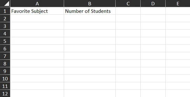
Step 2: Enter axis labels for your graph
You should enter the data as a table. As in the first cells, which are A1 and B1, you should enter the labels for the axes. On A1, enter the label for the X-axis. Similarly, on B1, enter the data for the Y-axis.
- For example, in our example, we have entered the “favorite subject” as the label for the X-axis. And “number of students” as the label for the Y-axis.
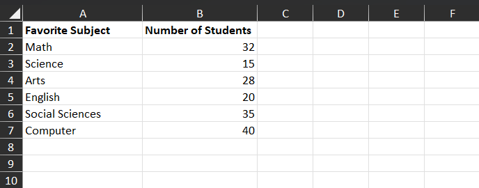
Step 3: Add your data
Under the labels, enter the corresponding data. For data on A column, type categories of your data. Under the B column, enter the corresponding values for each category.
- For example, in our data, “favorite subject” is divided into math, science, arts, etc. On the “number of students” column, we added how many students are labeled for each subject as their favorite.
Tip: When entering your data for the X-axis, consider choosing shorter phrases. Longer phrases may affect the look of the bar graphs. Longer phrases tend to separate bar graphs, or phrases are cut in the graph.
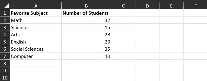
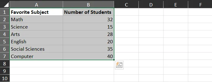
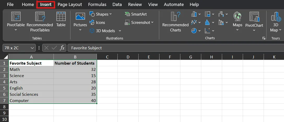
Step 4: Select the data
To select the data, you should hold the Shift key and drag your cursor from A1 to the end of the table. Your cursor should look like a plus sign that indicates that your cursor is on selecting.
Tip: Be sure to select only your data. Do not add any blank cells to your selection. This may disturb the created bar graph. Selected bars will be shown as grey bars.
Step 5:
Click on the Insert tab in the editing part. Make sure you are still selecting the data. You can understand this from the greyness of the selected cells.
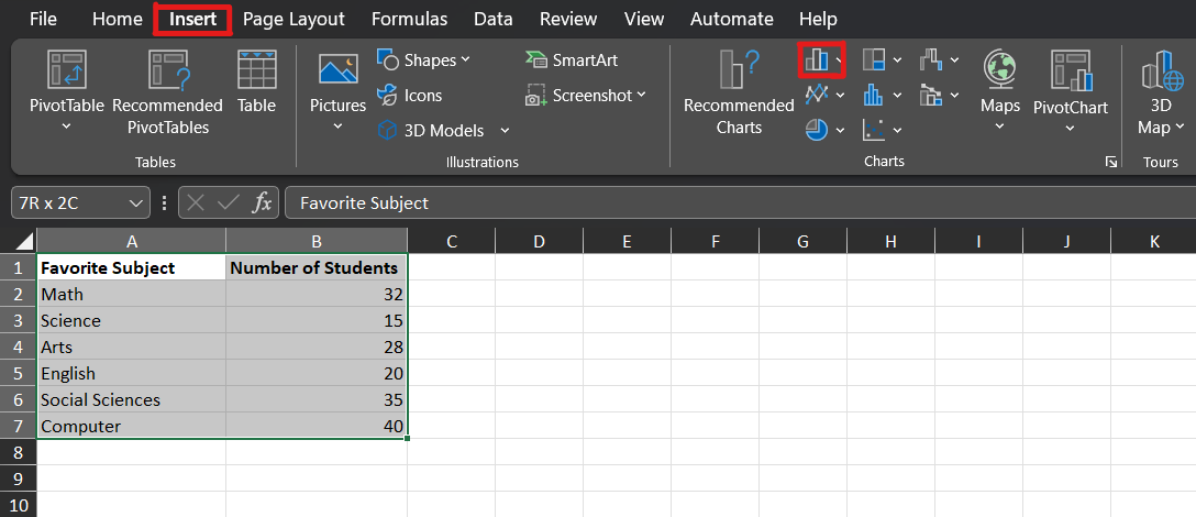
Step 6:
Click on the bar chart icon. It is an icon with three rectangles. This icon is on the “Charts” groups of the editing ribbon.
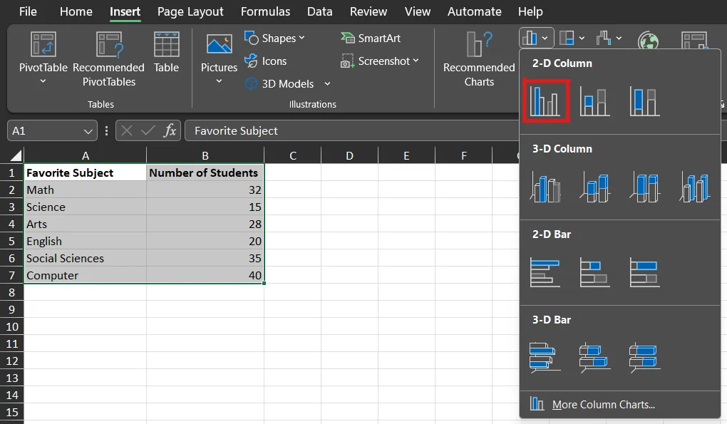
Step 7:
After clicking on the bar graph icon, Excel will provide a dropdown menu of different types of bar graph options. These options may vary depending on which version of Excel you are using. There are four format options of chart layouts available: 2-D Column, 3-D Column, 2-D Bar, and 3-D Bar.
The bars are divided into 2-D and 3-D, which refers to how the bars are drawn. Column refers to simple, vertical bars. Similarly, bar refers to horizontal bars. Excel provides exemplary icons for each bar graph before choosing.
- For our example, we will insert 2-D Column bar chart.
Step 8: Review and customize
After choosing a bar graph type, Excel will insert the graph in the middle of the document. You can review it and use it as it is or export it as a separate file. You can also make changes to it in the “Chart Design” tab and “Format” tab, which appear in the editing ribbon bar. You can later access this design by clicking on the created graph.
Tip: You can change the title of the graph by directly clicking on it. In addition, when you double-click on the bar graph, you can access advanced settings. In the format data series tab, you can change the gap width percentage, bar width, font and so on. In the format tab, you can find axis options.
You can also take a look at this YouTube video for any questions:
Create AI-Generated Charts in Decktopus
Excel is powerful for data analysis, but the bar graphs it produces often need extra work to look presentation-ready. If your bar graph is going into a deck for stakeholders, investors, or your team, Decktopus handles that step for you.
Decktopus is an AI-powered presentation tool. Describe your topic, and your deck is generated automatically, with bar graphs and other visuals included where they help communicate your data. Your brand, colors, and fonts are applied across every slide.
Decktopus is an easy-to-use presentation tool, but not only limited to this! There are many features available on Decktopus that are provided to users!
- AI Presentation Generation: Full deck built from your topic in minutes
- Auto-generated charts and visuals (Bar Chart Maker, Pie Chart Maker, Line Chart Maker, Donut Chart Maker and more) inside your presentation
- Brand Import: Paste your website URL to auto-apply your brand
- Brand Compliance: Auto-checks every slide for brand consistency
- Prompt-based Editing: Refine any slide by typing what you want changed
- Slide Library: Save and reuse high-performing slides
- Version History: Restore any past version in one click
- Export as PDF or PPT, share via link, or present directly
- AI Image Generator
- PDF to Deck Import

How to Create a Bar Graph in Decktopus?
Bar graphs in Decktopus are generated as part of your full presentation. Here's how it works:
- Describe your topic. Type what your deck is about, including the data you want to visualize. Or upload a spreadsheet with your numbers.
- Choose your style. Paste your website URL to apply your brand automatically, or let AI generate a style.
- Review the outline. Decktopus adds bar graphs where they help communicate your data.
- Refine in the editor. Use the prompt bar to adjust any chart with instructions like "switch this to a stacked bar graph" or "make the chart horizontal." Brand Compliance keeps every slide on-brand.
- Export or share. Download as PDF or PPT, share via link, or present directly.
Refine your bar graph anytime with prompts like "highlight the top bar" or "make the colors more contrasting." Brand Compliance keeps your design consistent, so you focus on the data, not the styling.
You can be the judge of the improvements that Decktopus brings! Visit our website!
Frequently Asked Questions
1) How to make a bar graph in Excel with 1 variable (single variable)?
Follow the example above. Select your data as a whole and Excel generates the chart automatically. For a polished, on-brand bar graph that goes straight into a presentation, generate the deck in Decktopus.
2) Where can I find pre-made bar graph designs in Excel?
Excel includes built-in chart styles you can apply after creating your graph (Chart Design tab, then Chart Styles). If you want a bar graph that's already part of a polished presentation, generate the deck in Decktopus. Your bar graph is built automatically, on-brand, and ready to share.
3) How to add different colors to bar graphs in Excel?
In Excel, double-click on a bar, then right-click and choose 'Fill' to change its color. Repeat for each bar individually. In Decktopus, colors are applied automatically based on your brand, and you can refine with a prompt like 'use complementary colors for each bar' instead of clicking through each one.
4) Can I make my bar graphs interactive?
You can create pivot charts from pivot tables. These pivot tables are interactive bar graphs. Several different interactions can be seen together in a single combined graph.
.avif)


.svg)
.svg)
.svg)
.svg)
.svg)
.svg)
.svg)
