
.svg)
.svg)
.svg)


.svg)


What are Graphs & Charts in Microsoft Excel?

In Microsoft Excel, graphs and charts are visual representations of data that provide a clear and concise way to convey information.
They are useful for analyzing trends, patterns, and relationships within datasets. Excel offers a variety of chart types, each designed to represent data in a specific way.
To create a graph or chart in Excel, you typically start by selecting your data and then choosing the chart type that best fits your needs.
How Can I Make a Chart in Excel: Step by Step Guide
Excel provides a user-friendly interface for creating, customizing, and formatting charts to enhance their visual appeal and effectiveness in conveying information. Charts in Excel are dynamic, allowing you to update them automatically when the underlying data changes.
To create a graph in Excel, follow these steps:
- Enter Data: Input your data into an Excel spreadsheet.
- Select Chart Type: Choose from one of the nine available graph and chart options based on the type of data you have.
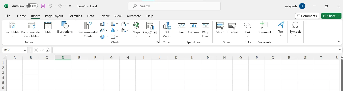
- Insert Graph: Highlight your data, then go to the "Insert" tab and select your desired graph type.
- Adjust Axis: If needed, switch the data on each axis for a clearer representation.
- Customize Layout and Colors: Modify the layout and colors of your chart to enhance visual appeal.
- Resize Legend and Axis Labels: Change the size of your chart's legend and axis labels for better readability.
- Adjust Y-Axis Measurement: Optionally, modify the Y-axis measurement options to better represent your data.
- Reorder Data: If necessary, reorder your data to present it in a more meaningful way.
- Add Title: Title your graph to provide context and clarity.
- Export: Once satisfied, you can export your graph or chart for use in presentations or reports.
Detailed Step by Step Chart Creation Guide
Step 1: Open Microsoft Excel
Create a blank workbook. This spreadsheet is where we will enter the data and create the line graph.
You may already have a workbook that includes your data. Then, click on the “Open” on the left and choose your data file.

Step 2 : Consider the type of graph you want to make
There are three basic types of graph that you can create in Excel, each of which works best for certain types of data.
- Bar: Displays one or more sets of data using vertical bars. Best for listing differences in data over time or comparing two similar sets of data.
- Line: Displays one or more sets of data using horizontal lines. Best for showing growth or decline in data over time.
- Pie: Displays one set of data as fractions of a whole. Best for showing a visual distribution of data.
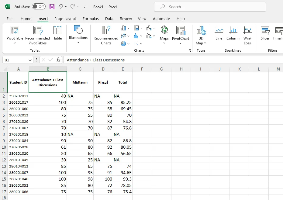
Step 3: Add your graph's headers
1) Enter Your Data: Input your data into Excel.
2) Select Your Data: Choose the data range you want to visualize.
3) Create a Chart: Go to the "Insert" tab and select a chart type (e.g., column, line).
4) Right-Click on the Chart: Right-click on the chart, then choose "Add Chart Element" and select "Chart Title."
5) Enter the Title: A text box will appear; type your chart title.
6) Customize the Title: Right-click on the title to customize it (color, font, size).
By following these steps, you can quickly add and customize a chart title in Excel.
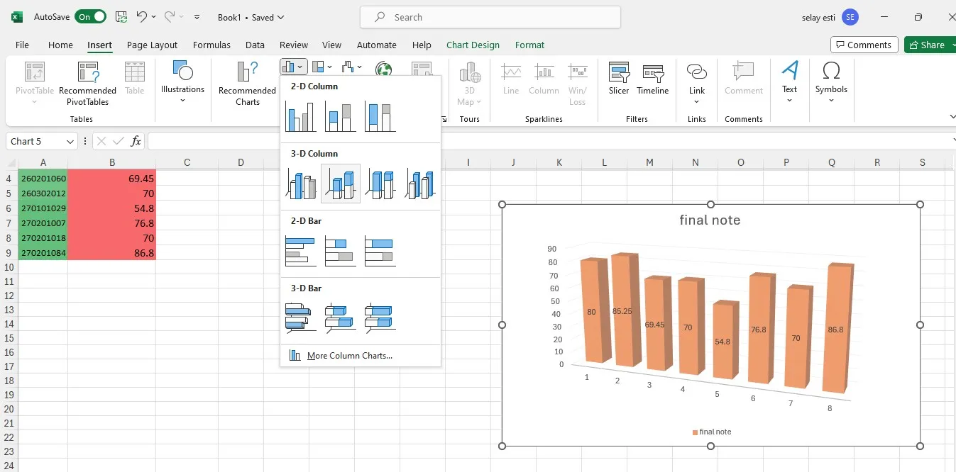
Step 4: Select a graph type
In the "Charts" section of the Insert toolbar, click the visual representation of the type of graph that you want to use. A drop-down menu with different options will appear.
- A bar graph resembles a series of vertical bars.
- A line graph resembles two or more squiggly lines.
- A pie graph resembles a sectioned-off circle.
Step 5: Select a graph format
In your selected graph's drop-down menu, click a version of the graph that you want to use in your Excel document. The graph will be created in your document.
- You can also hover over a format to see a preview of what it will look like when using your data.
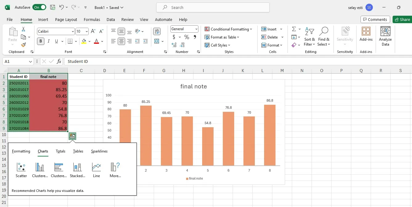
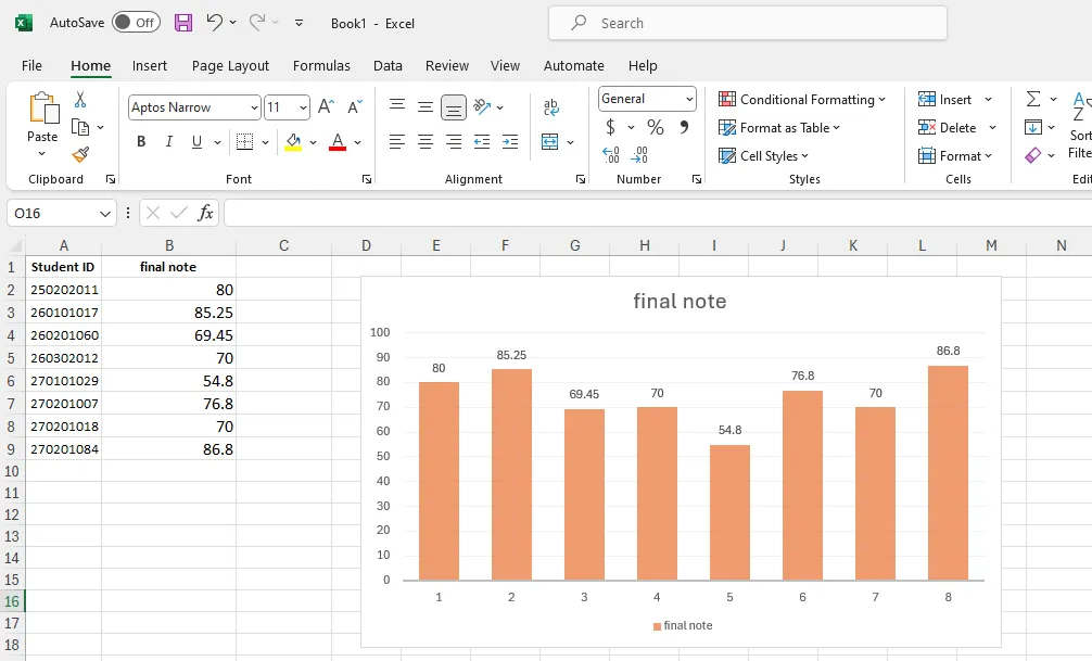
Step 6: Finalize Your Graph
As you may realize, the created column chart needs some adjustments. To change its colors and overall appearance, click on the "Chart Design" tab at the top.
From there, you can select a color palette or choose one of the available chart styles. Additionally, you can access the "Format" tab on the right to further customize shapes and fonts.
Chart styles not only alter the colors but also adjust the background and fonts of the columns.
Double clicking or right clicking on the column chart will also provide access to the same customization options.
Create Effortless Graph In Decktopus
Though Excel has many functions, it is challenging to use for many people. You may not be tech-savvy, which is understandable. However, creating a bar chart in Excel may not be the best option for you and your skills.

Decktopus is an AI-powered tool that includes a variety of functions, one of them being the bar graph generator! This easy-to-use tool eliminates the need for learning Excel!
Decktopus is an easy-to-use presentation tool, but not only limited to this! There are many features available on Decktopus that are provided to users!

- Bar Chart Maker
- Pie Chart Maker
- Line Graphs Maker
- Donut Chart Maker
- AI Image Generator
- PDF to Deck Import
- AI Assistant
- AI created Q&A Session Notes
- Rehearsal Mode
- Presentation Notes
- 100+ templates
How to Create a Bar Graph in Decktopus?
Decktopus brings AI excellence to the graphs!
The bar chart maker on Decktopus allows specific customizations for formatting, such as changing colors, text fonts, the position of the title, adding subtitles to explain the graph, background color, and changes on gridlines and data.
It is easy to create bar graphs on Decktopus. All you need to do is to choose the bar graph template and add your data!
For a detailed step-by-step tutorial on bar graph maker on Decktopus, you can take a look at our other related posts!


Frequently Asked Questions
1) How do you create a graph in Excel step by step?
- Enter your data into Excel.
- Select your data.
- Go to the "Insert" tab.
- Choose the desired chart type (e.g., column, line, pie).
- Adjust chart elements and formatting as needed.
- Your graph is now created!
2) How do you make an XY graph in Excel?
- Enter your XY data into two columns in Excel.
- Highlight the data.
- Go to the "Insert" tab.
- Choose "Scatter" from the Chart options.
- Customize as needed, adding labels and formatting.
3) How do I create a chart in Excel with multiple data?
- Enter all your data into Excel.
- Highlight the data including all series.
- Go to the "Insert" tab.
- Choose the desired chart type (e.g., clustered column, line with markers).
- Adjust as needed to represent multiple datasets.
4) How do I turn an Excel chart into a graph?
- In Excel, the terms "chart" and "graph" are often used interchangeably.
- Once you've created a chart, it is essentially a visual representation or graph of your data.
5) How to plot a graph?
- In Excel, enter your data into cells.
- Select the data.
- Go to the "Insert" tab.
- Choose a chart type (e.g., scatter plot, line graph).
- Customize the graph as needed for clarity and aesthetics.
.avif)


.svg)
.svg)
.svg)
.svg)
.svg)
.svg)
.svg)
