
.svg)
.svg)
.svg)


.svg)


Excel is an advanced data analysis tool by Microsoft Office. If you have any experience using Excel, then you may realize that Excel also contains several visualization tools. One of them is the line graph maker.

However, some functions of Excel are hard to use and adjust. Without experience, even a little task, like creating a line graph, can be time-consuming.
Thus, in this blog post, we will share a step-by-step tutorial on how to make line graphs in Excel. With this detailed and visualized guide, prepare your line graphs with ease. In addition, a more aesthetic way to present your line graphs will be explained with the help of Decktopus!
What is a Line Graph?

Definition of Line Graphs
A line graph is a special type of graph. The line graphs are designed to show differences or changes over time. While each data point shows the specific value for that time period, the lines emphasize the trends and changes between these data points.
Line graphs are widely employed in various fields, such as economics, science, and psychology. Line charts are an invaluable tool for data analysis and presentation because of their simplicity and clarity. Because line graphs are easy to understand and read, apart from being widely used in scholarly research, they are also commonly employed in everyday situations to effectively communicate information.
Parts of a Line Graph
- For more information about line graphs, please visit out this blog post: How to Make a Line Graph: Definition, Types, and Examples. In this popular post, several line graph types and how to make them have been explained!
How to Create a Line Graph in Excel
There are many tools specifically designed for creating line graphs. Several online tools are providing easy-to-use tools for creating line graphs, including Decktopus!
- In our blog post before, we have shared a list of the top 10 line graph makers! Check out our “Create Line Graphs Chart Simple: Explore Our Easy-to-Use Line Graph Maker” post!
A Quick Walkthrough to Create a Simple Line Graph
Step 1: Open Excel
Click on the Excel on your computer.

Step 2: Create a Blank Workbook
Create a blank workbook. This spreadsheet is where we will enter the data and create the line graph.
- You may already have a workbook that includes your data. Then, click on the “Open” on the left and choose your data file. You can move on to step 5, afterwards.
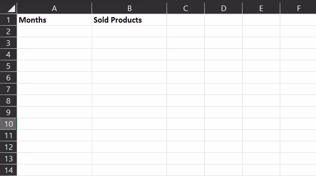
Step 3: Enter your labels
Your data should be as a table. For this, you should add data labels for your table. Enter the axis labels for the X-axis on the A1 cell. Similarly, enter the label for the Y-axis on the B1 cell.
- For example, our data is the number of products sold by a business throughout the year. We want a table that can show the monthly changes in sales. Thus, our X-axis will be “Months,” and the Y-axis will be “Sold Products.”
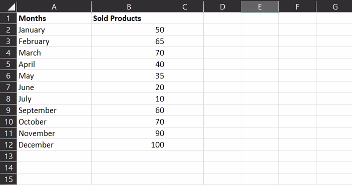
Step 4: Enter your data
Under labels, enter the corresponding data. In the A column, enter the time variables, whereas enter the dependent variables in the B column.
- In our example, A column includes months, as our time variable.B column includes the quantity of the sales.
- If you want to create other types of line graphs, you should enter more columns.
- Tip: While preparing your data, choose more short phrases. Longer phrases may disrupt the look of your graph.
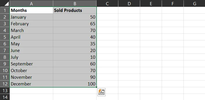
Step 5: Select your data
In Excel, you can select the whole table just by clicking one cell of it. However, if you want to manually select the whole table or want to select it partially, you should hold the Shift key and drag your cursor.
- In our example, we will select the whole table.
- Tip: Be sure to select only your data. Do not add any blank cells to your selection. This may disturb the created bar graph.
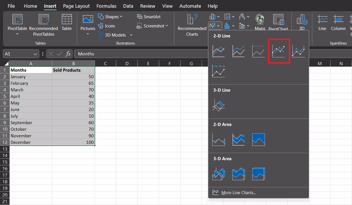
Step 6: Insert Line Graph
Click on the “Insert”. On the editing ribbon, click on the “Line Chart” icon. This symbol can be seen in the group of functions in the “Charts” tab/ category.
- Make sure you are still selecting your table.
- Tip: There is also another “Line” function in Sparklines on the left. Do NOT choose that.

Step 7: Choose a Line Graph
When you click on the “Line Graph” option, Excel offers 13 options. Each of them represents a different type of line graph.
- 2-D Line Graphs: These graphs are divided into 5 different types.
- Line
- Stacked Line
- %100 Stacked Line
- Line with Markers
- Stacked Line with Markers
- %100 Stacked Line with Markers
- 3-D Line Graphs:
- 2-D Area Graphs
- Area
- Stacked Area
- %100 Stacked Area
- 3-D Area Graphs
- 3-D Area
- 3-D Stacked Area
- 3-D %100 Stacked Area
- Tip: You can review and get more information about each graph type if you hover over them. The purpose of the graphs and when to use them are explained in the box provided.
- For our example, we will move on with the Line with Markers. Markers will allow us to differentiate each data point for months.
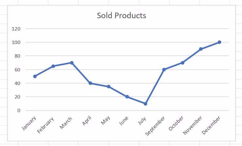
Step 8: Review the created table
Now, Excel has created a default line graph. Review it, display the data and see if you need to make any changes to the data. If not, we can move to the customizations!
Step 9: Customization Options
As you may realize, the created line graph needs some adjustments. To change its colors and general look, click on the “Chart Design” on the top.
After, you can choose any color palette or choose one of the chart styles. On the right, you can also access the "Format" tab. You can change the shapes and fonts available.
- Chart styles also change the background and fonts of the graphs.
- Double-clicking and right-clicking on the line graph will also offer the same customization options.

Create AI-generated Charts on Decktopus
Excel is great for data analysis, but the line graphs it produces often need extra work to look presentation-ready. If your line graph is going into a deck for stakeholders, investors, or your team, Decktopus handles that step for you.
Decktopus is an AI-powered presentation tool. Describe your topic, and your deck is generated automatically, with line graphs and other visuals included where they help communicate your data. Your brand, colors, and fonts are applied across every slide.

Here is a short list of the most popular features on Decktopus:
- AI Presentation Generation: Full deck built from your topic in minutes
- Auto-generated charts and visuals (Bar Chart Maker, Pie Chart Maker, Line Chart Maker, Donut Chart Maker and more) inside your presentation
- Brand Import: Paste your website URL to auto-apply your brand
- Brand Compliance: Auto-checks every slide for brand consistency
- Prompt-based Editing: Refine any slide by typing what you want changed
- Slide Library: Save and reuse high-performing slides
- Version History: Restore any past version in one click
- Export as PDF or PPT, share via link, or present directly
- AI Image Generator
- PDF to Deck Import
Decktopus Line Graph Maker
On Decktopus, you can create aesthetically pleasing graphs. These graphs will capture your audience's attention!
Line graphs in Decktopus are generated as part of your full presentation. Here's how it works:
- Describe your topic. Type what your deck is about, including the data trend you want to visualize. Or upload a spreadsheet with your numbers.
- Choose your style. Paste your website URL to apply your brand automatically, or let AI generate a style.
- Review the outline. Decktopus adds line graphs, which help communicate your data.
- Refine in the editor. Use the prompt bar to adjust any graph with instructions like "show this as a stacked line graph" or "add markers to the data points." Brand Compliance keeps every slide on-brand.
- Export or share. Download as PDF or PPT, share via link, or present directly.
Decktopus generates the line graph you need based on your description or uploaded data. The result is a clean, on-brand chart that fits seamlessly into your presentation.

Frequently Asked Questions
1) How do you create a line graph in Excel?
- Click on the "Insert" in the top ribbon.
- Choose Line Graph on the charts tab.
- Your graph will be ready.
For customizations:
- Click on the Design tab or Format tab at the top.
- You can also choose to double-click on the line graph.
2) How to create a line graph in Excel from a table?
- Create a table in Excel. Select the whole table or just the parts you want to visualize, then click the line graph icon in the Insert ribbon. Follow our step-by-step tutorial above for details. To go from an Excel chart to a polished, on-brand presentation slide, generate the deck in Decktopus.
3) How to create a line graph with two data sets?
- Creating a line graph with two data sets is a bit trickier than a basic line graph.
- First, enter your two sets of data in the same worksheet. Afterward, select both of them simultaneously and click on the "Line Graph" icon.
- On this part, choose to show "all charts" and click on "Combo." This will allow you to combine both data sets in one chart. You can edit the axes data and choose different formatting as well.
.avif)


.svg)
.svg)
.svg)
.svg)
.svg)
.svg)
.svg)
