
.svg)
.svg)
.svg)


.svg)


When it comes to delivering a powerful presentation, content is only half the story. The other half? Visual impact especially the colors you choose. Studies in color psychology show that hues can shape how your audience feels, processes information, and even decides whether to trust you.
Whether you're pitching to investors, teaching students, or delivering a keynote, your presentation colors send a message long before you say a word. From blue’s calming professionalism to red’s emotional urgency, every shade tells a story.
In this guide, we’ll break down:
- What each color means psychologically
- When and where to use them
- How to match colors to your goals and audience
- And how Decktopus makes this easier than ever—with ready-made, color-smart templates designed to impress
Let’s dive into the science and strategy of presentation color schemes that actually work.
🧠 What Is Color Psychology?
Color psychology is the study of how different hues influence human behavior, perception, and emotions. In presentations, it's not just about making slides "look good", it’s about creating a mood, emphasizing key points, and guiding your audience’s attention.
Each color carries a subconscious association. For example:
- Blue evokes trust and calm
- Red creates urgency and excitement
- Green signals growth and harmony
When used intentionally, colors help you:
- Reinforce your message and brand personality
- Establish emotional tone
- Improve readability and visual hierarchy
- Enhance retention and engagement
But it's not just about picking pretty shades. Contrast, consistency, and brand alignment matter too. A well-balanced palette improves clarity. A clashing one creates instant confusion.
For more on how strong presentation design supports your message, see our broader guide on presentation design.

🎨 Color-by-Color Breakdown: Meaning + Best Use Cases
When you choose a color for your presentation, you're choosing a mood, a message, and sometimes even a level of perceived credibility. Below is a breakdown of popular colors, what they say, and when to use them.
🔵 Blue: Trust, Calm, Authority
- Common in: Finance, SaaS, Healthcare
- Use when: You want to appear professional, credible, and data-driven
- Why it works: Blue builds trust, reduces tension, and helps audiences stay focused on logic-based content
- Use for: Data-heavy slides, company overviews, or financial reports
🔴 Red: Urgency, Passion, Excitement
- Common in: Marketing, Campaigns, Startups
- Use when: You want to spark action or emotion
- Why it works: Red draws immediate attention and fuels energy. It's perfect for driving decisions or evoking intensity
- Use for: Opening slides, call-to-action screens, or launch announcements
🟡 Yellow: Optimism, Energy, Creativity
- Common in: Education, Lifestyle Brands, Creators
- Use when: You want to uplift or energize the audience
- Why it works: Yellow creates warmth and optimism, but should be used sparingly to avoid visual fatigue
- Use for: Highlights, quote slides, or workshop intros
🟢 Green: Growth, Health, Calm
- Common in: Wellness, Environment, Finance
- Use when: Your topic involves progress, sustainability, or calm thinking
- Why it works: Green is grounding. It evokes renewal and peace, ideal for steady or progressive messaging
- Use for: Strategy maps, health initiatives, or growth projections
⚫ Black (Dark Themes): Luxury, Power, Clarity
- Common in: Luxury Brands, Fashion, Bold Thought Leadership
- Use when: You want to make a statement or pitch premium services
- Why it works: Black adds sophistication and amplifies contrast, making your visuals pop while staying sleek
- Use for: Portfolio covers, investor slides, or high-end brand reveals
For inspiration on premium portfolio design, see our best portfolio examples.
🟣 Purple: Innovation, Imagination, Wisdom
- Common in: Tech Startups, Coaches, Visionaries
- Use when: Your topic involves future-forward thinking
- Why it works: Purple merges the calm of blue with the fire of red. Great for inspiring vision and depth
- Use for: Future plans, AI concepts, or educational strategy decks
For founders pitching forward-thinking products, see our breakdowns of pitch deck examples and the best AI pitch deck generators for founders.

Watch: Color Trends That Still Inspire in 2025
Some color trends don’t fade, they evolve.
This short video offers a visually rich tour of timeless color trends that began gaining momentum in 2023, and continue to influence presentation design in 2025.
👉 Watch now:
What You’ll See:
- 🌿 The '70s Revival: Earthy tones like avocado green and mustard yellow that still dominate natural, nostalgic branding.
- 🪞Silver Chrome: Sleek, reflective surfaces with a moody edge, perfect for modern tech and AI presentations.
- 🧪 Acidic Hues: Super-saturated brights that bring Gen Z flair and fearless energy to creative decks.
- 🌅 Warm Mediterranean: Clay reds and soft island neutrals still trending in wellness, travel, and lifestyle.
- 🌍 Undersaturated Earth Tones: Eco-inspired, calm-inducing palettes with growing popularity in sustainability and B2B content.
- 🔴 Viva Magenta: Pantone’s 2023 Color of the Year remains a bold, expressive favorite for standout slides.
🧠 Why It’s Still Relevant:
Many of these palettes have evolved but not disappeared. Their emotional and cultural impact is still highly effective in visual storytelling today, especially when used with smart structure and strategic contrast.
Use the video as inspiration, then build your slides in Decktopus to instantly apply these palettes through your brand or AI-generated style.
🎯 How to Pick the Right Color Scheme for Your Audience
Knowing what each color means is one thing. Choosing the right combination for your audience is where design strategy meets psychology.
Here's how to make smart, intentional choices:
✅ Match Your Brand Personality
Your color palette should reflect who you are and what you stand for.
- Professional brands: Blue, gray, or black
- Creative brands: Yellow, orange, or purple
- Eco-conscious or wellness brands: Green and soft neutrals
If your brand already has guidelines, stick to them for consistency.
👥 Consider Audience Culture & Age
Colors mean different things across cultures.
For example:
- Red = love in Western countries, but luck in China
- White = purity in some cultures, mourning in others
Also, younger audiences may prefer bold, energetic palettes, while more traditional groups may trust muted or minimal tones.
🚫 Don't Overdo It
Too many bright or clashing colors can distract and confuse.
📌 Pro Tip:
- Stick to 2 to 3 core colors max
- Use contrast to show hierarchy (e.g., dark background, light text)
- Keep accent colors subtle and consistent
For more on what separates a polished deck from a confusing one, see our breakdown of what makes for a good presentation.

⚡ How Decktopus Helps You Apply Color Psychology Instantly
Even if you're not a designer, you can still create visually smart slides. Decktopus handles the heavy lifting for you.
Here's how it works:
🎯 AI-Recommended Styles Based on Your Topic
When you describe your topic in Decktopus, the AI generates slides with color palettes that fit your context. For example:
- A pitch deck gets bold, high-contrast styles (reds, blacks, purples)
- A wellness report gets soft greens, neutrals, and calming tones
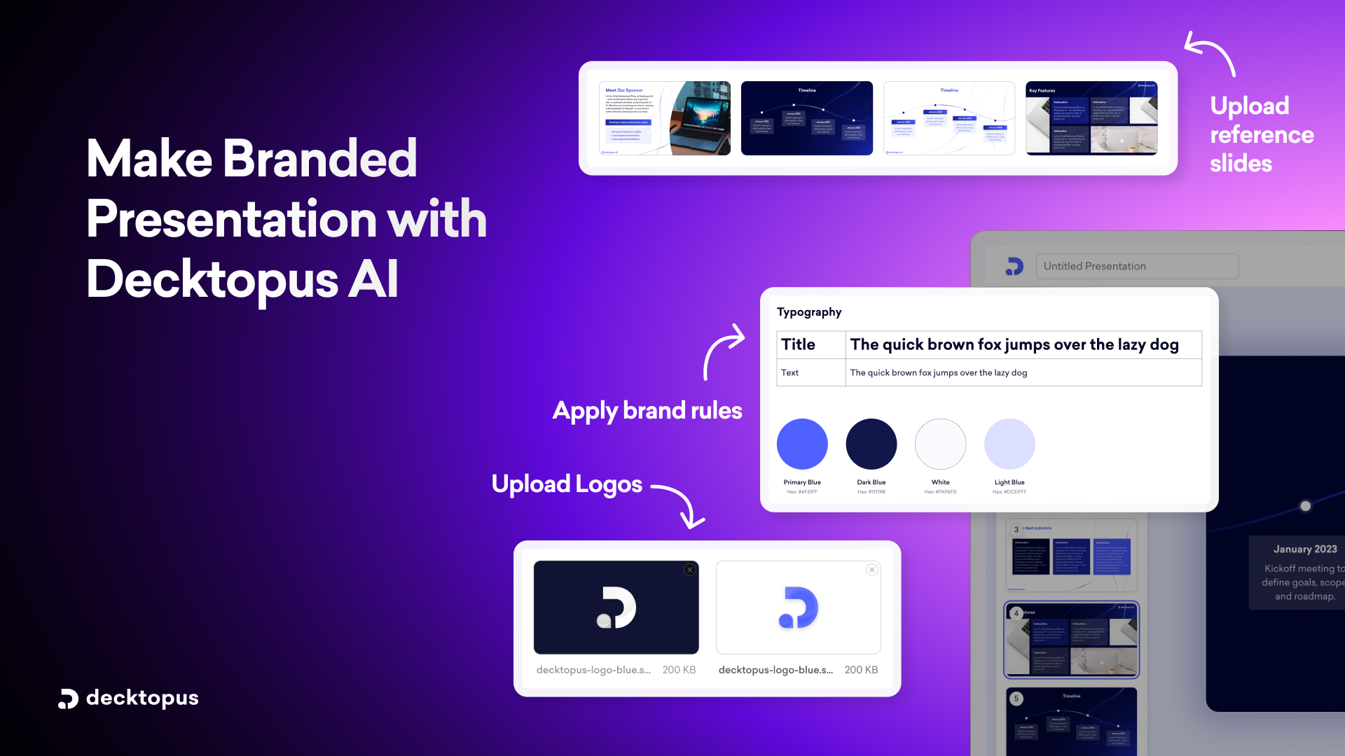
🎨 Brand Import and Brand Kit
Paste your website URL once and Decktopus pulls your logo, colors, and fonts automatically, applying them across every slide. Or upload your assets as a Brand Kit so every deck your team creates inherits your colors and fonts from day one.
No guesswork. No manual editing per slide.
For more on how AI handles brand colors specifically, see our guides on can AI generate presentations using my company logo, colors, and tone and why does AI change my fonts and colors in presentations.
🤖 Brand Compliance Built In
Decktopus uses Brand Compliance to auto-check every slide for:
- Color consistency
- Logo presence
- Font usage
- Visual hierarchy
It's like having a color-savvy designer on your team, always on. For a deeper look, see our breakdown on can AI really follow brand guidelines like fonts, colors, and logos and how can I make presentations that follow brand guidelines automatically.
🎨 Prompt-Based Color Adjustments
Want to change the color scheme of a slide? Just type it. Try prompts like:
- "Switch this slide to a warmer palette"
- "Make the accent color more muted"
- "Use higher contrast for this data slide"
Decktopus updates the slide without any manual color picking.
✅ Ready to Design Smarter?
Color isn't just decoration. It's communication.
Whether you're pitching a startup or teaching a class, the right palette can boost trust, engagement, and retention.
With Decktopus, you don't have to worry about hex codes or design rules. Describe your topic, paste your website URL to apply your brand automatically, and let AI handle the visuals, including colors that match your message.
🎨 Start Creating Instantly
- ✅ Generate decks with AI-recommended color palettes
- ✅ Apply your brand colors with one click using Brand Import
- ✅ Refine any slide's colors with prompts
👉 Launch Your Decktopus Presentation Now
For more on AI presentation workflows, see our guide to the best AI presentation tools.
.avif)
.avif)


.svg)
.svg)
.svg)
.svg)
.svg)
.svg)
.svg)
