Marketing
LinkedIn Carousel Best Practices: 12 Rules for Engagement
12 numbered LinkedIn carousel best practices for 2026, each with the reasoning behind it, from hook slide to final CTA.


İlayda Tunaboylu
Most LinkedIn carousel advice repeats the same handful of ideas without explaining why they work, which makes them easy to nod along with and hard to actually apply under a deadline. These 12 rules are built around the same core logic every time: LinkedIn rewards dwell time and swipe-through, so every rule below either earns a swipe, keeps someone swiping, or turns a finished read into a comment, save, or share.
If you’re still deciding what to actually post rather than how to format it, 10 LinkedIn Carousel Ideas That Get Saves & Shares pairs well with the rules below. If you haven’t built one yet, how to make a LinkedIn carousel covers the actual steps, and the LinkedIn Carousel Size, Dimensions & Format Guide 2026 covers the exact specs several of these rules assume you already know.
What Is a LinkedIn Carousel? (Quick Refresher)
A LinkedIn carousel is a single post built from a multi-page document, most often a PDF, that renders as swipeable slides directly in the feed rather than one flat image. These 12 rules assume you already know that much and are past the “how do I make one” stage, focused instead on what separates a carousel that gets swiped through from one that gets scrolled past.
Quick Answer
The 12 LinkedIn carousel best practices that drive engagement cover the hook slide, one idea per slide, a 6 to 10 slide length, mobile-first design, consistent branding, and a single clear call to action, each explained below with the reasoning behind it.
The 12 Rules
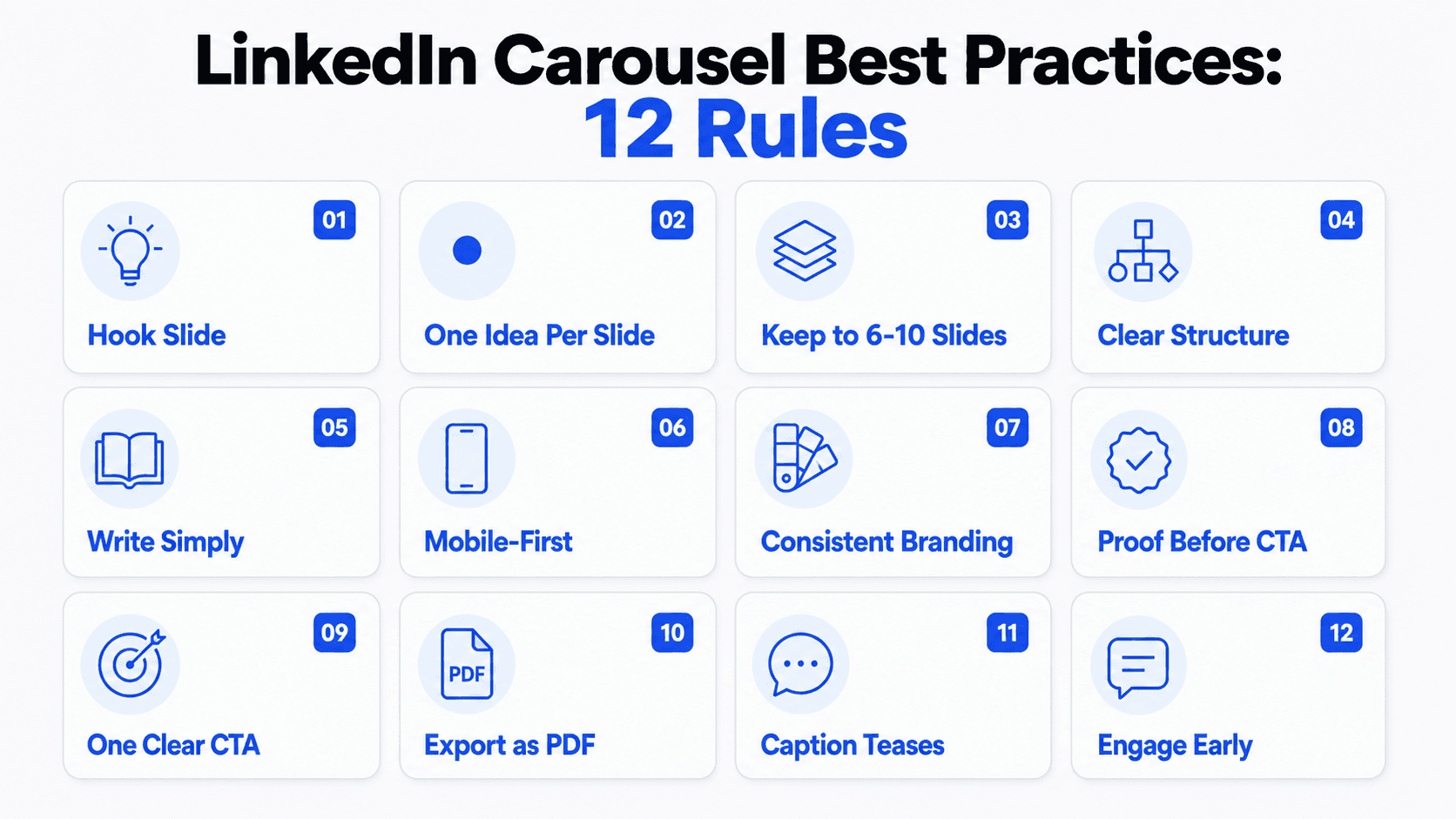
1. Make the hook slide a promise, not a title
The rule: Slide one should state a specific outcome or claim, not a vague topic label like “My Thoughts on Marketing.”
Why: LinkedIn only shows slide one before someone decides whether to swipe. A vague title gives no reason to continue; a specific promise (“the 4-step process I use to write a landing page headline in under 10 minutes”) tells someone exactly what they’d get by swiping.
2. One idea per slide, no exceptions
The rule: If a slide needs “and” to describe its content, split it into two slides.
Why: Carousels aren’t slide decks split across pages, they’re a sequence of single, digestible ideas. Cramming two points onto one slide is the single most common reason carousels feel cluttered and get abandoned mid-swipe.
3. Keep the carousel to 6-10 slides
The rule: Aim for 6 to 10 slides for most topics; use LinkedIn’s much higher platform limit only when the content genuinely demands it.
Why: Shorter carousels tend to get swiped through to the end, which sends a stronger completion signal than a longer one that loses people partway. If you’re padding to hit a slide count, that’s a sign to cut rather than extend.
4. Build momentum with a clear structure
The rule: Use a repeatable shape, problem then insight then solution, or step one through step five, rather than a loose pile of unconnected points.
Why: A structure gives each slide a reason to lead into the next one. Random tips without a narrative thread lose people faster than a carousel with a clear beginning, middle, and end, even when the individual points are equally good.
5. Write for a 7th-to-8th-grade reading level
The rule: Keep sentences short and avoid jargon, even for a professional audience.
Why: People are scanning on a small screen while scrolling, not reading closely. Simpler language is faster to process in the one or two seconds someone spends per slide, regardless of how sophisticated your actual audience is.
6. Design for mobile first
The rule: Use large, high-contrast text and generous white space, since most LinkedIn traffic happens on a phone.
Why: Text that looks fine on a desktop preview can become unreadable at typical mobile feed sizes. A carousel that’s hard to read on a phone loses swipes regardless of how good the content is.
7. Keep visual branding consistent across every slide
The rule: Use the same fonts, colors, and layout structure throughout a single carousel, and ideally across your carousels over time.
Why: Consistency builds recognition. Over time, an audience starts identifying your posts by look alone before they even see your name, which compounds the value of every carousel you publish.
8. Use the second-to-last slide for proof, not just summary
The rule: Before the closing CTA, include something concrete, a specific result, a quote, or a data point, rather than only restating the earlier points.
Why: A pure summary slide adds little new value right before someone decides whether to act. Proof gives the closing CTA more weight, since it’s the last thing someone reads before deciding to comment, save, or follow.
9. End with one specific call to action, not three
The rule: Pick a single outcome you actually want (a comment, a save, a follow) and ask for that one thing clearly.
Why: Offering “follow for more,” “save this,” and “comment below” all in the same slide creates decision paralysis. A single, specific ask converts better than a menu of options nobody commits to.
10. Export as a PDF, not images
The rule: Upload your carousel as a PDF (or PPT, PPTX, DOC, or DOCX) through LinkedIn’s “Add a document” option.
Why: LinkedIn retired native multi-image carousel uploads in late 2023. Uploading separate image files creates a static gallery, not a swipeable carousel; only a document upload renders the swipe experience LinkedIn users expect.
11. Write a caption that teases, not summarizes
The rule: Lead the caption with a hook and one line of context, and let the slides carry the actual value.
Why: Only the first line or two of a caption show before LinkedIn truncates it. If the visible part gives away everything the carousel covers, there’s no reason left to swipe.
12. Engage in the comments early
The rule: Reply to comments soon after publishing rather than checking back hours later.
Why: Early engagement compounds. A post that’s already generating conversation signals relevance, and replying promptly encourages more people to comment rather than scroll past a post with no visible activity.
How to Schedule a LinkedIn Carousel Post
Publishing on a consistent cadence matters more than any single rule above, so it’s worth knowing how to actually schedule a carousel rather than relying on remembering to post it live every time.
LinkedIn’s native scheduler: After uploading your document and writing your caption, look for the clock icon next to the “Post” button in the composer (rather than clicking “Post” itself). This opens a date and time picker. LinkedIn lets you schedule a post, including a document/carousel post, up to 3 months in advance. Once scheduled, it publishes automatically at the chosen time without you needing to be online. LinkedIn’s help center has the current scheduling specifics if they change.
What the native scheduler doesn’t do: It’s built for scheduling one post at a time from your own account. It doesn’t support bulk scheduling a batch of carousels at once, switching between multiple company pages or accounts from a single queue, or routing a draft through an approval step before it goes live. If you’re posting solo or for a single page, the native scheduler covers the need. If you’re managing carousels across several accounts or need someone else to approve a draft before it publishes, that gap is what third-party social media scheduling tools are built to fill, at the cost of an extra subscription.
Where scheduling fits with the rules above: Rule 12 (engage in the comments early) still applies to a scheduled post exactly as it would to one posted live. Scheduling solves for consistency, not for the first-hour engagement window, so plan to be available to reply to comments around whatever time you schedule the post for, not just when you originally wrote it.
Auditing Your Last Few Carousels Against These Rules
Before applying these rules to your next carousel, it’s worth running them backward against your last three to five posts. This tends to surface patterns a single carousel review misses.
Pull up your last five carousels and check the hook slides side by side. If more than one or two read like topic labels rather than specific promises, that’s a pattern worth fixing at the source, not just on the next post.
Count the average slide length. If most of your recent carousels run past 12 slides, check whether that’s because the topics genuinely needed the depth, or because points weren’t getting trimmed during drafting.
Look at your last five closing slides. A pattern of generic “follow for more” endings across multiple posts is a stronger signal than one weak ending, since it suggests the CTA slide has become an afterthought rather than a deliberate step in the process.
Check design consistency across the batch, not just within one carousel. Rule 7 covers consistency within a single post, but consistency across your carousels over time is what actually builds recognition. If your last five carousels each use different fonts or color treatments, an audience following you regularly won’t build the pattern recognition that makes a post immediately identifiable as yours.
This kind of backward audit usually takes 15 minutes and tends to reveal one or two rules you’re consistently skipping, which is more useful than trying to remember all 12 rules while drafting the next carousel from scratch.
Quick Reference Checklist
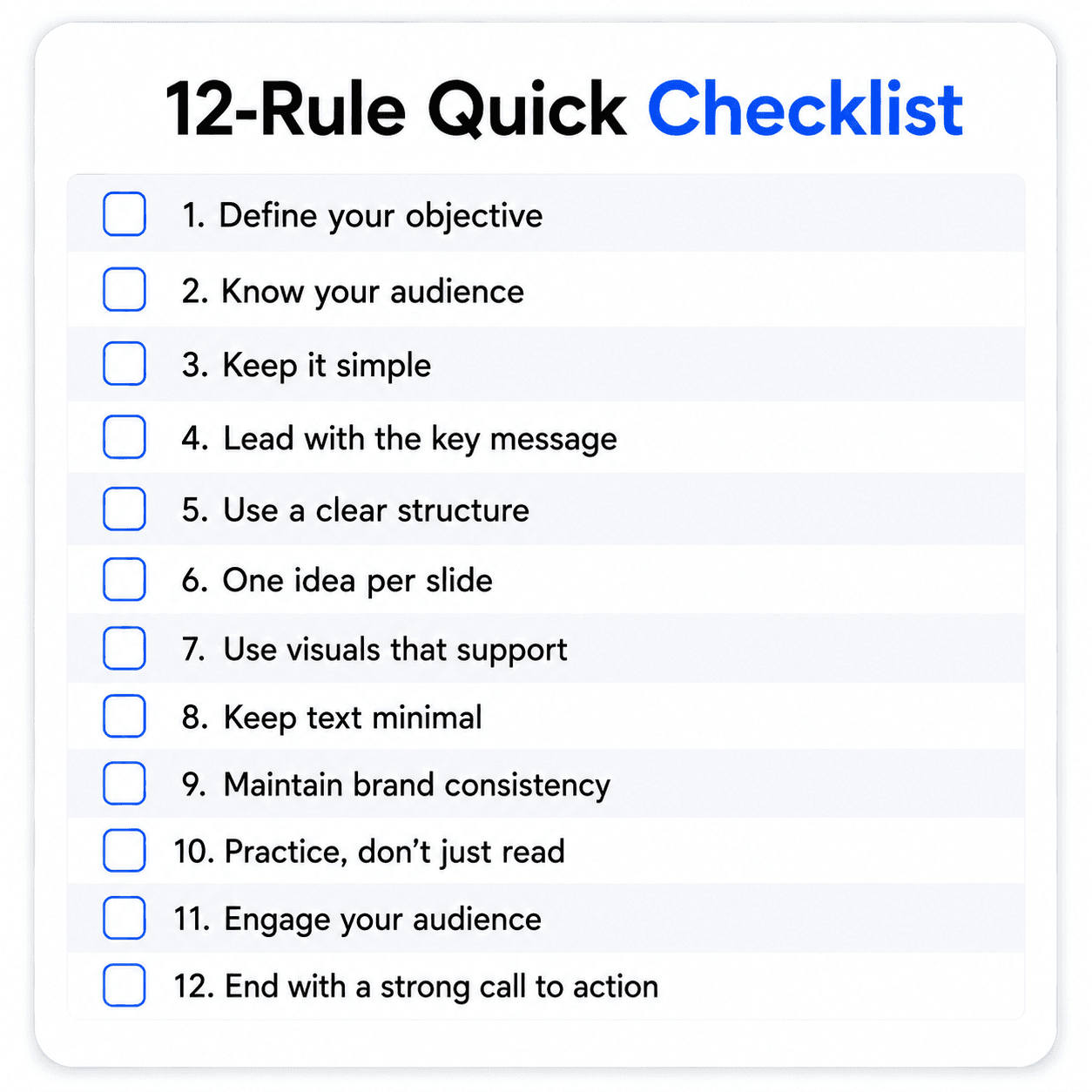
Why These Rules Work Together, Not Individually
None of these 12 rules operate in isolation, which is worth understanding before treating this as a checklist to tick through mechanically. A strong hook (rule 1) earns the swipe, but if the very next slide breaks rule 2 by cramming two ideas together, the momentum the hook bought gets spent immediately. A clean structure (rule 4) means little if the design isn’t legible on mobile (rule 6), since a well-organized carousel nobody can read isn’t actually well organized in any way that matters.
The rules cluster into three phases of the same swipe-through journey. Rules 1 and 2 earn the initial swipe and prevent the immediate bounce. Rules 3 through 7 keep someone swiping once they’ve started, through structure, simplicity, and legibility. Rules 8 through 12 convert a completed swipe into an action, comment, save, or follow, that extends the carousel’s reach beyond the person who just read it.
A carousel that nails the hook but ignores mobile legibility loses people at slide two. A carousel that’s beautifully designed but ends with three competing CTAs converts none of them. The rules aren’t a menu to pick favorites from, they’re sequential gates, and skipping one usually undercuts the value of getting the surrounding ones right. The same logic applies beyond carousels specifically: what makes a presentation actually work follows the same layered logic, where a strong opening doesn’t rescue a confusing structure.
Grading a Real Carousel Against the Rules
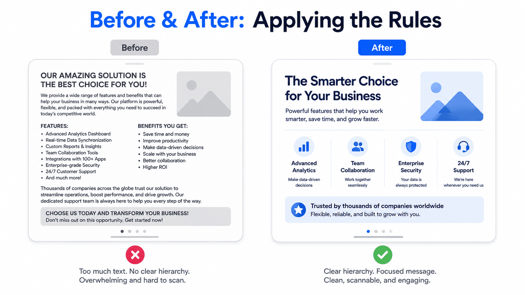
Here’s what applying all 12 rules looks like against one hypothetical carousel, before and after a pass through the checklist.
Before: Slide 1 reads “My thoughts on remote work.” Slide 2 covers both “why remote work increased productivity” and “why some companies are reversing course” in the same slide. The carousel runs 14 slides. Fonts and colors shift between slides 4 and 9. The final slide says “Follow for more, like if you agree, and comment your thoughts.”
Graded against the rules: fails rule 1 (vague hook, not a promise), fails rule 2 (two ideas on slide 2), fails rule 3 (14 slides is past where completion typically drops), fails rule 7 (inconsistent branding), and fails rule 9 (three competing CTAs).
After: Slide 1 becomes “Remote work productivity gains are reversing. Here’s the data nobody’s talking about.” Slide 2 splits into two, one per claim. The carousel gets trimmed to 8 slides by cutting the least essential points rather than padding weaker ones. A single font and color palette applies throughout. The final slide becomes “Comment which side you’re on, remote-first or office-first.”
The content didn’t fundamentally change between these two versions, the same underlying argument survives both. What changed is how much of that argument’s value actually reaches the reader, which is the entire point of applying these rules as a set rather than picking a few to follow loosely.
Applying These Rules in Decktopus AI
Several of these rules are easier to apply consistently when the design is generated rather than built slide by slide by hand.
Rules 2 and 4 (one idea per slide, clear structure) are addressed at the outline stage. Decktopus AI shows a reviewable, card-by-card outline before building the final design, so you can catch a slide trying to cover two ideas, or a structure that doesn’t flow, before it’s a finished visual.
Rules 6 and 7 (mobile legibility, consistent branding) are handled by the generation itself. Choosing a Brand Import pulls your colors, typography, and logo from your website URL automatically, keeping every slide consistent without manually re-applying the same styles each time.
Rule 10 (export as PDF) is a straightforward export choice: Decktopus AI supports PDF, PPT, and PNG export, so choosing PDF for a LinkedIn carousel is a single setting rather than a separate conversion step.
To refine any slide against these rules after generation, Edit with AI lets you describe the change (“tighten this to one idea,” “make the CTA more specific”) in plain language with a preview before applying, and Edit Text handles direct manual fixes.
Start a carousel on Decktopus AI with these 12 rules already baked into the workflow.
How to Know If These Best Practices Are Actually Working
Applying all 12 rules doesn’t mean much if you never check whether they’re actually moving the numbers. LinkedIn carousel analytics tell you specifically which of these rules are earning their keep, and which ones you can loosen for a particular carousel.
Check impressions and reach first, but don’t stop there. Impressions tell you how many people saw the post; they say nothing about whether rule 1 (the hook) actually earned a swipe. Treat impressions as the baseline you’re trying to move with everything else, not the success metric itself.
Swipe-through and completion signal whether rules 1 through 7 are working. LinkedIn doesn’t expose a raw “percentage who reached the last slide” number the way some platforms do for stories, but you can approximate it: a high ratio of comments and saves relative to impressions on a specific carousel is a reasonable proxy that people made it deep enough into the slides to find something worth reacting to. If a carousel gets strong impressions but comments and saves lag well behind your other posts, that’s a signal something between the hook and the closing CTA is losing people, not that the topic itself failed.
Saves are the strongest signal that rules 2, 4, and 8 are landing. A carousel people save is one they found worth returning to, which means the structure held together (rule 4), each slide carried real information (rule 2), and the proof slide before the CTA (rule 8) gave them a reason to treat the post as a reference rather than a one-time read. A carousel with high views but a low save rate relative to your other posts usually means the content was skimmable but not valuable enough to bookmark.
Comments test whether the closing CTA (rule 9) is actually specific. A generic “follow for more” produces silence. A single, specific ask produces a measurable comment count you can compare carousel to carousel. If your comment counts are consistently low across several posts, rule 9 is the first place to check, since it’s the rule most likely to get generic under a deadline.
Track new followers and profile visits attributable to a specific carousel, not just to your account overall, using LinkedIn’s native post analytics (available on the post itself, or through your Creator or Company Page analytics). A carousel that converts views into profile visits is doing more than entertaining; it’s building the kind of recognition rule 7 (consistent branding) is meant to compound over time.
Compare a carousel against your own baseline, not an external benchmark. LinkedIn carousel engagement rates vary enormously by industry, audience size, and posting cadence, so a specific external percentage isn’t a reliable target. What matters is whether this carousel outperformed your last five, using the same account and audience, since that comparison controls for the variables an external number can’t.
Run the “which rule broke” check when a carousel underperforms. If saves are low, check rules 2, 4, and 8. If comments are low, check rule 9. If the drop-off seems to happen early, check rules 1 and 6 (hook and mobile legibility). Treating a weak carousel as a diagnostic exercise, rather than just moving on to the next post, is what turns these 12 rules from a one-time checklist into an actual feedback loop.
FAQ
What’s the single most important LinkedIn carousel best practice?
The hook slide. If slide one doesn’t earn a swipe with a specific promise, none of the other rules matter, since no one sees past it.
How many slides is too many for a LinkedIn carousel?
There’s no universal cutoff, but completion rates tend to drop noticeably past 12 slides for most topics. LinkedIn’s platform limit is far higher (up to 300 pages), but that’s a hard limit, not a performance target.
Do these best practices apply to every industry, even a “boring” one?
Yes. The mechanics (a hook, one idea per slide, a proof point, a specific CTA) work regardless of topic. What changes by industry is the content itself, not the underlying structure.
Can I still post a carousel on LinkedIn if I only have images, not a document?
Not as a swipeable carousel. LinkedIn only renders the swipe format from a document upload (PDF, PPT, PPTX, DOC, or DOCX). Separate image files upload as a static gallery instead.
Should I follow all 12 rules on every single carousel?
Treat them as defaults, not a rigid checklist you can never deviate from. A carousel that intentionally breaks one rule for a specific reason (a longer carousel because the topic genuinely needs 15 steps, for example) can still work if the reasoning is sound.
Which rule matters most if I can only fix one thing before posting?
If a carousel is already built and you only have time to fix one issue, check rule 9, the closing CTA. It’s common to spend most of the effort on the hook and design, then default to a generic “follow for more” on the last slide, which wastes the strongest conversion point in the entire post.
How do I know if my LinkedIn carousel is actually performing well?
Look at saves and comments relative to your own past posts, not an external benchmark. Saves signal the content was valuable enough to bookmark; comments signal the closing CTA was specific enough to act on. If both lag your usual numbers, the drop-off is usually traceable to a specific rule, a weak hook, a generic CTA, or a slide that broke the one-idea-per-slide rule, rather than the topic itself.
Can I schedule a LinkedIn carousel post in advance?
Yes. Upload your document, write your caption, then click the clock icon next to “Post” instead of posting immediately. LinkedIn’s native scheduler lets you pick a date and time up to 3 months out and publishes automatically. It only handles one account and one post at a time though, so bulk scheduling, multi-account queues, or approval workflows require a separate third-party tool.
Do these rules apply the same way to a carousel meant purely for reach versus one meant to drive leads?
The rules stay the same, but which ones you optimize hardest shifts. A reach-focused carousel should lean hardest into rules 1 through 4 (hook, one idea per slide, slide count, structure), since the goal is maximum swipe-through and shares. A lead-focused carousel should weight rules 8 and 9 (proof before the CTA, one specific ask) more heavily, since the goal is converting attention into a specific next step rather than just visibility.
Want a head start with a pre-built layout while still following these rules? Free LinkedIn Carousel Templates for 2026 covers where to find one.
Conclusion
None of these 12 rules are complicated on their own; the value is in applying all of them consistently rather than getting a few right and letting the rest slip. A strong hook doesn’t save a carousel with no structure, and a great structure doesn’t save one exported as images instead of a document. Treat this as a checklist to run through before every carousel goes live, not a one-time read.
Ready to build a carousel with these rules baked into the process? Start a carousel on Decktopus AI, or see the full feature set on the carousel maker landing page.
Related posts

How AI Voice Agents Help Sales Teams Prepare and Deliver Better Presentations
Learn how AI voice agents help sales teams turn call insights into focused slides, stronger delivery, and more confident customer presentations at every stage.
Marketing

Instagram Carousel Size & Dimensions Guide (2026)
Instagram carousel size in 2026: exact dimensions for square, portrait, and landscape, plus file limits and safe zones, verified across sources.
Marketing

LinkedIn Carousel Size, Dimensions & Format Guide 2026
LinkedIn carousel size in 2026: exact dimensions, file limits, aspect ratios, and formatting rules so your slides never get cropped.
Marketing