Marketing
Instagram Carousel Size & Dimensions Guide (2026)
Instagram carousel size in 2026: exact dimensions for square, portrait, and landscape, plus file limits and safe zones, verified across sources.


İlayda Tunaboylu
Instagram doesn't ask what size you designed your carousel at. It takes whatever you upload and forces it to fit its own display rules, which usually means cropping, compressing, or adding borders you didn't choose. Since Instagram sets the aspect ratio for an entire carousel based on the first slide, getting the dimensions right before you design a single slide is the difference between a clean carousel and one with text clipped off the edges by slide four.
This guide covers the exact Instagram carousel dimensions for 2026, cross-checked across multiple sources rather than a single estimate, plus the file limits and safe zones that go with them. If you're also posting to LinkedIn, the LinkedIn Carousel Size, Dimensions & Format Guide 2026 covers that platform's separate spec, since the two don't share the same numbers or even the same file format.
What Is an Instagram Carousel?
An Instagram carousel is a single post that holds multiple images or videos, which viewers swipe through one slide at a time instead of seeing just one photo. Each slide can carry its own visual, so the format works for anything that benefits from being broken into steps or parts: tutorials, listicles, before-and-afters, product features, or a story told across several frames. Since every slide lives inside one post, the whole sequence shares a single caption, a single set of comments, and, as this guide covers, a single set of dimension rules. For the full walkthrough of building and publishing one, see how to make an Instagram carousel post.
Quick Answer
Design your Instagram carousel at 1080x1080 pixels (square, 1:1), 1080x1350 pixels (portrait, 4:5), or 1080x608 pixels (landscape, 1.91:1). Portrait takes up the most vertical feed space and is the format Instagram itself has been favoring in recent grid layout changes. Every slide must match the aspect ratio of your first slide, since Instagram crops later slides to fit whatever ratio slide one uses. Instagram's Help Center documents the current aspect ratio requirements if they change.
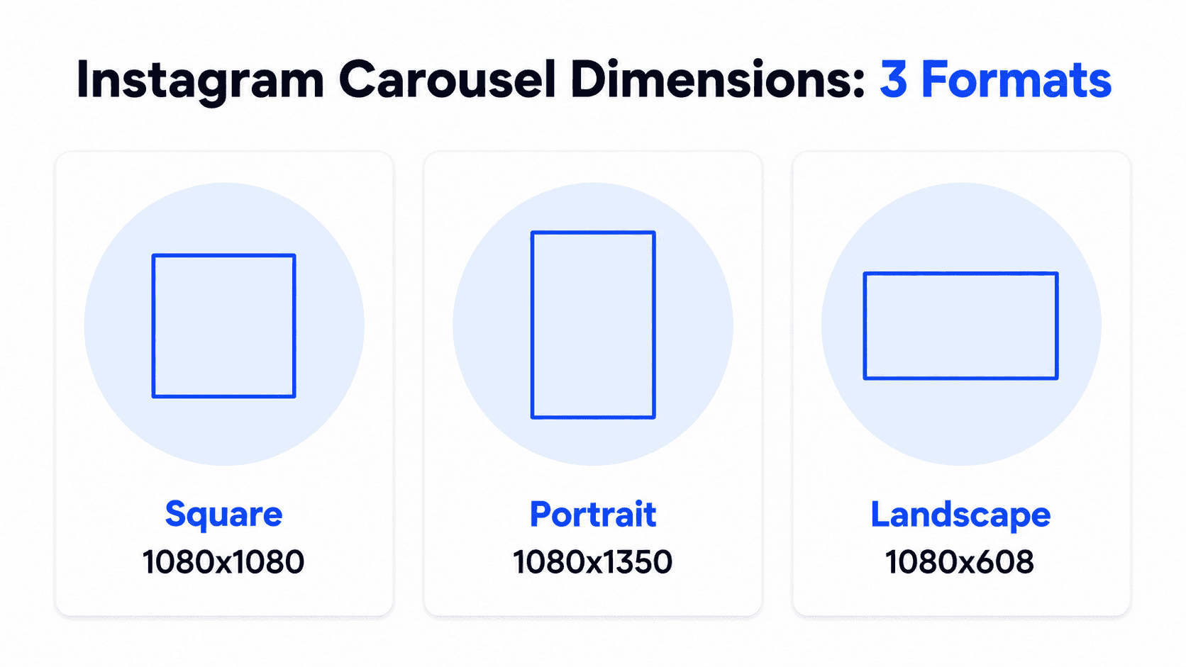
Instagram Carousel Dimensions in Full
Format | Pixel dimensions | Aspect ratio | Best for |
|---|---|---|---|
Square | 1080 x 1080 px | 1:1 | Universal safe choice, product catalogs, grid consistency |
Portrait | 1080 x 1350 px | 4:5 | Maximum vertical feed space, hook-driven and story content |
Landscape | 1080 x 608 px (some sources cite 1080 x 566 px) | 1.91:1 | Wide visuals: photography, real estate, panoramic shots |
The landscape height figure varies slightly between sources (1080x608 versus 1080x566), a small enough difference that it likely reflects rounding or slightly different source documentation rather than a meaningful design difference. If landscape is your format, 1080 pixels wide with a height in that range will render correctly; the safest move is to check your specific design tool's landscape preset against whichever number it defaults to.
Video slides follow the same dimensional rules as images: 1080x1080 for square, 1080x1350 for portrait. One thing to watch for: adding a video slide to a carousel can push the entire post toward portrait sizing, even if your first slide was square or landscape, so build the whole sequence around one aspect ratio before you add video rather than after.
A note on mixing dimensions: Instagram's default behavior is still to crop every slide to match the first one, but a "Mixed" resize option (added in late 2024) lets you combine different ratios in a single carousel if you opt into it manually. When you use Mixed, portrait images display at 4:5 and square or landscape images get padding added above and below rather than being cropped. It's an option, not the default, so unless you deliberately select Mixed, treat "match your first slide's ratio" as the rule.
Which Format Should You Use
Portrait (1080x1350) takes up the most screen space in the feed, which gives your first slide the best chance of stopping a scroll from someone who doesn't already follow you. It's the strongest choice when the goal is reach or when the hook slide needs to dominate attention.
Square (1080x1080) is the safest, most universally consistent choice. It renders predictably across the feed, Explore, profile grid, and shares, and it's the easier format to keep consistent if you're building a recognizable grid aesthetic. It's a strong default for educational content, listicles, and anything where reliability matters more than maximum screen dominance.
Landscape (1080x608) takes up the least vertical space, so it's the format most often skipped, which is part of why it can stand out when used deliberately. It suits content where the visual itself is the draw: photography, interior or architectural shots, real estate listings, wide product comparisons.
Whichever you pick, apply it consistently. Instagram sets the whole carousel's aspect ratio from the first slide, so switching formats mid-carousel isn't something the platform supports cleanly.
File Type and Size Limits
Requirement | Limit |
|---|---|
Supported image formats | JPEG, PNG, WebP |
Supported video formats | MP4, MOV |
Maximum image file size | 30 MB |
Maximum video file size | 4 GB |
Minimum resolution | 1080 px wide (below this, expect visible compression) |
Video length per slide | Up to 60 seconds |
Minimum slides per carousel | 2 (a single image is a regular post, not a carousel) |
Maximum slides per carousel | 20 (raised from 10 in 2024) |
Color mode | RGB (not CMYK, which shifts color on upload) |
The 20-slide maximum is the figure most consistently confirmed across current sources; be aware that a few older or slower-to-update pages still cite the pre-2024 limit of 10, so if you see that number elsewhere, it's likely outdated rather than a platform restriction that varies.
Safe Zones and Mobile Legibility
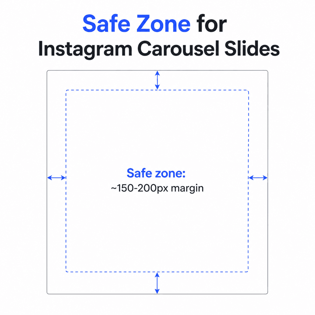
Keep critical text and visual elements roughly 150 to 200 px away from every edge of each slide. Instagram can clip content near the border, especially in profile grid view and when a post gets shared to Stories.
Design at 1080 px minimum width regardless of format; anything smaller gets visibly compressed once Instagram processes the upload. Use the sRGB color profile to keep colors consistent across devices, since a mismatched profile can shift how your palette looks between your design tool and the live post.
Your profile grid adds another layer to plan for: it displays every post cropped to a 3:4 ratio, center-cropped regardless of the post's actual aspect ratio. Horizontal images lose width from the sides; vertical and square images lose height from the top and bottom. A carousel designed at 4:5 (1080x1350) gets a small trim top and bottom on the grid, while the full post still displays at 4:5 when someone taps into it, so keep faces, text, and key visuals centered enough to survive that grid crop. Good presentation design principles like contrast, hierarchy, and consistent margins apply just as directly to a carousel slide as they do to a slide deck.
Building a Correctly Sized Carousel in Decktopus AI
Here's how these sizing rules translate into an actual Decktopus AI workflow, so the pixel math happens automatically rather than something you calculate by hand.
1. Start with a prompt or document. Enter your topic or upload a source document. Decktopus AI generates the carousel structure from this, with the visual design built from scratch rather than pulled from a template.
2. Choose your visual direction. Pick a previously used style, a Brand Import from your website URL, or a fully AI-generated look.
3. Review the card-by-card outline. Check the slide-by-slide structure before the final design is built.
4. Generate the full design. Decktopus builds the complete carousel with Instagram's supported formats in mind, rather than a generic size that needs manual reformatting afterward.
5. Refine with Edit with AI or Edit Text. Adjust copy or styling with a plain-language prompt and preview, or make direct text edits.
6. Export as PNG. Standard or compressed quality, as individual image files at a consistent aspect ratio, since Instagram needs separate images rather than a single PDF document the way LinkedIn does.
Start a correctly sized Instagram carousel on Decktopus AI and skip the manual pixel-checking altogether.
Common Sizing Mistakes
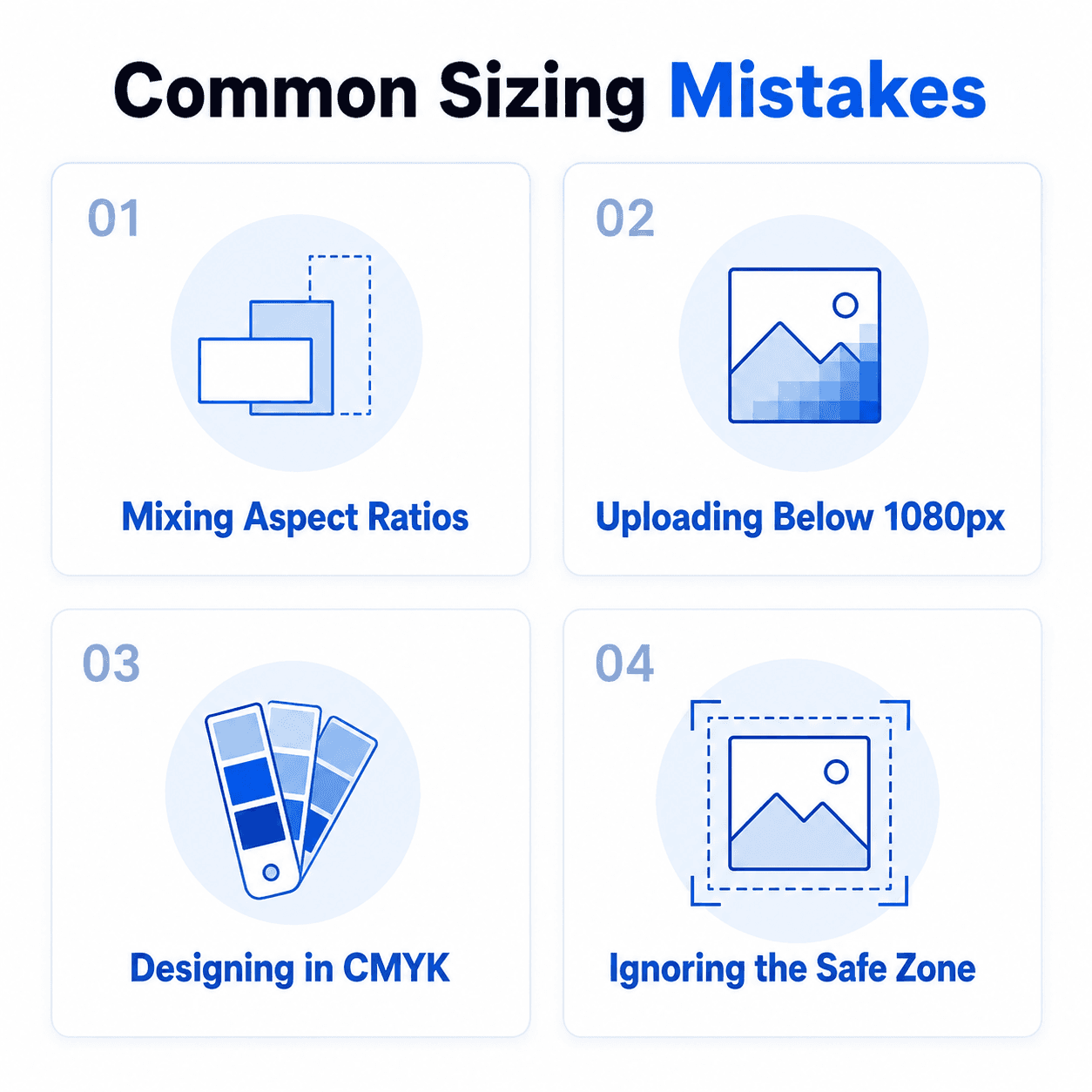
Mixing aspect ratios across slides. Even one mismatched slide gets auto-cropped to match the first slide's ratio, often cutting off exactly the part of the design you didn't want cropped.
Uploading below 1080 px wide. Anything smaller gets visibly compressed once Instagram processes it, especially noticeable on text-heavy slides.
Designing in CMYK instead of RGB. Colors that look correct in a CMYK-based design tool can shift once displayed on Instagram's RGB-based feed.
Ignoring the safe zone. Text or logos placed too close to the edge are the most common thing that gets clipped in profile grid view or when a post is shared to Stories.
Assuming the slide limit is still 10. It was raised to 20 in 2024; older guides and even some current ones haven't caught up to that change.
Assuming you can fix a bad crop after uploading. Once Instagram auto-crops a mismatched slide, there's no way to adjust that crop later, during or after upload. If a slide's dimensions are off, crop it yourself before uploading rather than leaving it to Instagram.
How to Tell If a Sizing Mistake Is Costing You Engagement
A carousel with a small sizing error still uploads and still looks fine at a glance, which is exactly why these problems go unnoticed until you check the actual numbers instead of just the file.
A weak save/share rate on a specific carousel is worth checking against the crop, not just the content. If a carousel underperforms your usual saves and shares, open it on your own phone and check specifically whether the profile grid's 3:4 center-crop is cutting off a face, key text, or the main visual on slide one. A hook that reads fine in the full post but gets awkwardly cropped in the grid preview loses the swipe before anyone opens the post.
Compression is a common, invisible cause of a flat-performing carousel. If a specific post underperforms and the source images were under 1080 px wide, or a slide got auto-cropped from a mismatched aspect ratio, that's worth ruling out before assuming the topic or copy failed. Compare the exported file against the live post to check whether Instagram's processing visibly softened text or key details.
Compare a carousel's performance to your own account's history, not an external benchmark. Engagement varies too much by niche and audience size for a general percentage to be a useful target here. What matters is whether a carousel underperforms your last several posts built the same way, which points to something specific (a crop, a compression issue, a safe-zone violation) rather than a topic that simply didn't land.
A pattern across multiple carousels, not a single post, is the reliable signal. One underperforming carousel could be the topic. Several carousels built with the same aspect ratio or export settings all underperforming is a stronger sign the sizing choice itself, not the content, is the recurring issue.
FAQ
What is the correct Instagram carousel size in 2026?
1080x1080 pixels (square), 1080x1350 pixels (portrait), or 1080x608 pixels (landscape). Portrait takes up the most feed space; square is the safest universal choice; landscape suits visual-first content.
Do all slides in an Instagram carousel need to be the same size?
Yes. Instagram sets the aspect ratio for the entire carousel based on the first slide you upload. A later slide in a different ratio gets cropped to match rather than displayed as designed.
What's the maximum file size for an Instagram carousel?
30 MB per image, 4 GB per video file.
How many slides can an Instagram carousel have?
Up to 20, raised from a 10-slide limit in 2024. Some older sources still cite the outdated 10-slide figure.
What happens if I upload the wrong dimensions?
Instagram resizes the file to fit its display requirements, typically through cropping, compression, or added borders, none of which you control once the file is uploaded. The only reliable fix is resizing correctly before you upload.
What's the safe zone for Instagram carousel slides?
Roughly 150 to 200 px from every edge. Content placed closer than that risks being clipped in profile grid view or when shared to Stories.
How do I know if a sizing mistake is hurting my carousel's engagement?
Check saves and shares against your own past posts, then open the live carousel on your phone and check whether the profile grid's 3:4 crop is cutting off the first slide's key text or visual. A pattern across several carousels built the same way is a stronger signal than any single post underperforming.
Cross-posting the same carousel to TikTok? The TikTok Carousel Guide covers what to adjust for that platform's format.
Conclusion
The specific format matters less than picking one, square, portrait, or landscape, and applying it consistently across every slide at 1080 px minimum width, exported as individual images rather than mixed ratios. Get the dimensions locked in once and every carousel after that follows the same safe template.
Ready to build a correctly formatted carousel without doing the pixel math yourself? Start a carousel on Decktopus AI, or see the full feature set on the carousel maker landing page.
Related posts

How AI Voice Agents Help Sales Teams Prepare and Deliver Better Presentations
Learn how AI voice agents help sales teams turn call insights into focused slides, stronger delivery, and more confident customer presentations at every stage.
Marketing

LinkedIn Carousel Size, Dimensions & Format Guide 2026
LinkedIn carousel size in 2026: exact dimensions, file limits, aspect ratios, and formatting rules so your slides never get cropped.
Marketing

Best AI Carousel Makers in 2026 (Tested & Compared)
The best AI carousel maker for 2026, compared by AI approach, platforms, and pricing. Find the right tool for LinkedIn and Instagram carousels.
Marketing