Marketing
LinkedIn Carousel Size, Dimensions & Format Guide 2026
LinkedIn carousel size in 2026: exact dimensions, file limits, aspect ratios, and formatting rules so your slides never get cropped.


İlayda Tunaboylu
Getting the LinkedIn carousel size wrong doesn't just look sloppy, it can mean text getting clipped at the edges, slides rendering blurry after compression, or an inconsistent aspect ratio forcing an awkward crop halfway through your carousel. Since LinkedIn generates the swipeable experience from a document upload rather than individual images, the pixel dimensions of every page in that document matter before you ever hit publish.
This guide covers the exact dimensions, file limits, and formatting rules for LinkedIn carousels in 2026, cross-checked against multiple sources rather than a single estimate. If you're building for Instagram too, the Instagram Carousel Size & Dimensions Guide 2026 covers the equivalent specs for that platform, since the two don't share the same numbers.
What Is a LinkedIn Carousel?
A LinkedIn carousel is a single post built from a multi-page document, most often a PDF, that renders as a set of swipeable slides directly in the feed rather than one flat image. Viewers swipe through each page, which makes the format suited to frameworks, listicles, case studies, or any point that lands better broken into steps than compressed into one paragraph. Unlike Instagram, where a carousel is a sequence of separate image files, a LinkedIn carousel is technically one uploaded document, so the whole thing shares a single caption and a single upload, and that document nature is exactly why the dimensions in this guide matter: get the page size wrong at the design stage and there's no fixing it after the file is live. For the full walkthrough of building and publishing one, see how to make a LinkedIn carousel.
Quick Answer
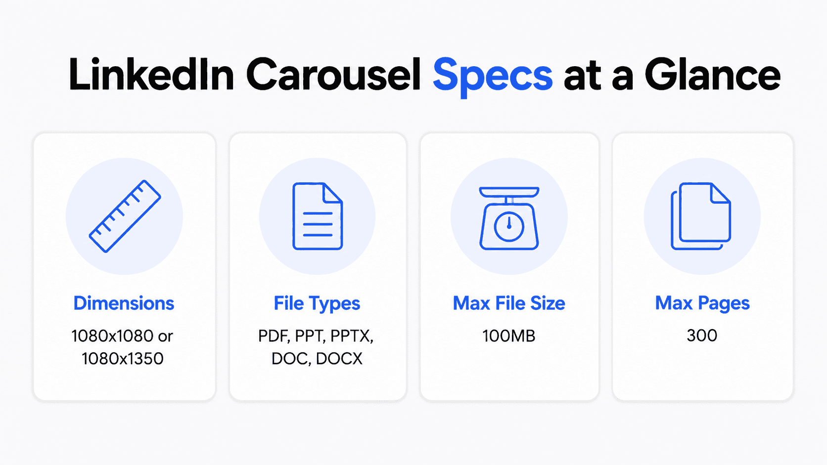
Design your LinkedIn carousel at 1080x1080 pixels (square, 1:1) or 1080x1350 pixels (portrait, 4:5). Export as a PDF, in RGB color (not CMYK). Keep the file under LinkedIn's 100 MB hard limit, ideally closer to 3-10 MB for faster mobile loading. Use the same aspect ratio on every slide, since LinkedIn applies your first slide's dimensions to the entire carousel.
One distinction worth flagging up front: this guide covers organic carousel posts (the document/PDF format). LinkedIn's paid Carousel Ads product has its own stricter spec, exactly 1080x1080 pixels with no other ratio accepted, so don't assume your organic carousel dimensions carry over if you're also running carousel ads. See the callout below for the full ad spec.
LinkedIn Carousel Dimensions in Full
Format | Pixel dimensions | Aspect ratio | Best for |
|---|---|---|---|
Square (most common recommendation) | 1080 x 1080 px | 1:1 | Universal, renders consistently on desktop and mobile |
Portrait | 1080 x 1350 px | 4:5 | Mobile-first audiences, takes up more vertical feed space |
Landscape | 1920 x 1080 px (or 1080 x 608 px) | 16:9 | Data-heavy slides repurposed from wide presentation decks |
Square and portrait are the two formats most consistently recommended across carousel-focused guides. Landscape is supported but renders smaller in the mobile feed, where most LinkedIn traffic happens, so it's the least common choice for a carousel-first design.
Whichever format you choose, apply it to every slide. LinkedIn sets the aspect ratio for the whole document based on your first page, so a mismatched later slide gets auto-cropped rather than displayed as designed.
A note on 9:16 (vertical): this is not an officially supported ratio for LinkedIn document carousels. Uploading a 9:16 slide gets cropped down to 4:5 in the feed, so skip it rather than treating it as a fourth option.
LinkedIn Carousel Ads: A Different Spec
If you're also running paid Carousel Ads, don't reuse your organic dimensions. LinkedIn's Carousel Ads require:
Requirement | Spec |
|---|---|
Card dimensions | Exactly 1080 x 1080 px (1:1), no other ratio accepted |
File format | JPG or PNG only (no GIF, not even static) |
Max file size per card | 10 MB |
Number of cards | 2 to 20 |
Bottom safe zone | 50 px |
Headline | 45 characters max |
An image that isn't exactly 1:1 gets rejected or cropped, cutting off text or visuals at the edges. This is a separate product from the organic document carousel this guide otherwise covers.
File Type and Size Limits
Requirement | Limit |
|---|---|
Supported file types | PDF, PPT, PPTX, DOC, DOCX |
Recommended file type | PDF (renders most consistently and preserves embedded fonts) |
Maximum file size | 100 MB |
Practical file size target | 3 to 10 MB; smaller files load faster on mobile |
Maximum pages/slides | 300 |
Practical slide count | 6 to 12 slides for most carousels |
Color space | RGB, not CMYK |
The 300-page and 100 MB figures are LinkedIn's hard platform limits, not recommendations. A carousel that uses the full allowance will upload without errors, but it won't perform like a tighter, well-edited one. If you're exporting from PowerPoint or Google Slides rather than a native PDF export, convert to PDF before uploading; LinkedIn can accept PPT and PPTX directly, but PDF avoids compression artifacts that sometimes show up when LinkedIn converts other formats internally.
Aspect Ratio Rules
LinkedIn reads the aspect ratio from your first slide and applies it to the entire document. That means:
Every slide in the carousel must share the same aspect ratio, or later slides get cropped to match the first one.
Switching between square, portrait, and landscape slides within a single carousel isn't supported cleanly; pick one ratio before you start designing.
If you're repurposing an existing presentation deck (commonly 16:9), expect it to render smaller in the feed than a purpose-built square or portrait carousel.
Safe Zones and Text Sizing
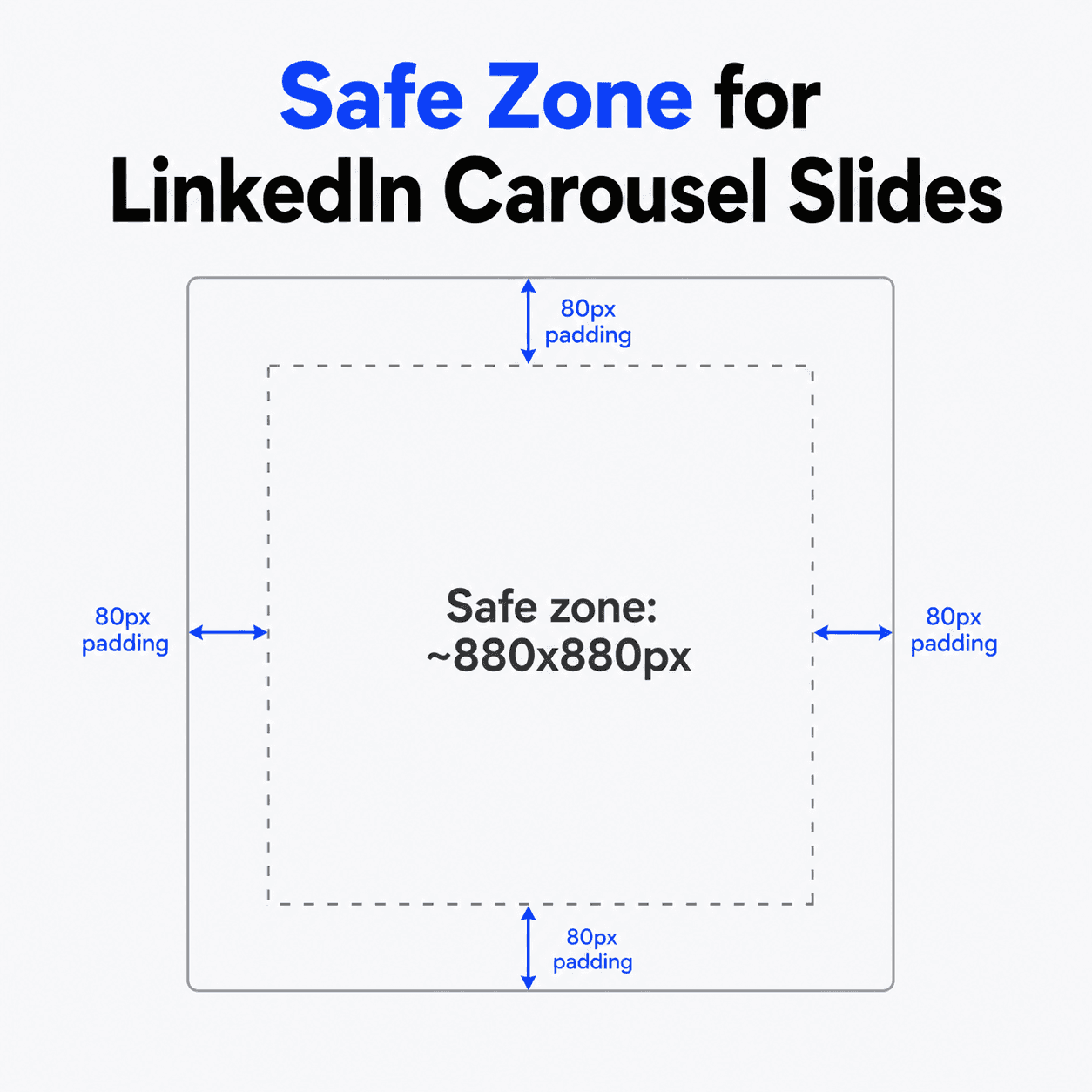
Keep key text and visual elements away from the edges of each slide, since LinkedIn's preview and mobile rendering can crop close to the border.
Element | Guidance |
|---|---|
Safe content area (square, 1080x1080) | Keep critical content within the central ~880x880 px |
Edge padding | Roughly 80 px on all sides |
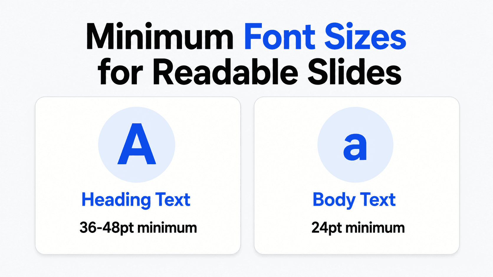
Body text minimum size | 24 pt |
Heading text minimum size | 36 to 48 pt |
Contrast | Maintain strong contrast between text and background for mobile legibility |
Text below these minimums tends to become unreadable once LinkedIn compresses and displays the document at typical feed sizes, especially on mobile.
A real accessibility limitation to know about: LinkedIn doesn't currently support adding alt text to individual slides inside a document/PDF carousel, unlike its regular multi-image posts, where each photo can carry its own alt text. If accessibility for screen-reader users is the priority for a specific post, a multi-image post may serve that goal better than a carousel, even though carousels generally get more reach. At minimum, describe key visuals in the caption when the content matters for accessibility. The same logic that governs typography and layout in any visual medium applies here: color and design choices affect how information gets read, not just its size.
Building a Correctly Sized Carousel in Decktopus AI
Here's how the sizing rules above translate into an actual Decktopus AI workflow, so you don't have to manually calculate pixel dimensions yourself.
1. Start with a prompt or document. Enter your topic or upload a source document. Decktopus AI generates the full carousel structure from this, without a template library to browse.
2. Choose your visual direction. Pick a previously used style, a Brand Import from your website URL, or a fully AI-generated look built from scratch.
3. Review the card-by-card outline. Check the structure before the final design is built, since this is faster to fix than adjusting a finished layout.
4. Generate the full design. Decktopus builds the complete carousel, and since it's generating for LinkedIn's carousel format, the output is built around the platform's supported aspect ratios rather than a generic slide size that needs reformatting afterward.
5. Refine with Edit with AI or Edit Text. Adjust copy or styling with a plain-language prompt and preview, or make direct manual text edits.
6. Export as PDF. Standard or compressed quality. Upload directly to LinkedIn through "Add a document" in the post composer.
Common Sizing Mistakes
Mixing aspect ratios across slides. Even one slide in a different ratio than the rest forces an inconsistent crop across the whole carousel.
Designing at exactly 1080 px and never checking on mobile. Since most LinkedIn traffic is mobile, always preview the exported PDF on a phone screen before publishing, not just on desktop.
Repurposing a 16:9 presentation deck without resizing. It will upload and work, but it renders noticeably smaller in the feed than a purpose-built square or portrait carousel.
Skipping the safe zone. Text or logos placed right at the edge of a slide are the most common thing that gets clipped once LinkedIn renders the document.
Uploading a file close to the 100 MB ceiling. Large files load slowly, and slow-loading carousels lose swipes before someone even sees slide two. Favor vector shapes and text over embedded raster images where you can, compress any background photos before importing them into your design tool, and go easy on heavy gradients, all three add file weight without adding readability.
Exporting in CMYK instead of RGB. Design tools like Canva default some PDF export options to CMYK ("PDF Print"), which is built for print, not screens. Choose the RGB-based export option ("PDF Standard" in Canva) or your colors will look duller or shifted once uploaded.
Designing at exactly 1x and skipping a higher-resolution export. Designing at double the target resolution (2160x2160 for a 1080x1080 slide, for example) and exporting down keeps text and icons sharp on high-density phone screens, rather than looking soft at native size.
Not signaling that the post is swipeable. Some readers don't intuitively know a document post is a swipeable carousel. A small right-pointing arrow or "swipe" label in the corner of your first slide can reduce the drop-off between slide 1 and slide 2.
FAQ
What is the correct LinkedIn carousel size in 2026?
1080x1080 pixels (square, 1:1) or 1080x1350 pixels (portrait, 4:5) are the two most consistently recommended dimensions. Both work; the choice comes down to whether you want a universally safe square format or a more mobile-forward vertical one.
What file format should I export a LinkedIn carousel as?
PDF. LinkedIn also accepts PPT, PPTX, DOC, and DOCX, but PDF renders most consistently and preserves embedded fonts without conversion artifacts.
What's the maximum file size for a LinkedIn carousel?
100 MB is LinkedIn's hard limit. In practice, keeping your file well under that maximum helps it load faster in the feed, which matters for whether someone finishes swiping through it.
How many slides should a LinkedIn carousel have?
LinkedIn allows up to 300 pages, but that's a platform ceiling, not a target. Most well-performing carousels run 6 to 12 slides.
Can I mix square and portrait slides in the same carousel?
No, not cleanly. LinkedIn applies the aspect ratio of your first slide to the entire document, so a later slide in a different ratio gets cropped to match rather than displayed as designed.
What's the minimum font size for LinkedIn carousel text?
Around 24 pt for body text and 36 to 48 pt for headings, based on what's held up as legible once the document renders at typical feed sizes on mobile.
Bonus: Sizing for Cross-Posting to Other Platforms
If you're reusing the same carousel content on other platforms, here's a rough starting point for each:
Platform | Recommended size | Format |
|---|---|---|
1080 x 1350 (4:5) or 1080 x 1080 (1:1) | ||
1080 x 1350 (4:5) | JPG/PNG (multi-image) | |
X / Twitter | 1080 x 1350 or 1200 x 675 (16:9) | JPG/PNG (up to 4 images) |
Threads | 1080 x 1080 (1:1) | JPG/PNG |
1080 x 1350 (4:5) | JPG/PNG (multi-image) |
These are cross-platform starting points, not each platform's current official spec, so double-check the destination platform's own documentation before a high-stakes post.
Conclusion
The exact numbers matter less than the discipline of picking one aspect ratio, 1080x1080 or 1080x1350, and applying it consistently across every slide, exported as a PDF in RGB, well under LinkedIn's file size ceiling. Get the dimensions right once and every carousel after that is a copy-paste of the same safe setup.
Ready to build a correctly formatted carousel without doing the pixel math yourself? Start a carousel on Decktopus AI, or see the full feature set on the carousel maker landing page.
Related posts

How AI Voice Agents Help Sales Teams Prepare and Deliver Better Presentations
Learn how AI voice agents help sales teams turn call insights into focused slides, stronger delivery, and more confident customer presentations at every stage.
Marketing

Instagram Carousel Size & Dimensions Guide (2026)
Instagram carousel size in 2026: exact dimensions for square, portrait, and landscape, plus file limits and safe zones, verified across sources.
Marketing

Best AI Carousel Makers in 2026 (Tested & Compared)
The best AI carousel maker for 2026, compared by AI approach, platforms, and pricing. Find the right tool for LinkedIn and Instagram carousels.
Marketing