Templates & How-to
How to Create a User Flow Diagram: A Step-by-Step Guide for 2026
Learn how to create user flow diagrams with standard symbols, step-by-step methods, real examples, and best practices for product design teams.


Decktopus Content Team
How to Create a User Flow Diagram: A Step-by-Step Guide for 2026
A user flow diagram maps every step a person takes to complete a task within a product — from entry point to final action. It is the most practical tool designers, product managers, and developers have for spotting where users get stuck, drop off, or take unnecessary detours before reaching their goal.
According to Nielsen Norman Group's research on task flows, mapping user paths before design prevents misalignment between intended and actual user behavior, significantly reducing late-stage usability fixes. The reason is straightforward: a user flow forces you to think in sequences rather than screens, revealing gaps and friction points that static wireframes hide.
This guide covers what user flow diagrams are, when to use them, the standard symbols, step-by-step creation methods, real examples across product types, and tools that make the process faster.
Table of Contents
What Is a User Flow Diagram?
Why User Flow Diagrams Matter
User Flow vs. Wireframe vs. Sitemap vs. Customer Journey Map
Standard User Flow Diagram Symbols
How to Create a User Flow Diagram: Step-by-Step
User Flow Diagram Examples
Best Practices for Effective User Flows
Common User Flow Mistakes to Avoid
Tools for Creating User Flow Diagrams
How to Present User Flow Diagrams with Decktopus AI
Frequently Asked Questions
Conclusion
Stay Connected
What Is a User Flow Diagram?
A user flow diagram is a visual representation of the path a user takes through a product to accomplish a specific goal. It maps the sequence of screens, decisions, and actions from an entry point (landing page, app open, email link) through to a completion point (purchase confirmed, account created, report downloaded).
User flows differ from other UX documentation in their focus on sequence and decisions. While a wireframe shows what a single screen looks like, a user flow shows how screens connect. While a sitemap shows the structure of a website, a user flow shows the experience of moving through it.
A well-constructed user flow answers three questions:
Where does the user start? (Entry point — which page, screen, or trigger begins the flow)
What decisions do they make? (Branch points — where the path splits based on user choices or system logic)
Where do they end up? (Terminal point — the goal state, error state, or exit)
Why User Flow Diagrams Matter in Product Design
User flows serve multiple roles across a product team:
For Designers
User flows reveal missing screens, redundant steps, and dead ends before any pixels are pushed. A flow that requires five steps where three would suffice becomes obvious on a diagram in a way it never does in a Figma file.
Designers use flows to validate that the happy path is actually happy — and that edge cases (error states, empty states, permission denials) have somewhere to go.
For Product Managers
User flows are the bridge between business requirements and design execution. They translate "users should be able to check out" into the specific sequence of screens and decisions that make checkout possible.
When stakeholders request new features, mapping the user flow first reveals scope, dependencies, and potential conflicts with existing flows.
For Developers
User flows define the routing logic, state transitions, and API calls needed to support the experience. A developer looking at a user flow can estimate implementation complexity, identify backend dependencies, and plan the data flow before writing code.
For the Entire Team
User flows create a shared language for discussing the product experience. Instead of debating abstract concepts, teams can point to specific nodes and paths: "What happens when a user reaches this decision point without being logged in?"
This specificity prevents misalignment and reduces revision cycles.
User Flow vs. Wireframe vs. Sitemap vs. Customer Journey Map
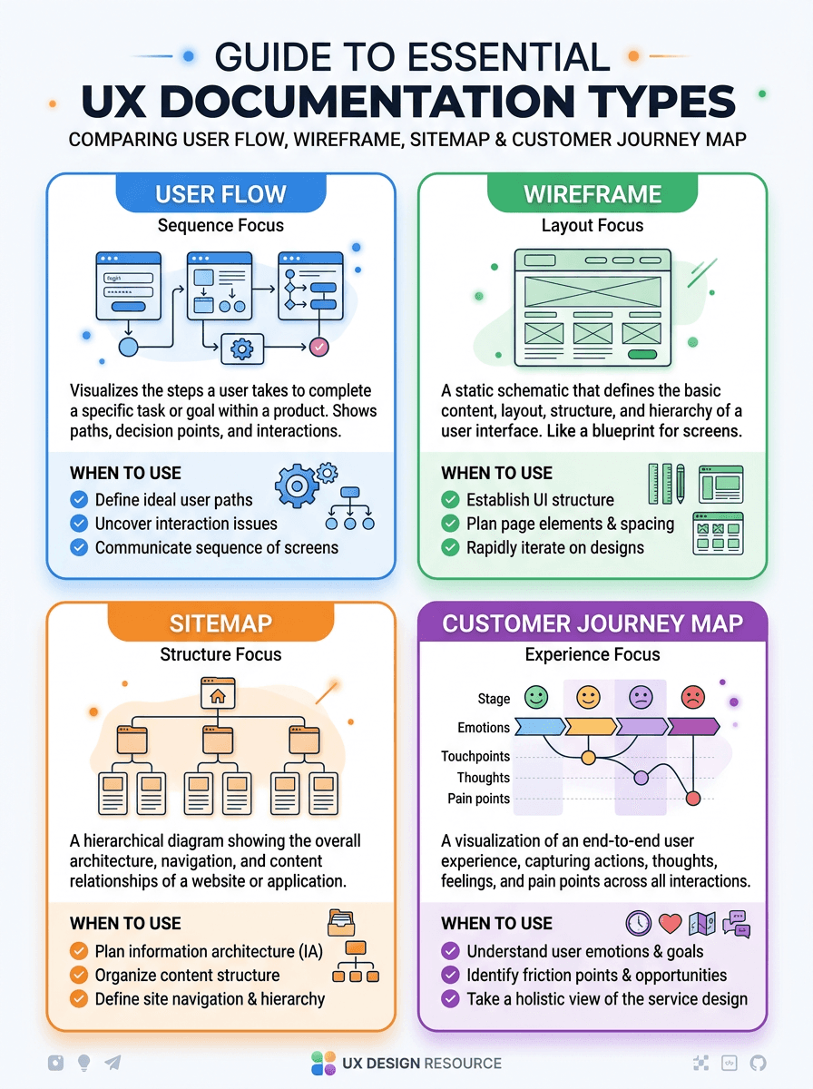
Document Type | What It Shows | Best Used For | Level of Detail |
User Flow Diagram | Sequence of screens and decisions for one task | Mapping task paths, finding friction | Medium — steps and decisions, not layout |
Wireframe | Layout and content structure of one screen | Designing individual pages | High — elements, placement, hierarchy |
Sitemap | Hierarchical structure of all pages | Information architecture, navigation planning | Low — pages and relationships only |
Customer Journey Map | End-to-end experience across all touchpoints | Understanding emotional experience, multi-channel flows | Broad — feelings, pain points, channels |
User flows sit in the sweet spot between sitemaps (too structural) and wireframes (too granular). They capture enough detail to be actionable without requiring design decisions about layout and visual treatment.
Standard User Flow Diagram Symbols
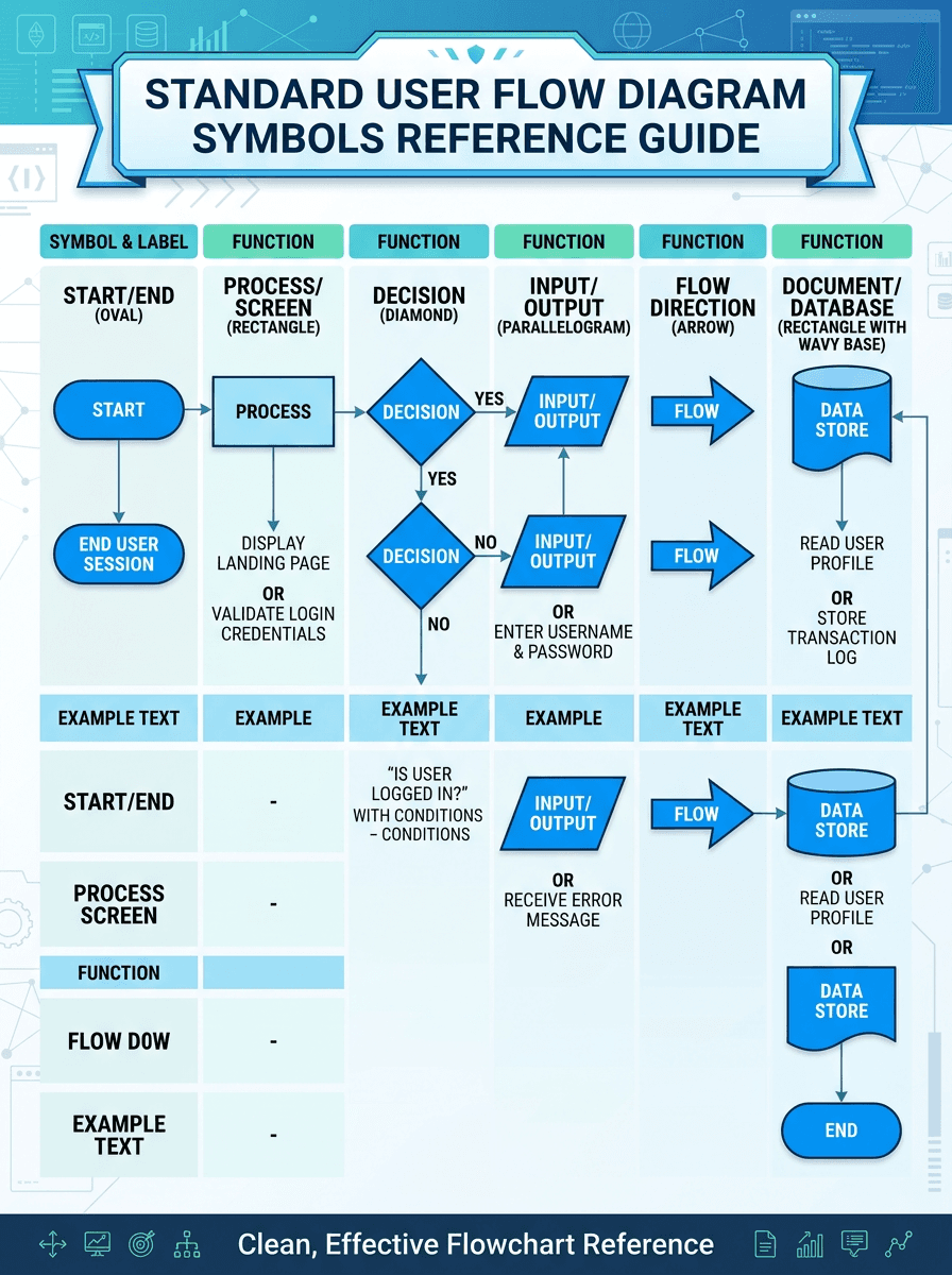
User flow diagrams use a set of standard shapes inherited from flowcharting conventions. Consistent symbol use makes flows readable across teams without a legend.
Symbol | Shape | Meaning | Example |
Oval / Rounded Rectangle | Terminal | Start or end of the flow | "User lands on homepage," "Purchase complete" |
Rectangle | Process / Screen | A page, screen, or action the user sees or takes | "Product detail page," "Fill in shipping form" |
Diamond | Decision | A point where the path branches based on a condition | "Logged in?" → Yes / No |
Arrow | Connector | Direction of flow between steps | Homepage → Product Listing → Product Detail |
Parallelogram | Input / Output | Data entry or system response | "Enter email address," "Display confirmation" |
How to Create a User Flow Diagram: Step-by-Step
Step 1: Define the User Goal
Every user flow starts with a specific goal: "Sign up for an account," "Complete a purchase," "Reset a password," "Share a report with a teammate." One flow, one goal.
If you find yourself mapping multiple goals in one diagram, split them into separate flows.
Write the goal as a verb phrase from the user's perspective: "Subscribe to the newsletter" rather than "Newsletter subscription flow." This keeps the focus on what the user is trying to accomplish, not what the system is doing.
Step 2: Identify the Entry Point
Where does the user enter this flow? Common entry points include:
Direct URL (typed or bookmarked)
Search engine result
Email link or push notification
In-app navigation (menu, button, link)
Social media post or ad
Referral from another product or page
Different entry points may require different paths to the same goal. A user arriving from a pricing page email has different context than one browsing from the homepage.
Map the primary entry point first, then add alternates.
Step 3: List Every Screen and Action
Walk through the flow yourself (or watch a user do it) and list every screen they see and every action they take. Be specific: "Click 'Add to Cart' button" rather than "Add item."
Include:
Pages/screens the user sees
Forms they fill out
Buttons they click
System responses (loading states, confirmations, errors)
Redirects or page transitions
Step 4: Map Decision Points
Identify every point where the flow branches. Decisions can be:
User decisions: "Do they click Option A or Option B?"
System decisions: "Is the user logged in?" "Is the item in stock?" "Does the coupon code validate?"
Error conditions: "What if the payment fails?" "What if the email is already registered?"
Every decision point creates at least two paths. Both paths need to lead somewhere — no dead ends.
Step 5: Draw the Flow
Using the standard symbols, connect your screens, actions, and decisions into a diagram. Start from the top or left and flow downward or rightward.
Keep the happy path (the most common, successful path) as the straightest line, with edge cases branching off to the sides.
Step 6: Validate with Real Users or Stakeholders
Walk through the completed flow with someone who was not involved in creating it. Ask them to narrate what happens at each step.
If they hesitate, get confused, or interpret a step differently than intended, the flow needs revision. Common feedback:
"What happens if the user goes back here?"
"Is there a way to skip this step?"
"What if they close the browser mid-flow?"
Step 7: Iterate Based on Data
After the product is built and live, compare actual user behavior (from analytics) against the intended flow. Where do users drop off?
Where do they loop back? Where do they take unexpected paths? Update the flow to reflect reality and use the gaps to prioritize UX improvements.
User Flow Diagram Examples
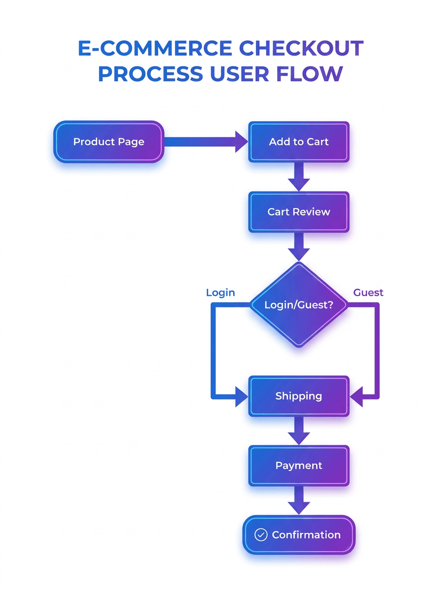
E-Commerce Checkout Flow
A typical e-commerce checkout flow: Product Page → Add to Cart → Cart Review → Login/Guest Checkout (decision) → Shipping Address → Shipping Method → Payment → Order Review → Place Order → Confirmation. Key decision points: logged in vs. guest, saved address vs. new address, payment method selection, coupon application (valid/invalid).
SaaS Onboarding Flow
SaaS onboarding: Landing Page → Sign Up (email/Google SSO decision) → Email Verification → Profile Setup → Workspace Creation → First Action Prompt → Dashboard. The "first action prompt" is critical — it is the moment where users either experience value or abandon.
Map what happens if they skip it.
Mobile App Registration Flow
Mobile registration: App Open → Welcome Screen → Sign Up / Log In (decision) → Phone/Email Entry → OTP Verification → Permission Requests (notifications, location — accept/deny branches for each) → Home Screen. Each permission denial needs a graceful degradation path, not a dead end.
Password Reset Flow
Password reset: Login Page → "Forgot Password" Link → Enter Email → Email Sent Confirmation → Email Link Clicked (valid/expired decision) → New Password Entry → Password Requirements Check (pass/fail) → Success → Redirect to Login. Edge cases: expired link, email not found, password requirements not met.
Best Practices for Effective User Flow Diagrams
1. One Flow, One Goal
Resist the urge to map your entire product in one diagram. A checkout flow and a returns flow are separate diagrams, even though they share screens. Combining them creates unreadable spaghetti.
2. Keep the Happy Path Straight
The most common, successful path through the flow should be the most visually prominent line — typically running top-to-bottom or left-to-right. Error states, edge cases, and alternative paths branch off to the sides.
A reader should be able to follow the happy path without navigating branches.
3. Account for Every Branch
Every decision diamond needs labeled outputs for every possible outcome. "Logged in?" needs both a Yes and a No path.
If a branch leads somewhere you have not designed yet, mark it explicitly rather than leaving a dangling arrow.
4. Include Error States
Error states are where users get stuck. "Payment declined," "email already in use," "session expired" — these all need paths.
The most common UX failures happen not on the happy path but at error recovery points that nobody mapped.
5. Label Everything
Every arrow should indicate what triggers the transition (click, submit, system redirect). Every decision should state the condition clearly.
Every screen should have a name that matches what the user sees. Ambiguous labels create ambiguous implementations.
6. Use Consistent Granularity
Do not mix high-level steps ("Complete onboarding") with granular ones ("Click the blue button in the top right"). Choose a level of detail and maintain it throughout the flow.
You can create separate detailed sub-flows for complex sections.
Common User Flow Mistakes to Avoid
1. Mapping the System, Not the User
User flows should reflect what the user experiences, not what the backend does. "Database writes user record" is a system flow step, not a user flow step.
The user sees "Account created — redirecting to dashboard."
2. Ignoring Entry Points
Most flows assume the user starts at the homepage. In reality, users enter from search results, emails, social media, deep links, and ads — each with different context and expectations.
Map the most common entry points, not just the ideal one.
3. Forgetting the Back Button
Users go backward. They change their minds, re-read previous screens, and correct mistakes.
If your flow only shows forward movement, it does not match real behavior. Consider where backward navigation is expected and what state should be preserved.
4. Dead Ends
Every node in a user flow should lead somewhere. Error messages that do not offer a recovery path, confirmation screens with no next step, and permission denials with no alternative are dead ends that strand users.
Every terminal should either complete the goal or redirect to a productive path.
5. Over-Complicating the Diagram
If your user flow requires scrolling on a large monitor, it is too complex for a single diagram. Break it into sub-flows connected by reference nodes.
A checkout flow can reference a "payment sub-flow" without embedding every payment method branch.
Tools for Creating User Flow Diagrams
Tool | Best For | Key Strength | Limitation |
FigJam (Figma) | Design teams already in Figma | Integrated with design files | Limited flowchart features |
Miro | Collaborative workshops | Real-time collaboration, sticky notes | Can get messy at scale |
Lucidchart | Professional flowcharts | Extensive shape libraries, templates | Paid for full features |
Whimsical | Quick, clean flowcharts | Fast auto-layout, minimal UI | Fewer customization options |
draw.io (diagrams.net) | Budget-conscious teams | Completely free, offline capable | Less polished interface |
How to Present User Flow Diagrams with Decktopus AI
Creating a user flow diagram is half the job. Presenting it effectively to stakeholders, clients, or team members determines whether the flow gets approved, revised, or ignored.
A user flow exported as a static image and dropped into a slide deck loses context. Stakeholders need to understand why the flow looks the way it does, what alternatives were considered, and what the implications are for development.
Decktopus AI helps UX designers and product managers build presentations around their user flow work — turning raw diagrams into structured narratives that drive decisions.
Why Decktopus AI Works for UX Presentations
AI Presentation Generation: Describe your presentation need ("UX review presentation covering user flow analysis for the checkout redesign") and Decktopus AI generates a complete deck with structure, content, and design. Review the AI-generated outline, adjust sections, then generate.
Beautify: Upload your existing UX documentation (PDF or PPT with user flows, wireframes, research findings). Use as a Resource extracts key points and builds a new presentation (prompt required). Redesign keeps your content but applies a fresh visual design (prompt optional).
Edit with AI: Refine any slide with natural language. "Add a slide comparing the current flow with the proposed flow" or "make this section more focused on the business impact." Preview before applying, undo available.
AI Image Generation: Generate supporting visuals — process diagrams, comparison graphics, metric callouts — from text descriptions. Useful for creating clean, consistent visuals to accompany your user flow screenshots.
Loop AI Delivery Coach: Rehearse your UX presentation with real-time delivery feedback. Particularly valuable for design reviews where you need to present clearly to non-design stakeholders.
Live Link with Auto-Update: Share a live link that auto-updates when you revise the presentation. When stakeholders request changes after a review meeting, update the deck and everyone sees the latest version automatically.
Export: PDF, PPT, or PNG (Standard or Compressed, Pro and Business plans). Embed user flow diagrams as images within the generated presentation for a complete deliverable.
How to Structure a User Flow Presentation
Context slide: What problem are you solving? What user goal does this flow address?
Current state: Show the existing flow (if redesigning) with pain points highlighted.
Research insights: What data or user research informed the new flow design?
Proposed flow: Walk through the new user flow diagram step by step.
Decision points: Explain why the flow branches the way it does at each decision.
Edge cases: Show how error states, empty states, and edge cases are handled.
Impact: What metrics will improve? What development effort is required?
Next steps: What needs to happen to move from diagram to implementation?
Who Uses Decktopus AI for UX Presentations
UX Designers presenting user flows and research findings to product teams: Decktopus for UX Designers
Product Managers communicating feature requirements with flow documentation: Decktopus for Product Managers
Startup Founders pitching product concepts with user flow narratives: Decktopus for Founders
Frequently Asked Questions About User Flow Diagrams
What is a user flow diagram?
A user flow diagram is a visual map of the steps a user takes to complete a specific task within a product. It shows screens, decisions, and actions in sequence, using standard flowchart symbols to represent different types of steps.
User flows help teams design, evaluate, and communicate the experience of using a product.
What is the difference between a user flow and a wireflow?
A user flow uses abstract shapes (rectangles, diamonds) to represent screens and decisions. A wireflow replaces the rectangles with actual wireframe screenshots of each screen, adding visual context.
Wireflows are more detailed but take longer to create and update. Use user flows for planning and wireflows for detailed design documentation.
When should I create a user flow diagram?
Create user flows: before designing a new feature (to plan the experience), when redesigning an existing flow (to map current state and proposed state), when onboarding new team members (to communicate how the product works), and when debugging drop-off points (to identify where users get stuck).
How detailed should a user flow be?
Match the detail level to the audience. For stakeholder alignment, keep it high-level: major screens and key decisions.
For design handoff, add granular detail: specific form fields, validation states, error messages. For development specs, include system decisions and data requirements alongside user-facing steps.
What tools are best for creating user flow diagrams?
FigJam and Miro work well for collaborative workshops. Lucidchart and Whimsical produce polished, professional flowcharts.
draw.io is a strong option for teams that need a capable tool at no cost. Choose based on your team's existing tool stack and collaboration needs.
How do I present a user flow diagram to stakeholders?
Do not just show the diagram — narrate the user's experience step by step. Use a presentation tool like Decktopus AI to build context around the flow: the problem it solves, the research behind it, the key decision points, and the expected impact.
Walk through the happy path first, then address edge cases.
What is the difference between a user flow and a task flow?
A task flow maps a single path with no decisions — the linear sequence of steps to complete a task assuming everything goes right. A user flow includes decision points and multiple paths.
Task flows are simpler but less realistic; user flows capture the complexity of actual usage.
How many user flows does a typical product need?
One flow per critical user goal. An e-commerce site might have flows for: browse and search, checkout, account creation, returns, and account management.
A SaaS product might have: onboarding, core feature usage, billing, and team management. Start with the flows that impact revenue or retention most.
Can I create user flows for mobile apps?
Yes, and you should. Mobile flows need to account for mobile-specific patterns: gesture navigation, push notifications as entry points, permission requests, smaller screen real estate, and platform differences between iOS and Android.
Map mobile and desktop flows separately when the experiences diverge.
How do user flows connect to user stories?
A user story ("As a customer, I want to reset my password so I can regain account access") defines the goal. The user flow maps every step to accomplish that goal.
One user story typically generates one user flow. Complex stories may need multiple flows or sub-flows.
How often should user flows be updated?
Update flows when the product changes: new features, redesigned screens, new entry points, or changed business logic. Review flows quarterly even without changes — analytics may reveal that actual user behavior diverges from the intended flow, suggesting design improvements.
What are the most common user flow diagram mistakes?
The five most common mistakes: mapping the system instead of the user experience, ignoring alternative entry points, creating dead ends with no recovery path, cramming too many goals into one diagram, and not validating the flow with real users or data before building.
How do I handle complex flows with many decision points?
Break complex flows into sub-flows connected by reference nodes. A checkout flow can reference a "payment processing sub-flow" and an "address validation sub-flow" without embedding every branch.
Each sub-flow is a separate diagram with clear entry and exit points.
Should user flows include error states?
Always. Error states are where users get stuck and abandon.
Map what happens when: a form validation fails, a payment is declined, a session expires, a page returns a 404, a required service is unavailable. Every error state should offer a recovery path back to the main flow.
How do user flows help with accessibility?
User flows reveal accessibility barriers before they are built: steps that rely on drag-and-drop without keyboard alternatives, decision points triggered by color alone, or sequences that require simultaneous actions. Mapping the flow for keyboard-only and screen-reader users alongside the visual flow catches issues early.
Conclusion: Map the Path Before Building the Product
A user flow diagram is the cheapest, fastest way to find and fix UX problems. It costs nothing to redraw an arrow on a diagram; it costs weeks to redesign a feature after development.
The best product teams treat user flows not as documentation artifacts but as active design tools — living diagrams that evolve with the product and reflect actual user behavior, not just intended behavior.
Start with your highest-impact user goal, map the flow from entry to completion, validate it with real users or data, and iterate. When you need to present your flows to stakeholders, Decktopus AI generates complete, presentation-ready decks that turn raw diagrams into persuasive narratives.
Stay Connected
Follow Decktopus for the latest updates, tips, and resources:
Related posts

How to Build Confidence When Speaking in Public (2026 Guide)
The science behind speaking confidence, the CONFIDENT framework, and the AI practice method that turns nervous presenters into calm, credible speakers.
Templates & How-to

How to Practice Public Speaking Alone (With and Without AI)
The 4 rehearsal methods that actually build public speaking skill, why mirror practice fails, and how AI simulates a real audience for structured feedback.
Templates & How-to

How to Give a TED Talk: Delivery Tips from the Best Speakers (2026)
A structured breakdown of what makes TED talks land, the delivery framework used by top speakers, and the AI practice method that closes the gap.
Templates & How-to